Pattern Pulp

Functional Creativity with MWM Studio


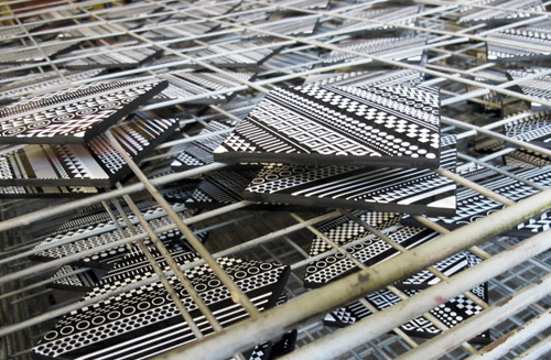
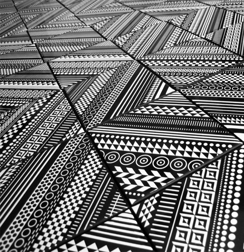
Matt W Moore’s a master at his craft and today we’re sharing one of our favorite MWM projects: DIY Ceramic Tile Sets. This collaboration with Core Deco’s an interesting example of functional creativity.
1mwm_tiles 2mwm_tiles 3mwm_tiles

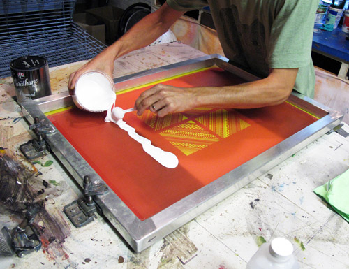
Walking us through the creative process, Moore invites us into his studio, sharing the mechanics behind the work. We particularly love this, as it lives beyond the customer purchase- once you buy a set, you become the designer, organizing, collaging and assembling the patterns to suit your particular taste. What do you think?

Vectorfunk on Canvas


[slideshow id=22]

It’s always fun to see what Matt W Moore is up to. Here are a few snapshots of his latest round series. Enjoy!

MWM's XYZ AXIS


When Matt W. Moore headed to Cincinnati for a month long residency at YES Cincinnati, he arrived with art, no supplies, and no firm plan for his next series of paintings, much like his February 2010 trip to Paris.

The result is a vibrantly colorful series created entirely with spray paint. Precise geometric lines reign as Matt created an analog version of his intricate and distinctive “Vectorfunk” style of graphic art. The result is certainly exciting and delightfully mind-bogglingly intense. Check out his work at YES gallery as well as the massive mural he created in downtown Cincinnati. For more info, click here.

Ray Ban: Never Hide Campaign


What’s the first thing that comes to mind when viewing the latest rare prints collection from Ray Ban? My gut response channels a modern day Garbage Pail Kid set, only PG and without the creative titling. That being said, Ray Ban’s Never Hide campaign is an amazing example of how patterns can be incorporated into a high visibility ad campaign. Matt W. Moore, a Pattern Pulp favorite was tapped to design the limited edition shades and joins a talented roster of artists for the bold and colorful round up.

Twitter Influencer: Matt W. Moore


Matt W. Moore has always been a Pattern Pulp favorite. His colorful vectorfunk continues to touch nearly every medium- from the rawest street designs to the most polished advertisements. It’s no doubt that Moore’s talent, coupled with his willingness to take on just about anything, has made him an inspirational figure in the art world. We love his twitter feed for the documentation of his process, commentary on his world travels and pointed opinions on his daily finds. It’s always a pleasure when you can sense someone’s excited about their work and Moore encompasses that on a daily basis.

The Trend Is Crystal Clear


We reported diamonds to be a shining motif in pattern design back in June and now the trend has officially crystallized.

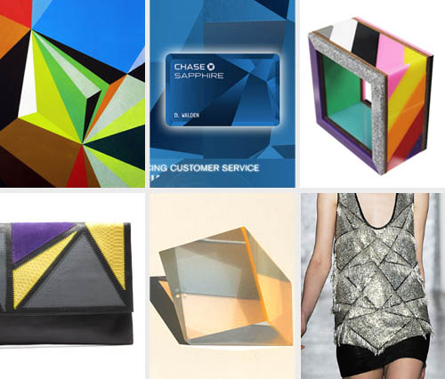
We’ve seen the classic diamond shape shift to a crystal-like gem on works ranging from new Matt W. Moore murals to Chase Bank advertisements. The laser cut shapes are bold. Just check out these angular bangle bracelets by Patricia Field and this radiant Helena De Natalio clutch. The sassy accessories are the perfect way to flaunt some flash with a basic black get-up.

But these crystals don’t sparkle like their compressed coal predecessor. Instead, they catch eyes with their geometric shapes and powerful lines. Strong colors further emphasize their graphic feel, as evident in Phillip Low’s sculptures and Jen Kao’s angular FW10 debut. We can’t wait to see how this crystal trend will continue to rock the fashion and art world.

Coverage by: Rebecca Silver

Tracking Repetitive + Awesome.
On Instagram.