Pattern Pulp

Capturing Migration Patterns


migration_captured

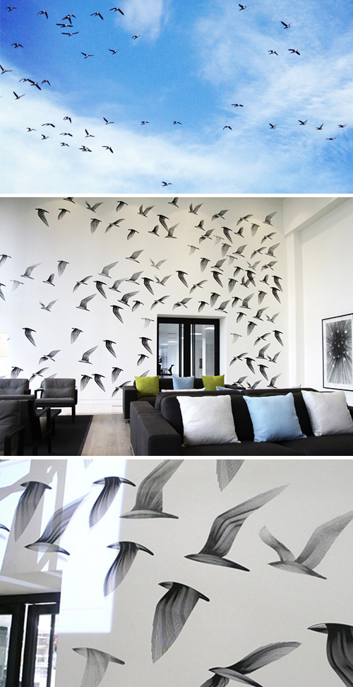
Walking along the Hudson last weekend, something seemed off. The birds weren’t the typical bunch. My husband, who’s somewhat of an aviary guy, started to stare in fascination- he was certain these weren’t ‘New York’ birds. As we stared at the ever-growing flock in Battery Park City, we realized that these circlers were in migration. They were making a weekend pit-stop (insert amusing NYC joke here), much like my McDonald coffee breaks along I95. Coincidentally (or perhaps not), the next day I stumbled across this fantastic mural by Kai and Sunny, measuring 20 x 26ft, entitled Migration East. It’s lively and energetic, much like the real thing.
 

Book Review: High Touch


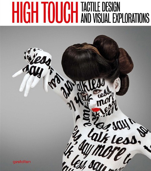
Today’s visual culture is shaped by a vast wealth of influences from a diverse range of styles, cultures, and eras. Handcrafts including crochet, papercraft, and the design of costumes and masks are being melded with the techniques of more traditional art forms such as installation, sculpture, collage, photography, and illustration.

This new visual language is currently being formed out of the skillful and unusual combination of creative styles, as well as the use of an expanded range of materials and techniques. One of the most striking aspects of today’s visual culture is its intricate, handcrafted quality.

The term “high touch” is used in design theory to describe an accessible, human visuality. High Touch the book is a compilation of current work that is broadening and enriching this definition in a contemporary way.

Presenting a rich selection of innovative, often handmade design created with the full spectrum of materials and stylistic devices in existence today, the book explores all of the many ways artists are expanding this palette of visual possibilities. We’re excited to see so many of the fantastic design and art projects we’ve documented here on Pattern Pulp in the pages of this eye-catching book.


Book Review: Iconic Sculptures & Installations


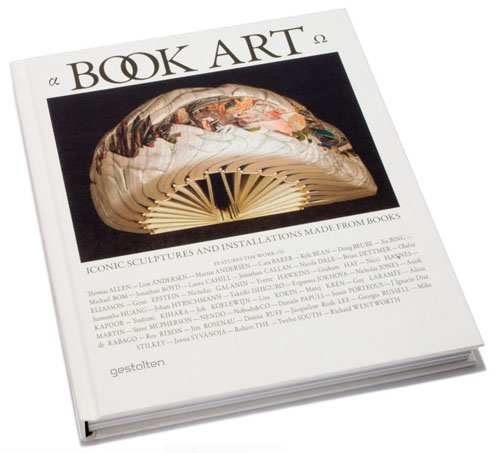
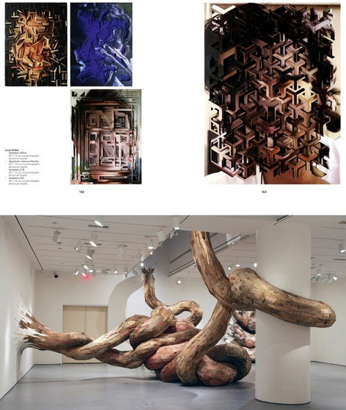
Book Art is a stunning 220-page compilation of art, installation and design created with and from books. The content is diverse in narrative and ranges from old printed pages wound into creative threads to laborious works of art, decomposed into organic matter.

The fascinating range of examples is proof that—despite or because of digital media’s inroads as a source of information—the book’s legacy as a carrier of ideas and communication is an impressive one. Click here to buy online.


Painting to Music with Jeroen Erosie


The other day I got an email from Jeroen of Erosie and was pleasantly surprised when I hit play. A friend of Oliver Kosta Thefaine, an artist we featured in relation to burnt beauty, it’s easy to see why they’re friends.

No surface is spared when either of them get to work. In Jeroen’s case, his freestyle wall painting occurs in an underground club in Eindhoven, in the Netherlands. Using just 15 liters of black paint and and a handful of paint rollers, the installation took 7 days to complete. This series is part of the Horror Vacui Project, where the grotesque nature of excessive pattern decoration is explored.


Trend: Sweet and Savory Details


motoi-yamamoto1

No matter how detail oriented you are, Motoi Yamamoto will still beat you to the punch.  Using salt and an extraordinarily steady hand, this Japanese artist merges organic influences with the most basic of natural elements, salt, to his build his masterfully intricate installations. Yamamoto’s work has progressed from an inquiry on death to the exploration of salt as a meditation on life. “Now I believe that salt enfolds the memory of lives…salt is used across culture as an antibiotic, preservative, and purifier.  Salt is a life-sustaining element.”  For the full story on Yamamoto’s work, pick up a copy of this month’s  Theme Magazine– unfortunately the online version omitted the story.

bantjes-cartier

It doesn’t take long to see techniques reinterpreted and trends take hold when an artist gains global acclaim. Using sugar in place of salt, Marian Bantjes, a typography genius, illustrates a variety of styles for Stefan Sagmeister’s book, Things I have learned in My Life So Far.  Infusing a touch of luxury to this trend, Cartier crafts golden fingerprints for thier latest ad campaign, Trinity, which can be found in Time magazine’s April supplement entitled, Fashion’s New Attitude.

Trend: Kid Friendly Clouds


tsumori-chisato-dress

Though we’d typically hold off on our cloud postings til late March when pairings can be aligned with April showers, cumulous floaters have proven inspirational as of late.  Åsa Dahlbäck, a graphic designer from Sweden, creates sharp textured markings to form bold fluffy dimples.  Utilizing the largest markers in the box, Tsumori Chisato’s cloud dress portrays a dreamlike state, obscuring clarity with harmonious violets.

rose-clark

In a playful salute to “partly-cloudy” weather reports, Rose Clark’s collaboration with Sinem Erkas reveals a portable balloon installation series for fashion and art magazine, Exit. Continuing along bold and witty lines, the users of we heart it, found amusement in this hungry gutter by The 6emeia Project.  Harmless street art to make you smile.

alisonfoshee

Fusing photography with playful attainability, these pastel clouds encourage conceptual daydreaming.  Alison Foshee, of  California, explores the potential of everyday objects in her dynamic collages.  Here she has layered an assortment of stickers to form whimsical colorful droplets.

cloud-3d

Cloud and rain inspired accessories have infultrated the marketplace in a variety of forms.  This blue wooden sculpture by Flatland OK, solidifies unattainable pairings.  Modernizing Ming Dynasty Era alcove beds, Courtney Skott of San Francisco has carved out pixelated cloud patterns in an effort to decorate her “room within a room” concept.  Feminizing this concept, necklaces and other curious jewelry findings can be located here.

Tracking Repetitive + Awesome.
On Instagram.