
Pattern Pulp

Color: Green and Graphic


green-mosaics

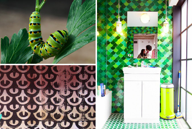
It’s common knowledge that nature inspires design.  When we saw this tomato worm on one of our favorite design and inspiration blogs, Lovely Morning, a few months ago, we knew that Summer ’09 was going to be both green and graphic.  The natural pattern found on this stunning caterpillar is visually connected to the beautiful tile work backing a shot of Kid America by the infamous photographer, The Selby.  We then found a black and white retail display at LA’s The Lab, that was distinctly reminicient of the scalloped mosaic.  Much like the caterpillar’s transformation to a butterfly, graphic design inspiration can evolve in equally magnificent ways.

Event: Show & Tell at the PSFK Conference


matt-moore

Tomorrow marks the 3rd annual PSFK Conference in New York City hosted by my good friend and colleague, Piers Fawkes and his team at PSFK.com.  I have been fortunate enough to attend every year and can soundly say that the event never fails to exceed expectations.  I’m particularly excited to hear Matt Moore of MWM Graphics speak about his working style and inspirations.  Moore has a portfolio of patterns that would make make any art director smile.  His seamless transition from crafty to commercial has pleased clients ranging from Nike and BMW to Burton and Oilily.  If you’re in tomorrow’s Battery Park crowd, swing by for a hello, I’ll be the one with the polka dot name tag.

Tracking Repetitive + Awesome.
On Instagram.