Pattern Pulp

Color & Graphics: Maxwell Holyoke-Hirsch


Maxwell Holyoke-Hirsch PatternPulp 1

What makes a good editorial illustration? Like a book cover, I believe it’s one that immediately draws you in, conveys a complicated message, and feels simple in execution. Achieving this balance is a tough task, as there’s a true art form to showing and not necessarily telling. Editors, art directors and graphic designers grapple with this visual see-saw every day.

Maxwell Holyoke-Hirsch PatternPulp2

If you read the New York Times, Bloomberg Business Week, The New Yorker or The Washington Post, you may be familiar w the bold clever illustrations of Maxwell Holyoke-Hirsch.

Maxwell’s designs incorporate pattern through simple line and texture, often supporting a singular theme and color way within his layout. His work translates complicated topics, allowing the article and accompanying content to shine – which is no easy feat. Click here to page through his portfolio – as you scroll through, you’ll appreciate the edited minimalism that allows his work resonate so clearly.
 

Breathing Life into Your Infographic


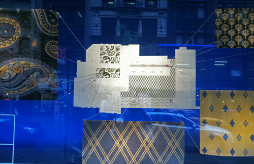
Check out this window on Madison just north of Eataly. I’ll admit it’s not my best street shot, though the concept’s interesting. In an effort to demystify a 2D floor plan, carpet swatches and string have been added to provide dimension, color and texture. It’s a valiant effort, and I’d love to see a few more interpretations.


Illustrating Global Currents


Pretty stunning visualization, isn’t it? Here we have the ocean surface currents during the period from June 2005 through Decmeber 2007, designed by the NASA/Goddard Space Flight Center Scientific Visualization Studio.

A comparison was recently made by Mark Wilson of Fast Company comparing it to Starry Night by Vincent van Gogh. Beautifully accurate, wouldn’t you say?


Trend: Digitizied Collages


When making comparisons, it’s hard to tell that these two works are by artists from different sides of the world. On the tail of this morning’s Giles Hayter feature, it seems timely to talk about a trend we keep seeing in the art world: collage color-blocked patterns. The piece on the left is by Hayter and can be viewed in London’s Redchurch Gallery this week. The drawing on the right, entitled, Inconsequential Terrain, by Seong Chun, is represented by Mary Ryan Gallery in New York. This piece is just one of many amazing works on Artlog‘s roster. Another cool component at Artlog is ACP, their latest initiative to build a close community of art lovers and collectors both locally and globally. Both designs resemble organized chaos and remind us of slightly chaotic info graphics.

Pie Charts & Patterns for the Future


When graphics are bold and balanced, they’re downright compelling. Everyone from the programmers at Adobe Illustrator to the designers at Wired Magazine to the marketers at the Gyre Department store in Omotosando Hills, Tokyo can agree here. Why else would squares, circles and lines be preloaded in Illustrator 3’s Creative Suite? Jumping to the pages of this month’s Wired, the Will Ferrell feature uses a patterned-blocked pie chart to communicate futuristic topics ranging from designer babies to clean coal. Adding color and textural layering, the Gyre store booklet applies circles for a neutral airy layout. Adding Japanese characters to the video and web component, the simple shading and spiraling technique reminds us that black and white rarely fails, so long as there’s movement, balance and dynamism.

Literary Intelligence: Information is Beautiful


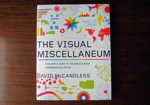
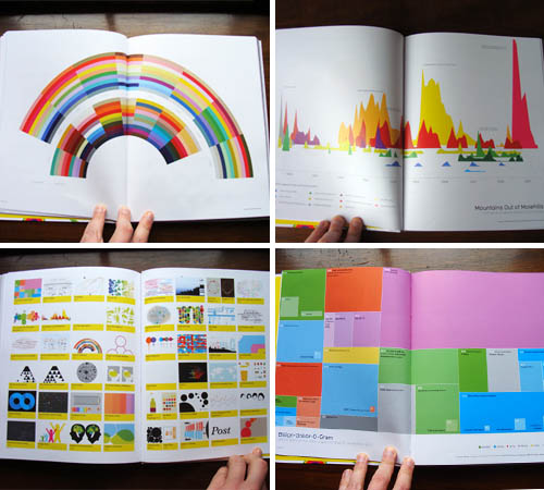
It’s quite a treat having friends that double as industry experts. Not only do I have reliable sources to bounce ideas off of, whenever a email recommendation ends up in my inbox, I know it’s from a trusted source. This morning, my good friend and colleague, Alexandra Machinist, a Manhattan based literary agent, sent a heads up about The Visual Miscellaneum: A Colorful Guide to the World’s Most Consequential Trivia, by David McCadless. McCadless’ new book is a collection of his most recent info graphics, knowledge maps and data visualizations. For any designer handed the task of simplifying data, then this is the book for you.

A few sneak peaks of what you’ll find in McCadless’ book. Enjoy and support!

Tracking Repetitive + Awesome.
On Instagram.