Pattern Pulp

Color & Graphics: Maxwell Holyoke-Hirsch


Maxwell Holyoke-Hirsch PatternPulp 1

What makes a good editorial illustration? Like a book cover, I believe it’s one that immediately draws you in, conveys a complicated message, and feels simple in execution. Achieving this balance is a tough task, as there’s a true art form to showing and not necessarily telling. Editors, art directors and graphic designers grapple with this visual see-saw every day.

Maxwell Holyoke-Hirsch PatternPulp2

If you read the New York Times, Bloomberg Business Week, The New Yorker or The Washington Post, you may be familiar w the bold clever illustrations of Maxwell Holyoke-Hirsch.

Maxwell’s designs incorporate pattern through simple line and texture, often supporting a singular theme and color way within his layout. His work translates complicated topics, allowing the article and accompanying content to shine – which is no easy feat. Click here to page through his portfolio – as you scroll through, you’ll appreciate the edited minimalism that allows his work resonate so clearly.


Illustrate Patterns with Julia Rothman


Screen Shot 2015-07-23 at 11.34.09 AM

Julia Rothman is always creating something magical- be it wallpaper with hand drawn motifs, books to guide you as you roam about observing life, or environments for creation, where up-and-comers and experienced colleagues can share tips and tools to push each other forward. It’s inspiring to watch her build, nourish and support the illustration community.

Rothman’s latest collaboration runs along the same lines and is an exciting opportunity for anyone looking to dip their toes in the world of surface design. Together with Skillshare, she’s created an online course to teach the technical ins and outs of pattern making. I highly recommend it for artists at any level who want to jump right in and start making again. Click here to sign up and keep learning!


Brandon Locher's Creative Process


brandon locher2brandon locher1bbrandon locher3

Nearly a year ago, we shared the incredible illustration work of Brandon Locher. It’s easy to recognize a Locher piece, as his distinct style is intricate, colorless and evolutionary of his Mazes to the Motherlode series. Locher draws for ten hours straight, going into a meditative disciplined state. In his own words:

Our journey must be to awaken here and now. To be fully alive, we must be fully present. Hopefully embedded within these illustrations lies a personal topographic blueprint for the vision and self creation of even smaller moons, larger galaxies, and realized worlds. I became very meditative while making these pieces. My self-focused mantra was making this creative process completely effortless.

Here is one of his newest works – a 20″ x 20″ illustration which was made exclusively for The Ghostly Store. It’s a tremendous tangle of mono-patch chords, an appropriate collaboration for an electronic music based label. Click here to buy and learn more.


Trend: Expressive Body Script


expressive - illustration - patternpulp

There’s been a lot of talk about graffiti finding it’s way into high fashion. Miuccia Prada ushered in the conversation last summer with her About Face runway presentation. The latest examples have similarities in their raw essence, but take a bold, expressive typographic turn. We have Evisu, Die Antwood, Comme des Garcons and Dior Homme all using the body or page as a canvas for expressive thought.

shantell-martin-artist-may-issue-interview

All of these pieces feel connected in some way to the style and vibe of Shantell Martin’s illustrations. Her stream-of-contiousness drawings have been an influential style for a while now, and a stark contrast to the crisp colorful characters and collage work from Fall.


Concepts & Illustrations at Maiyet


maiyet-illustration and pattern

Bringing a drawing to life takes a lot of work. The sky’s the limit when you take pen to paper, but achieving the desired results requires patience and expertise. I found these before and after watercolors from Maiyet to be beautiful realizations of product development. The crochet polo and hand beaded venus clutch are part of their Spring/Summer 15 line and have timeless appeal.


Cycling Climbs & Textured Landscapes


NigelPeake-Mountains

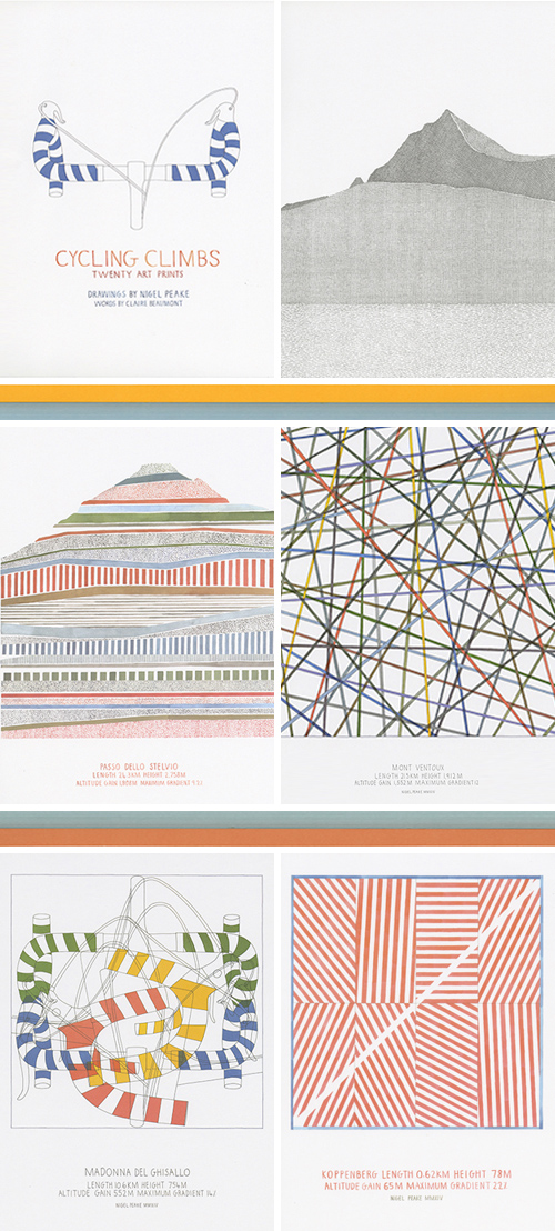
Artists often see the world through varied prisms. It almost doesn’t matter if graphic elements are manmade or within natural habitats, they pop through visual texture. Nigel Peake, the illustrator behind In the City, recently released 20 prints, illustrating this concept. The collection follows his biking travails and is called Cycling Climbs. The infographics merged with geometry and illustration create a beautiful storyline. If you’re your a fan of art, cycling and/or landscape development, this 44 page publication is for you.


Tracking Repetitive + Awesome.
On Instagram.