Pattern Pulp

Patterns & Posters from Project Projects


1projectproject_intercourses2projectproject_intercourses

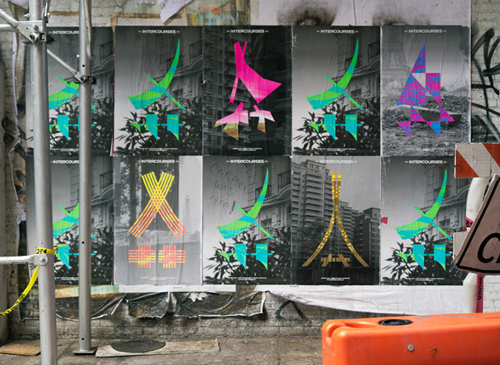
I’ve always been a wheat paste poster fanatic. I love the freshness in the graphic design, the fleeting nowness of pop culture and the way it merges into urban environments- usually a construction site or run-down corner. I love that it’s illegal, but not really, and that it keeps the general population in the know about current events beyond the internet. This collection, by Project Projects, caught my eye.

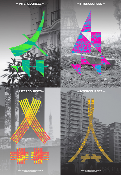
The graphic campaign centers around an invented symbol derived from the significant Chinese character, “Ei” — the first letter in the Chinese word for “Eiffel Tower,” and an ideogram often used in the phonetic transliteration of foreign (non-Chinese) names. Although it may appear Chinese to a Western viewer, the new symbol functions as a two-fold abstraction: a simulacrum and a fiction of the functioning of language.

Project Projects’ creative campaign is an extension of Intercourses, the Danish Pavilion’s five-channel video installation by artist Jesper Just for the 55th Venice Biennale. The pieces parallel ideas of doubling, dislocation, and the illusion of communication.


The Colors of a Modern Identity Crisis


Identities are a funny thing. In one instance you’re one version of yourself and in another you’re an entirely different character. Alternate parts of your personality shine at varying times. Now add a digital layer. A boundary of sorts, something to protect you from the reality of what’s true and what’s false.

Today’s story hones in on the awkward line between these worlds. Photographically, it’s illustrated by Neil Barret’s latest print campaign of youth divided. Reminding us of Nick Cave’s beautiful and often confusing costumes, we have David Sim’s latest spread in LOVE Magazine and bringing an eerie surrealist interpretation to the table, there’s Dow’s Einstein-infused Solutionism campaign.


Print: Illusionist Masks


alakazam-bryan-schnelle

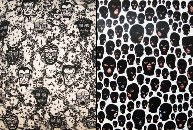
For as long as I can remember, garbage pail kids have claimed their stake in pop culture.  Though the cards are iconic of the 80’s, throw-backs have been rampant throughout the web ever since.  Vivid line drawings paired with parodical humor can be found on Street Carnage, while printed on home goods, at Alakazam.  Using ski masks to conceal his characters’ identities, Bryan Schnelle, a west coast artist, illustrates his alternative reality, admitting, “nothing is what is seems, people aren’t who you think they are, don’t trust [anything], and question everything.” Though this concept of ulterior identities may seem extreme, it has laid the foundation for many plots. For the twisted comedians among us, it validates the satire behind the punch line.

Tracking Repetitive + Awesome.
On Instagram.