Pattern Pulp

Tuesday's Gallery Picks


gallerypicks_patternpulp127

This week’s artists keep it bright, with crisp lines and a lot of pop.

*            *            *

1. “The process involved in making [these paintings] is that of drawing and redrawing an image until only the most essential pieces are left.” at Joshua Liner Gallery
2. Richard Colman’s Faces, Figures, Places, & Things at Chandra Gallery
3. In Chromatic Aporias Rafael Lopez-Ramos includes realistic renderings of tropical fruits paraphrasing the gaze of colonial Art; the syncretism of Afro-Cuban religious symbols and Catholic images; and the Revolution’s propaganda iconography. Now he adds typical Americana popular culture characters, & esoteric symbols related to the American political tradition at Museum of Contemporary Art North Miami
4. Steven Harrington’s “Wavy Days” will feature 16 newly hand-painted canvases, 15 graphite drawings, 2 new sculptural works, and an exclusive screen-printed exhibition poster. The paintings present a brand new body of work that has never been exhibited, or shown within a gallery space at Colette
5. “Barbara Rossi: Poor Traits” presents a selection of Barbara Rossi’s enigmatic graphite and colored pencil drawings from the late 1960s and her meticulously rendered reverse paintings on Plexiglas from the early 1970’s at New Museum
6. The World Goes Pop will reveal how pop was never just a celebration of western consumer culture, but was often a subversive international language of protest – a language that is more relevant today than ever.at Tate Modern
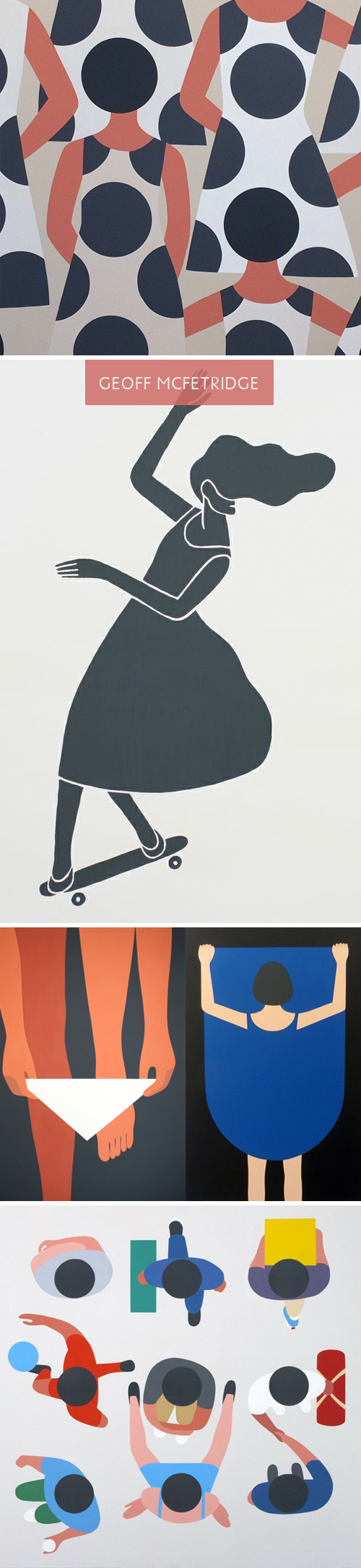
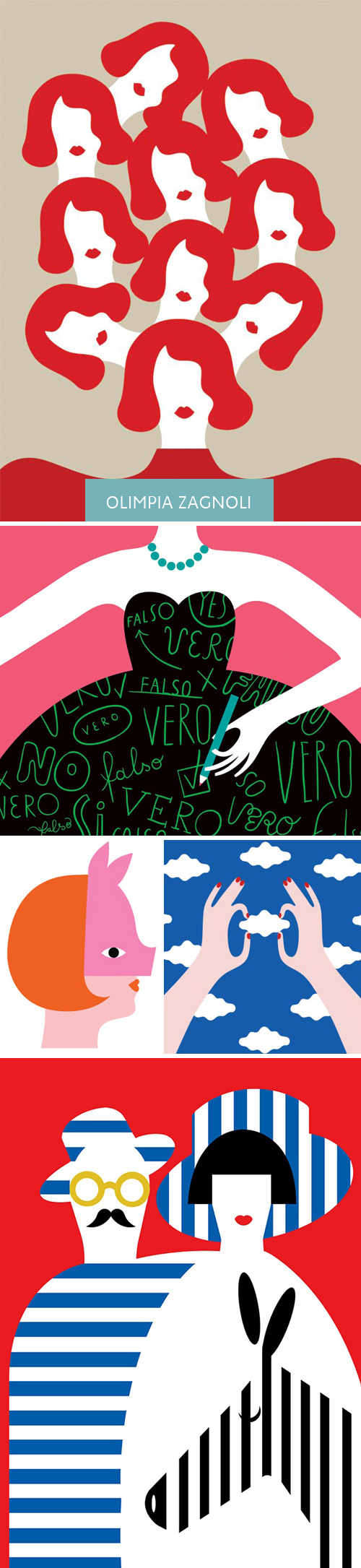
Gender & Paralleling Illustration Styles


GeoffMcFetridge_PatternPulp

Lately, I’ve been spending a lot of time on Pinterest. Part of it’s due to a few social media assignments for various clients, and the other part is a renewed interest in home decor and dying techniques. Interestingly, Geoff McFetridge, an artist I’ve always loved, has been populating my feed quite a bit. Much of his recent work reminds me of a style I’m used to seeing in Olimpia Zagnoli‘s illustrations. When you take a closer look though, each artist may use bold, abstract shapes, though the story lines are extremely different.

McFetridge’s recent work feels quite sexualized when you view the grouping together. Men are men, and women are welcoming of men. At first, you don’t think much of it, as the perspective and lack of detail throws you off. The design feels quite simple, but the longer you sit with it, the complexities and storyline grows. Themes of exposure, individuality, disguise and personal space seem to be markers of this series. In comparing the works side by side, you notice the difference in artistic nuance.

Olimpia Zagnoli_PatternPulp

Zagnoli’s woman has a coyishness to her that feels defiant. She seems stylish and quirky, and an equal player amidst male counterparts. Her shapes and color palette have greater contrast and present what feels like an uptown woman (where McFetridge’s female feels younger and more exploratory of herself).  I have to believe neither artist wants to be compared to one another, but when works have been pinned alongside one another, it’s hard not to notice a narrative and comment on the parallels and differences. Curious, what do you all think?


Tuesday's Gallery Picks


gallerypicks_patternpulp21

Delving into the familiar and turning it on it’s head with this week’s gallery picks.

 *            *            *

1. Agostino Arrivabenes’ seeks to understand his inner world and the world around him by creating a fantastical series of self portraits at Panarama Museum
2. Ian Strange has worked with a film crew and volunteers in Ohio, Detroit, Alabama, New Jersey, New York and New Hampshire to create, photograph and film seven site specific interventions incorporating suburban homes at National Gallery of Victoria
3. Traditionally used as a symbol for purification and mourning in Japanese culture, Motoi Yamamoto’s use of salt emanates from a powerful personal experience in working through the death of his sister. His artwork is rooted in themes of life, death, and rebirth, and his process with salt has helped him cleanse his grief at Monterey Art
4. With works of painting, drawing, sculpture and photography, artists in “Summer Reading” explore the relationship of literature and print media to the realm of fine arts, or perhaps the slippages of meaning and experience between the act of reading and that of looking at The Hole
5. Carl Cashman’s most recent works continue to develop his own distinctive brand of Op-art he has named ‘Neometry’; geometric based Op-art made with a primarily neon based palette at Breeze Block Gallery
6. In Robin Mitchell’s recent paintings, her brilliantly colored starbursts, orbs and linear overlays suggest that she is moving even deeper into what appear to be the molecular structures of her imagery.Craig Krull Gallery

Merav Danny's Textured Bowls


1merav_danny_telaviv2merav_danny_telaviv3merav_danny_telaviv

While visiting Tel Aviv last month, I spent some time exploring Nachalat Binyamin, a weekend artist’s market. I was on a bit of a mission. We we heading to my husband’s family for a few hour lunch, and I was on the hunt for a gift. As it goes, when you’re creatively opinionated and unclear of who’s on the receiving end, I go with something I’d love to get, toned down a bit. When I stumbled upon Merav Danny’s papier-mâché bowls, it was over and I was glued to the table for the rest of the fair. Merging street art, nature and feminine themes, each collage is a work of art worthy of extended distribution. I gravitated towards a torn paper camouflage bowl for the family and bought this cartoon piece for myself. Feels like Geoff Mcfetridge and Brian Rea had a baby, right? Danny’s email’s on the above link if you’d like to get in touch.


Repurposing Patterns with Pottock


Converting his familiar character illustrations into upholstered fabric, Geoff Mcfetridge‘s venture into furniture is as playful as it is practical. The Allofus chair, a product of Pottock, him and his wife’s wallpaper company, merges midcentury styles with a playful pattern. Successful repeats have many legs and it’s exciting to see this soft, tangible extension executed so beautifully.


Geoff McFetridge


Geoff McFetridge is a true design pioneer, not to mention a wicked multi-tasker.  “He is part of a new generation of designers who are eager to leap the old divides between image and product, design and art, the flat page and the moving image,” says Paul Thompson, director of the Smithsonian’s Cooper-Hewitt, National Design Museum.  Patten Pulp caught up with McFetridge to talk about his design process, as well as Pottok, the wallpaper company that he founded with his wife Sarah.  Pottock marries McFetridge’s unique pattern skills with environmentally-friendly papers and water-based inks.  The abstract and breathtaking results have papered walls from The Montalban Theater in Hollywood to the well-known Colette boutique in Paris.  Check out our Q+A for a glimpse into the mind of this skateboarding wunderkind.

Tracking Repetitive + Awesome.
On Instagram.