I recently worked on four sets of FW 16/17 palettes for The Color Association for our biannual meeting. Whenever it’s time to convene, I spend a few weeks fixated on key visuals from the fashion, art, news and technology worlds and try to wrap my head around general cultural themes that have evolutional staying power.
I collect imagery and toy with ideas tied to politics, pop culture and generational shifts while attempting to trust my gut with what’s relevant and what feels tired. Sometimes it’s optimistic, other times it’s a bit grim. Mostly though, it’s a balancing act of positive and negative forces.
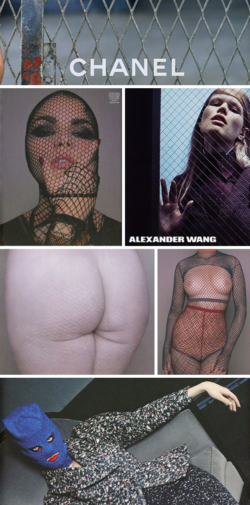
Here are a few magazine tears that caught my eye and fed some of my thinking in the last report. The palettes are for women’s fashion, so I always try to consider the commercial messaging I’m being fed. These fence and fishnet themes kept popping up in the pages of editorial shoots and fashion advertising. Looking at them, I see lust, capture, bondage, transparency, barriers, and female role playing.
Personally, this not-so-subtle messaging seems to both endorse and artistically react to the sexualization and confinement of women, a theme with unfortunate staying power in past and present realities.
This imagery contradicts the Lean In mentality society embraced in 2013. Can you imagine Tavi Gevinson, Taylor Swift or Leandra Medine – all thought leaders and Gen Y role models modeling in fetishized meek poses? It seems to go against the grain of art by women for women – especially with a lack of underlying humor and irony (except for maybe the blue face mask).
There’s a fine line between art, fashion and propaganda, and while these magazine pages have abstract beauty to them, they also convey stark messaging. It’s simply hard to detach them from today’s political matters – specifically in regard to gender power plays and violence against women. In absorbing these works as a whole, I wonder where we’re headed over the next few years.
I’m also curious how you all read into them. Are you seeing what I’m seeing? And, does the 2016 election paint a brighter picture for women or are we just momentarily circulating within a culture that celebrates these ideals?