Pattern Pulp

Colors & Summer Brights


1Summer_BrightsSummer’s arrived – especially in Manhattan where the temps are teetering on 90 degrees Farenheit. In acknowledgment and celebration of the season change, I thought I’d share some snaps from the past few weeks.

2Summer_Brights3Summer_Brights4Summer_Brights5Summer_Brights

It’s been a bit of a travel forecasting whirlwind, and interestingly, it seems like the global color palettes are on the same page. The rose floral clutch is from Selfridges, while the mega leaf was spotted during a wedding weekend celebration in Tulum, Mexico. It truly feels like the Mara Hoffman of plants. I inserted myself in the mix- since the orange and pink play was unexpected, but extremely characteristic of the vibrancy throughout Morocco. That said, this dress is a Balinese print. This was a brief roadside coffee break, enroute to Marrakesh. Hay Design has created a pop up shop at Liberty London, and unsurprisingly, the patterns were fabulous. Here are a few tote bags from their spring collection. The geometric paper is from Pentreath & Hall, an interiors store just off Lambs Conduit Street in London. The folds make the 2D/3D graphics truly pop.

6Summer_Brights2

In putting this together, I thought I’d make a quick print that embodied all of the above, incorporating the colors and mood from each image. I don’t usually share my designs on the blog, but figured it’d be useful to illustrate the meaning behind concept and creation.


Color, Collage & Chad Wys


4chadwys_patternpulp5chadwys_patternpulp2chadwys_patternpulp1chadwys_patternpulp3chadwys_patternpulp

There’s a seriousness to Chad Wys’ work that feels very fresh in it’s storytelling. While some elements are familiar, like the color blocking and dripped coats, the ever-evolving collection has a point of view that’s purposeful and original in it’s familiarity.

A major strand throughout much of my artwork, beyond the broader inquirers into what art means socially, is the notion of object: object ownership, objectification of history, objectification of people, objectification of artwork and its many mediums; objectification of aesthetic pleasure; etc. I often explore/exploit the idea of objecthood: how we decorate our lives with arbitrary, as well as meaningful, things; how we objectify the ones we love and the strangers we see; how we objectify pain and death; how we objectify complex and sensitive cultural histories. I’m also deeply interested in understanding the reception of art, the reception of objects, and how extrinsic and intrinsic influences affect individuals’ reception of the visuality they experience.

At the core, Wys’ work is a development of composition, color and form, pairing materials and gestural strokes in brilliant simplicity. if you’re a fan, check out his shop on Society6.


Tracking Color & Creating Pattern


color_drirection_patternpulp

I first learned about stream of continuousness in grade school- probably a week or two after writing my first haiku. I remember the idea being a bit foreign at the time – as a kid learning how to craft a plot and a storyline in relation to form and flow was hard enough. The concept that you could free yourself from those boundaries to write something loose and unstructured seemed a bit counter intuitive. I remember thinking that it felt very journal-like, and that I was surprised by my thought process- at surface value, things didn’t connect, but as the greater picture came to light, the steps along the way made more sense.

Over the years, it’s become increasingly apparent that this method of writing – and thinking – and making, was a lens in which to the view the world- one that many creative thinkers embrace.

So how does this link up to today’s imagery? The color story above is a snapshot of inspiration that led to a pattern I designed. While the imagery as a whole seems a bit disjointed, there’s overlap between two of the three photos at all times. The Karen Kimmel Shape Shifters are from Ten Over Six in Los Angeles. They’re a fantastic combination of color and shape- for art loving kids and adults alike. The macrame shares a similar color story in terms of balance and accents, and is a part of The Platform Experiment– another creative (but unrelated) creative endeavor from Los Angeles. The bottom pattern is a design I recently painted for a Fall/Winter project and incorporates bits and bobs from the above imagery. It’s similar in some ways, yet extremely different, as the floral inspiration and linking paths came from my own head.

Oftentimes we only share the work in it’s final state- I thought it might be interesting to track and share the flow- which is often a  combination of experience, serendipity, inspiration and style. We can’t control the visuals we consume or the color combinations we absorb, but the resulting products usually reflect aspects of these processes.


Interior Color Stories from Dubai


1kate_lewis-harpersbaazar_dubai 2kate_lewis-harpersbaazar_dubai

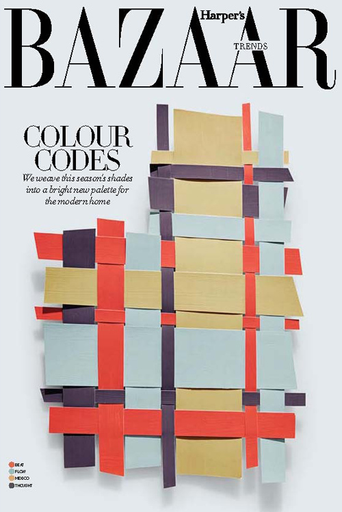
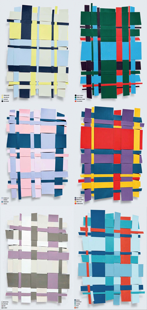
Paging through instagram this morning, I came across the work of Kate Lewis. Lewis is a photographer living in Dubai with a gifted eye for chic, modern, magazine-worthy moments. She recently shared these still life color collages from the March edition of Harper’s Baazar Interiors on her tumblr. They’re inspiring in more ways than one, as they convey an interesting balance in color harmony while doubling as unexpected plaids, worthy of art or fashion. Do any of these translate to your home?


Color & Pattern: Apple's iPhone5 C


2iphone5c

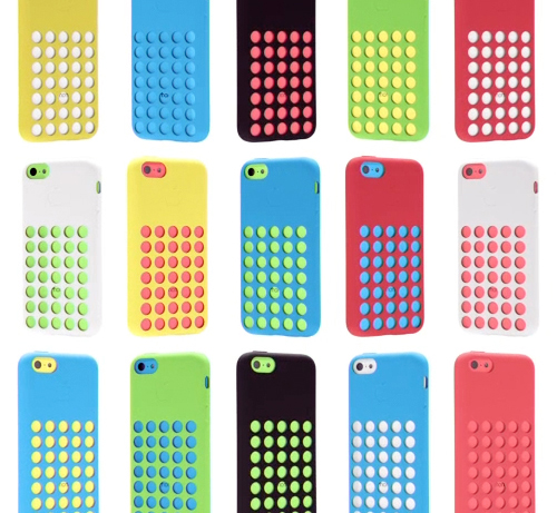
The anticipation’s over and even Apple’s in back-to-school mode with their latest iPhone C product launch. Combining matte and shiny surfaces, gridded netted covers, and a very bright color palette, these phones have a decidedly childish twist- taking a 180 diversion from the stark monochromatic days of the past.

The palette feels very American in a naive, almost unglamorous way. The playfulness of the colors are rather commercial and we suspect will have a good deal of influence over the coming years. When you’re a brand like Apple, you have serious sway. You set the mass market trends in the world of tech and product design.

I’m assuming the male market will veer towards the white C or any of the S phones, while the female buyers will be more varied (hello, coral), though it’ll be interesting to see how this palette plays out and inserts itself into our subconscious vernacular. If you’re planning to buy one, which color will win?


Color, Conversation & Hanes Underwear


http://www.youtube.com/watch?v=gRJ9ko0nZmI

1color_marketing_hanes

2color_marketing_hanes 3color_marketing_hanes

Have you seen the latest Hanes spot? Chances are, maybe not, as the YouTube page has only 118 views. Parts of it are pretty cool, we’d recommend giving it a go. The concept reminds us a bit of Gap’s Be Bright campaign from a while back, but has clever synchronization and pattern mash-ups that transition human puzzles into cotton graphics.

Complimenting the TV spot, the social media component plays off of color, hoping to create chatter about an otherwise taboo topic. Would you tweet the color of your underwear? Hanes is hoping you will, by utilizing a Pinterest-like layout and pre-populated tweetable content, with a campaign entitled, What’s Your #undercovercolor? Have a look, play with the wheel, and let us know what you think…


Tracking Repetitive + Awesome.
On Instagram.