Pattern Pulp

Homegoods: Design & Divide


The room, that is. Who else is in the process of reinventing their home? I recently moved and am in turbo furnishing mode. Now that my office is also a home office, I’m attempting to section areas off in elegant artistic ways.

Which leads me to Custhom’s newest product collaboration, the modular room divider. They’ve taken their Offset Collection, a beautifully mismatched pattern and applied it to birch-faced ply to create one of the most elegant screens I’ve ever come across. What do you think? How do you compartmentalize your home environment?


Venice: Circling Nature


Artist Don Suggs has a fascination with circles and enjoys incorporating them into his work. His latest pieces are inspired by the colors of nature in select environments that he then distills into glossy painted concentric circles. Taking up two floors, his exhibition displays work using this concept in two different ways.

The first floor shows Suggs’ Abyss Pools and Travertine Springs, inspired by the color palettes of dark pools and mineral springs, crafted into layered circles against a white or grey background. On the second floor, Suggs’ presents his Paradise Prints, which are archival inkjets inspired by landscape, printed in small editions of five or fewer. Click here for more info.

L.A. Louver: 45 North Venice Boulevard, Venice, CA, USA


Patterns in Web Design


*            *            *

Always a proponent of repetition, I thought I’d share two examples where patterns steal the show online. The above banners on The Sydney Morning Herald illustrate the power of color and graphic detailing when paired alongside text. Your eye is immediately drawn to the advertising, even before the duck.

*            *            *

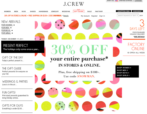
J.Crew illustrates a similar technique in their online holiday sale. When paired with text, large shapes with relevant or abstract meaning can be a wonderful compliment.


Trend: Piecemeal Geometrics


Lately, I’ve been reading a lot about how we’ve reverted back to basics when it comes to digital design in the 2D vs 3D realm. When we could first work with depth, we took the bait, went crazy, shadowed everything and added a bevel and emboss. As styles have evolved and we move towards simplification of data overload, basic geometrics have gained prominence in design navigation and it seems like we’re in an age of geometric simplification.

Which brings me to today’s feature on piecemeal geometrics. Using line to texturize, this skirt from Al & Alicia is busy, yet beautifully restricted by palette & structure.

Using vector and paint to illustrate the same point, Chris Benz‘s latest runway collection magnifies the circle, forcing us to ebb and flow within his patterns.

Pie Charts & Patterns for the Future


When graphics are bold and balanced, they’re downright compelling. Everyone from the programmers at Adobe Illustrator to the designers at Wired Magazine to the marketers at the Gyre Department store in Omotosando Hills, Tokyo can agree here. Why else would squares, circles and lines be preloaded in Illustrator 3’s Creative Suite? Jumping to the pages of this month’s Wired, the Will Ferrell feature uses a patterned-blocked pie chart to communicate futuristic topics ranging from designer babies to clean coal. Adding color and textural layering, the Gyre store booklet applies circles for a neutral airy layout. Adding Japanese characters to the video and web component, the simple shading and spiraling technique reminds us that black and white rarely fails, so long as there’s movement, balance and dynamism.

Tracking Repetitive + Awesome.
On Instagram.