Pattern Pulp

Follow-up: Angular & Sapphire Marketing


Back in March of 2010 we highlighted an emerging angular trend. Today we’re following up, as it doesn’t appear to be dissipating- it fact it’s continuing to evolve into other markets. We’ve seen the classic diamond shape shift to a crystal-like gem in the fashion, home and marketing industries and interesting, the color and “vectorfunk” style has been adapted to a new campaign. Bombay Sapphire’s latest creative initiative looks like an extension of Chase Bank’s design roll out in 2010. We wonder if it’s a coincidence, a collaboration or a copycat. Either way, the visuals are crisp, and somewhat interchangeable.


Color: Blue Blocking


When it comes to color blocking, very rarely do I see foreground and background fills done well. Here are two examples, new and old of exquisite blue blocking. The first is a movie poster for Submarine, a coming of age indie film that hit the theaters last week. The older image captures Jean Shrimpton in one of her many modeling poses from the 1960s.

Trend: Dirty Etchings


As spring merchandise starts trickling in, it’s evident brands have been experimenting with etching styles and restricted palettes. Veering away from Ed Hardy’s infamous tattoo style, fashion labels with ranging customer bases are channeling new inspirations. From the mom-friendly label, Chicos to Louis Vuitton’s most recent collaboration with tattoo wunderkind Scott Campbell, blue, black and gray are reining strong.

Replicating a mood similar to “dirty finger nails,” these styles are raw, imperfect and full of texture. The bottom picture was taken at Spacecraft, an Australian homegoods store on my most recent scouting trip to Melbourne. The design’s been printed directly onto the cement floor, emulating the worn and tattered look of an old ethnic rug.

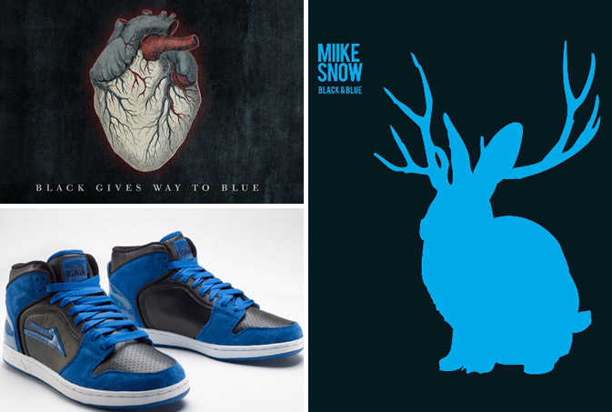
Color: Black and Blue Basecamp


black-blue

Growing up, the words “black and blue” generally applied to the bumps and bruises earned on the playground. This fall though, the phrase seems to transcend both aural and visual projects.  From the title of the new Alice In Chains album, to a track title on Miike Snow’s critically acclaimed album, it’s obvious to see how fashion, film and digital influences are continuing to make their cultural mark.

Art: Wave Interpretations


waves

Reinterpretations of the wave are the norm every summer season, so in honor of the weather, we’re highlighting four artists and their unique approach to the surf.  Caitlin Hinshelwood, a textile designer and illustrator from the UK, explores nautical themes ranging from anchors and Hokusai-like waves to sea urchins and starfish in her 2D gouache creations. Riding a massive wave of foam (and irony), our hairy meets hip favorite, Alexandra Cassaniti, introduces her summer catalog, Summer Bummer, with a colossal, hovering, tooth-like swell.  Moving into the literary corner, Tamara Shopsin, a frequent illustrator for The New York Times, communicates political content using a googly-eyed shark fin in her effort to convey the art of political distraction. Using a similar blue and white palette, Geoff McFetridge expresses surf etiquette with his marker drawing, Your Wave, My Wave.

Tracking Repetitive + Awesome.
On Instagram.