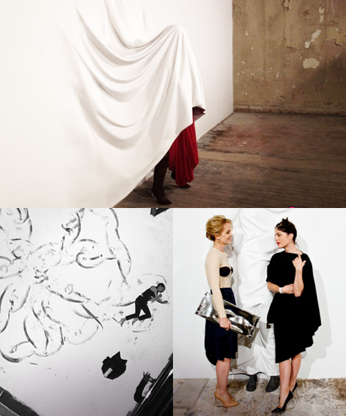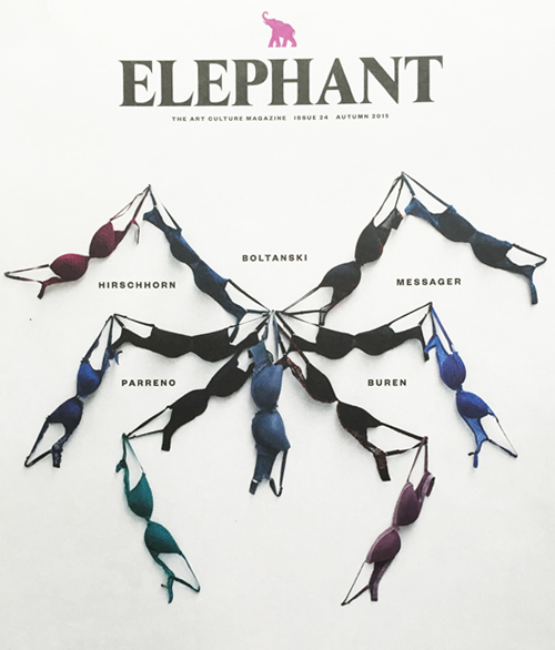
In a world where we’re constantly consuming content in various mediums, it’s hard not to draw comparisons on an image-by-imgae basis. As you scroll through instagram, it’s interesting to see similarities between posts, especially when there’s no geographical or thematic connection between the accounts.
These two printed pieces struck me in a similar way, as they share a familiar energy yet come from divergent design worlds. Elephant is an art and culture magazine that’s printed and produced in the UK. It has fantastic coverage of the art world. Just below, is the New York City Ballet‘s Fall advertising campaign. In describing both spreads, they feel lyrical, lanky and muted. Do you also see a common thread?