
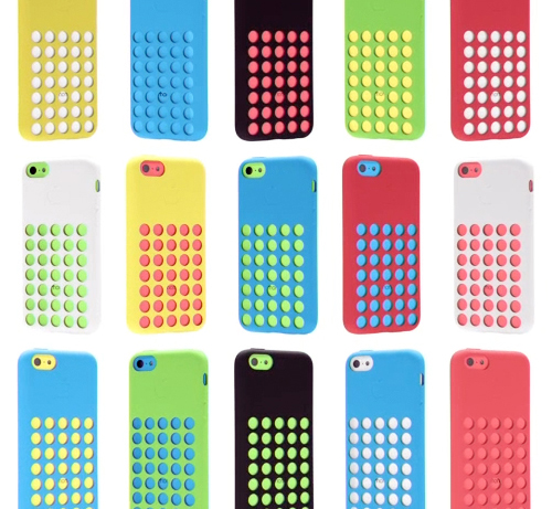
The anticipation’s over and even Apple’s in back-to-school mode with their latest iPhone C product launch. Combining matte and shiny surfaces, gridded netted covers, and a very bright color palette, these phones have a decidedly childish twist- taking a 180 diversion from the stark monochromatic days of the past.
The palette feels very American in a naive, almost unglamorous way. The playfulness of the colors are rather commercial and we suspect will have a good deal of influence over the coming years. When you’re a brand like Apple, you have serious sway. You set the mass market trends in the world of tech and product design.
I’m assuming the male market will veer towards the white C or any of the S phones, while the female buyers will be more varied (hello, coral), though it’ll be interesting to see how this palette plays out and inserts itself into our subconscious vernacular. If you’re planning to buy one, which color will win?

