Pattern Pulp

Shades of Pink Around the Globe


Pink Accents2

In America, the color pink is often associated with youth culture. If you’re trying to be younger, or more feminine, or even more girly, you go for pink- it’s the defacto color of the female gender. Move across the Atlantic though, and you’ll find that pink serves as a cool, edgy accent. Vivid, florescent tips, paired with white or cream send an entirely different message- one that the French and the Swedes have embraced for a long time. Then, we have Karen Mainenti’s humorous painting that captures the conflict and dichotomy of color and the sexes. Here’s a quick round up of some favorite applications:

1. Hanro’s handmade dip-dyed paper torn window display in the Meat Packing District in Manhattan 2. A DIY maxi skirt on a pair & a spare 3. Very cool coasters from the Caribbean restaurant Glady’s in Crown Heights, Brooklyn 4. Youth retail display at ABC Carpet in Manhattan 5. A spectacular painting I took a photo of at my airbnb in Stockholm earlier this Spring 6. Revlon No.450 Gentlemen Prefer Pink by Karen Mainenti


Red on Red Retailing


Red is the comeback kid this Fall. I’m not sure if you recall seasons past, but it went on a bit of a hiatus, standing behind shades of magenta and plum. It’s interesting in a way, as I vividly remember the conversations we all had at the Color Association round table a while ago, as we discussed the strength and emergence in Chinese and Russian territories and the direct influence it would have on European and American palettes.

The Prada coat is photographed by Jacob Sutton for Bergdorf Goodman’s latest Fall catalog and the chairs were captured by my iphone at ABC Carpet this past weekend. The monochromatic foreground and background combo is rather striking, wouldn’t you say?


Trend: Linear Mosaics


linear-mosaics

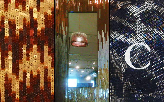
Sequins are back.  Regardless of how much you love or hate these tiny embellishments, designers continue to incorporate them everywhere they can, in an effort to grab consumer attention.  This month, we’ve been noticing a linear trend throughout top tier merchandise within the home and fashion sectors.  Kim Seybert‘s sequined place mats are representative of an elegant approach that merges warm tones with gradation.  Adding a sharper edge, these Ercole mosaic mirrors from ABC Home prove fall colors are making their way back onto the showroom floors.  In an exploration of colder tones, Gucci’s fall collection plays homage to the disco ball, mimicking wild animal prints through the use of iridescent jewel tones.

Artist Profile: Cut-Out Couture with Dale Kaplan


dale-kaplan-pillows

Achieving Queen-Bee status of cut-out couture isn’t an easy feat, but for Dale Kaplan, a Brooklyn-based textile designer, it’s  a walk in the park, or shall we say playground.  Patch-working minimalist words with vintage fabrics, Kaplan has made a name for herself, adorning kids’ playrooms with whimsical pillows, clothing and window panels.  Inspired by nature, Kaplan often alludes to the notion of time, using spring and autumn to communicate her message.  Her creations can be found at ABC Home and Carpet, Garnet Hill, Wonk‘s Dumbo hub and other high-end children’s boutiques.

dale-kaplan3

Tracking Repetitive + Awesome.
On Instagram.