Pattern Pulp

Trend: Expressive Body Script


expressive - illustration - patternpulp

There’s been a lot of talk about graffiti finding it’s way into high fashion. Miuccia Prada ushered in the conversation last summer with her About Face runway presentation. The latest examples have similarities in their raw essence, but take a bold, expressive typographic turn. We have Evisu, Die Antwood, Comme des Garcons and Dior Homme all using the body or page as a canvas for expressive thought.

shantell-martin-artist-may-issue-interview

All of these pieces feel connected in some way to the style and vibe of Shantell Martin’s illustrations. Her stream-of-contiousness drawings have been an influential style for a while now, and a stark contrast to the crisp colorful characters and collage work from Fall.


Trend: Fractured Perspectives


fractured_Perspectives2a

Recently, I’ve been seeing a lot of fractals. Broken imagery, split into unpredictable shards  – presenting the world in varied multiples. The idea reminds me of a kaleidoscope gone awry – where perfect geometry is gone, but varied angles still exist. Amusingly, this seems like a metaphor for life online, but that’s a post for another day…

One of my favorite examples comes from the instagram account of Thalea MV. Her clothing and prop styling has a refreshing spin that combines a carefree and specific point of view. Balenciaga also follows a similar path. Their latest ad reveals the reflection of a model, owning and destroying the photographer’s image, by way of a mirror. It’s very much an art, power and action shot.

In a complimentary realm, lines and layering do the trick in W Magazine. This typographic spread compliments the Bewitched editorial theme shot by Mert Alas and Marchus Piggott. And balancing out the chaos, this image from Antonio Guzzardo- depicting a white gridded face covering shouts futurism and the apocalypse- two drivers to parallel the unpredictable future of broken glass.


Typographic Textures for Summer


92y_miltonglaser

If you live in New York, I dare you not to attend the 92Y Talks. At the start of 2013, I decided to mix things up and go to as many presentations as possible…as the direct access to knowledge is pretty unreal. Since January, I’ve heard Madeleine Albright, Nick Kristof, Al Gore, Allen Grubman, Charlie Rose, Richard Engel and Paul Grubman speak ever so candidly about current events and their life’s work.

Unsurprisingly, the catalog that houses the upcoming summer calendar is just as expressive as the roster. My gut says Milton Glaser did the art, but please correct me if I’m wrong. The type, color and movement are perfectly suited for the upcoming season. If you’re free this evening, there’s a fantastic talk entitled, Secrets of Start Up Queens, featuring Dylan Lauren, Iman, Coco Rocha and Piera Gelardi with Cindi Leive as the moderator. Click here for more info.


Texturizing Your Wedding Invites


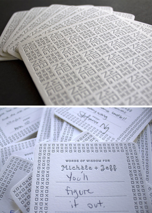
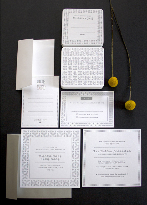
1wang_wong_wedding_invitations2wang_wong_wedding_invitations

Welcome to the Wang and Wong wedding invite. Designed by Michèle Wong Kung Fong, a UX/UI designer living in Irving, Texas. Merging Eastern Chinese characters with Western decorative styles, Fong’s original pattern works seamlessly on all of the creative elements, beautifully illustrating the alternate A and O. Now that wedding season is upon us, we’re excited about all of the untraditional invites and typographic patterns. Feel free to share your favorites…


Color: Typographic Illustrations


2aDan_blackman

I dare you not to pin these posters. Daniel Blackman‘s the talent behind the playful collection, merging type, pattern and a prominent palette. Each design represents a bike sold at Rivendell Bicycle Works and shares a theme relevant to the product. The results are a perfect balance of harmonious chaos.


Tracking Repetitive + Awesome.
On Instagram.