
Pattern Pulp

Trend: Allover Graphic Chaos


Peter-Pilotto-Target

Mary Katrantzou_gianvito rossi

loefflerrandall2

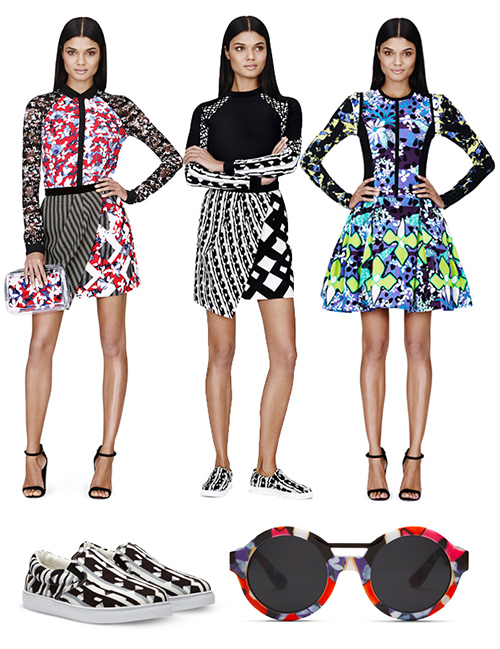
There are four brands in this mix- though it looks like one cohesive story. That folks, is a trend. At the top, we have Petter Pilotto’s fabulous new collection for Target. The prints seem a bit experimental for the Target customer, though, bright always sells, so it should be interesting to see who buys (beyond the city types).

Then we have the most eccentric footwear collaboration by Mary Katrantzou and Gianvito Rossi. Simply amazing- the print collages are loud, and the styles remind me of J.Lo, but in a fresh way. Then, in a quieter, more pared down corner, there are these sophisticated beauties by Loeffler Randall. Crisp flats or boots for monochromatic fans. I might actually buy these, I like them so much.


Trend: Circular Styles


Circular Styles3circular spaces2

Circular motifs never get old. When history, science and creativity are hinged upon these forces, you realize why cyclical flow is a part of our daily vernacular. Much of the branding and styling I’m attracted to incorporates this concept, and you realize, over time, that it’s actually easy to reinvision a brand, packaging or any design for that matter, if the underlying direction has a timelessness to it.

From the mechanical curves of the Sonos logo to Dan Funderburgh’s recent illustration collaboration in the Manual for Speed, to ABC Carpet’s spiritual and nature-inspired retail merchandising to the graphic styling techniques in this Dazed and Confused spread, all overlap in relatable, defined ways.


Trend: Gesture & Direction


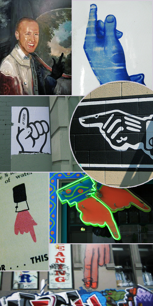
hands and gesture

Some symbols are universally recognized around the globe: A smile, chocking hands, the red of a stop sign, a heart symbolizing love…

Today’s feature, highlights the silhouette of a hand pointing you along your way. Whenever I’m on the road, I photograph fingers and the gestures they’re making. Be it graffiti, a menu, a sign for the bathroom, or just a fun mood signifier, the simplest line makes all the difference in communicating a mood. Here’s a roundup of some shots online (sources sadly unknown) to illustrate subtle and extreme messaging through gesture. Any of these speak to you?


Paper Mache Trends in Paris


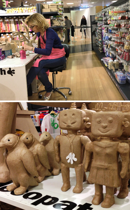
1papermache_paris 2papermache_paris

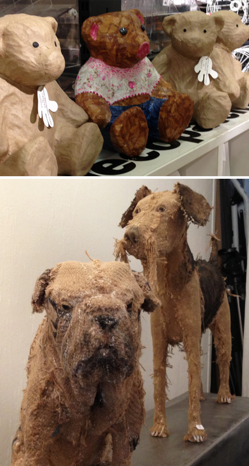
3papermache_paris

I’ve been sitting on this for a while for no good reason, and today’s the day I finally get it out the door. The last few hours I was in Paris over the summer, I remember having to go to the bathroom. I was running around Le Marais like a mad woman, looking for a bar to pop into, when I realized there was a department store across the street. I dashed inside, ran to the eighth floor, then realized, with 15 minutes to spare before heading to the train station, I was upon a paper mache mecca.

Just like we have our Legos, our rubber band jewelry and embroidery sets in America, an entire tenth of this floor was devoted to children’s paper mache. There were robot, bear and penguin bases alongside decorative papers, paints, buttons and markers. Interestingly, it reminded me of a show I had seen earlier that weekend at a gallery lining the Place des Vosges by Hausey Leplat.

Leplat’s a sculpture artist who creates life size animals covered in burlap. They’re incredibly intricate, rough and emotive. It’s an interesting thing – this parallel of the art domain alongside the DIY craft world. It may seem coincidental, but after comparing palettes, themes and construction, the trend has legs, and hopefully, will be making it’s way overseas.


Steven Shell's Geometric Dresser


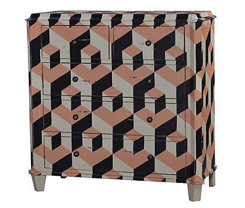
Steven Shell_dresser

It’s rare to see highly decorative furniture in America. We usually keep it plain, simple and modular. Be it Pottery Barn, Design Within Reach, Bo Concept, CB2, IKEA or even Blue Dot, hard surfaces rarely incorporate print and pattern, let alone bold texture. Last night, I came across this Steven Shell dresser on One Kings Lane. I wish I needed it, as I certainly want it. Reminds us of yesterday’s footstool and Moonish’s wall decor. Amazing, right?


Opposing Worlds in Social Media


1seanfromtexas 2Erica Domesek

These two are really the antithesis of each other- it’s almost comical to compare the stratospheres. Sean Williams, an exceptionally talented tattoo artist living in LA, recently posted his latest work to instagram. Take a deep dive into his reel, and while it’s rather dark, you’ll find beautiful illustrations and inticate body art.

Fast forward four minutes, and I’m looking at Facebook, then Refinery29’s piece on Erica Domesek of P.S I Made This. For those who are unaware, Erica is one of the internet queens of DIY replica fashion. My brain had a fission, but when you’re visual, you can’t deny the obvious comparison, and with social media, you also can’t control or avoid the stream coming at you. Alas, I’m sharing these military tassel themes.

Any odd but poignant compare/contrasts in your reels? Would love to see…


Tracking Repetitive + Awesome.
On Instagram.