Pattern Pulp

Artist Profile: Jo Meesters


jomeesters-furniture-copy

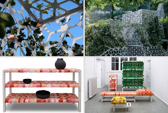
Over the past few months, Pattern Pulp has noticed more and more artists taking the sustainable highroad.  If you’re a creative person, the spark’s not going anywhere but recent material and budget restraints have forced designers to reinterpret their concepts and retool their executions.  Jo Meesters, a Dutch product designer with an eye for sophistication, is a master at breathing life into used materials. Green Oasis is an initiative that was brought about in an effort to incorporate greenery into public urban spaces.  Reworking 34 discarded wooden beams and 16 leftover blankets, another Meesters project entitled, Odds and Ends, is based on the idea of woven rejuvenation.  If these prototypes ever go mass, they’d be a seamless fit in Anthropologie’s home goods department.

jomeesters-table-ceramics2

Combining fabrication with jet cutting technology, Meesters’s approach to the traditional tabletop is quite stunning in his collaboration with Marije van der Park entitled, Reshaping Wood. Showcasing contemporary symbols such as airplanes, windmills and the infamous McDonalds gold arches, Ornamental Inheritance is a menagerie of current industrialism.

Trend: Graceful Graffiti


shu-umera

Every artist loves a happy accident. For those who are unfamiliar with this term, a happy accident is an unexpected and unintended creative mistake that ends up being more brilliant than your day’s work. For those in search of a tool that offers a degree of uncertainty and requires little to no prep, spray paint is the way to go.  Many designers have taken note, as this technique has gained momentum in creative studios throughout the globe. Curiosity, the Japanese brainchild of Gwenael Nicolas and Reiko Miyamoto, was established in 1998 and caters primarily to the design needs of luxury clients. Combining saturated pigments with Shu Uemura‘s eau de toilette collection, Curiosity’s bottle art emulates the textural results of a prolonged spray. 

abccarpet-stolivodka

ABC Carpet gets a lot of airtime on Pattern Pulp.  Their retail installments set an industry standard and usually showcase an organic interpretation of modern materials. Their latest window display accentuates plant growth with the use of neon paint and an imperfect stencil. Adding russian flair and gold pigment, Stoli’s recent marketing campaign revives it’s expressionist roots, stenciling illegible phrases alongside chic photography.

bumble

Tapping academic and artistic references, John Powell’s 1990 MIT exhibit, Partial Lines, uses holographic installations to convey depth and plane.  Utilizing a similar technique for their hair powder packaging, the creative ingenues at Bumble and Bumble encase their alternative shampoos in subtle spray dust.  Tying this collection together, silhouette graffiti, such as this colorless image, is a careful execution of expressive markings paired with restrictive boundaries.

Street Finds: Opposites Attract?


babeland-aidsposter

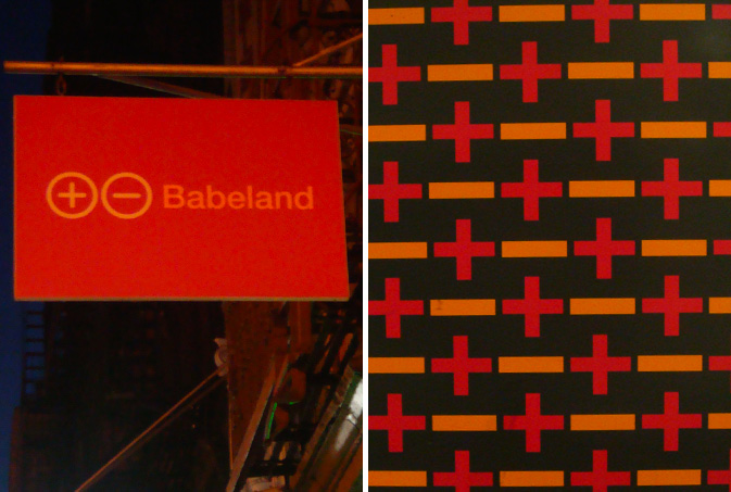
After taking a quick glance at the above imagery, one would assume these designs came from the same origin.  Not the case.  On the contrary, the symbols used in the downtown sex shop logo, Babeland, are the same markings used to promote AIDS awareness at the 14th St. subway station.  Positive and negative signs have always implied a balance of contrasts, and while it makes sense that both categories would seek inspiration on the same avenue, the final message is somewhat lost.  Then again, perhaps there’s brilliance in the fact that these signs are interchangeable. 

mcdonalds-anniesorganic

Highlighting another world of opposites, fast food giant, McDonalds has recently released the campaign, Give it Love, using a mcnugget and fry combo to connote a kiss and a hug.  In a breakfast aisle on an alternate universe, Annie’s organic bunny love cereal can be found on the shelves at Whole Foods Markets.  Again, we see opposing brands attracted to the same symbols, perhaps these patterns prove reality is the circumference of opposing forces.

Fashion: Text Heavy Threads


venacava-salvorprojects

Is a picture still worth a thousand words if it’s a literal reproduction of organized type? While perusing the spring collections at Barneys and Blue and Cream last week, Vena Cava‘s heiroglyphics dress made a few notable uptown and downtown appearances.  For well established brands, this feat is a walk in the park, though it’s notable to highlight the versatility of this young American label, particularly when company buyers have clamped down on their retail collections.  Applying similar typographic methods, Ross Menuez, the founder of Salvor Projects, incorporates digitized text to create a vertical ticker of information.  This gray on gray stream of characters is a subtle reminder of the communication chaos that’s circling us on a 24 hour basis.

[youtube=http://www.youtube.com/watch?v=Pkyw4JTh19U]

This vintage m ss ngp eces video highlights Menuez’s creative process, an interesting watch with timeless appeal- one of many captivating shorts produced by Cool Hunting.

Packaging: Eau De Patterns


sula-wvillagewall

We’re all guilty of the duty-free pit stop. It’s nearly impossible to resist spritzing yourself before boarding an international flight, particularly when you’ve got twenty minutes to kill.  Today Pattern Pulp is exploring perfumes that are slightly under the radar.  Scents that take a bit of exploring to find, yet are true favorites among their fan base.  Each of these brands has taken a similar stab at adorning their packaging with intricate florals, a common theme throughout the beauty industry. Sula, a side project of Susanne Lang, a Canadian parfumerie, is an affordable scent that intertwines theme-specific patterns with asymmetrical negative space. In an attempt to trace organic steps to this endpoint, real life inspiration can be found on this Jane Street apartment building as branches span the cement in upward growth.

harris-tocca-tsila

Miller Harris’s signature floral etchings are equal parts raw and luxurious.  Following suit, Tocca, known for their understated elegance, has feminized tattoo illustrations for their latest line of fragrances.  Tsi-la Organics, a new player to the team, combines delicate florals with darker tones, enclosing their bottles in a signature black lotus box covered with spot varnish monochromatic detailing.

fresh2

Fresh has been producing beautifully intricate packaging for as long as I can remember.  Incorporating delicate details such as wire, metallic thread and jade colored pebbles, the outer mementos are are as appealing (if not more) than the actual product- a successful marketing move when alluring first time buyers and gift recipients.

Fashion: Armed with Asymmetry


assymetry1

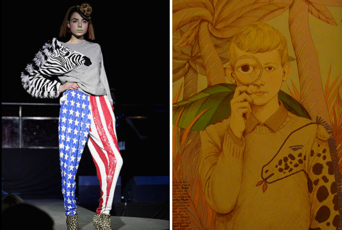
Back in the day when garments were handmade, nearly everything was asymmetrical. Sleeves were slightly off and patchwork signified frugal living.  With the evolution of mass market technology and overseas production, asymmetry has taken a back seat, proving that sameness sells, particularly when the tween market is buying.  As it often goes when trends become the norm, designers resurface classically ancient styles, merging them with bizarre twists. Ashish, an up and coming star in the UK, showcased a collection of fiercely vibrant designs during London Fashion week, merging ostentatious safari trends with asymmetrical sleeve details.  Following suit, brilliant fashion illustrations can be found in the February edition of Citizen K Magazine, highlighting a Little Marc giraffe sweater.

commesdegarcon-luella

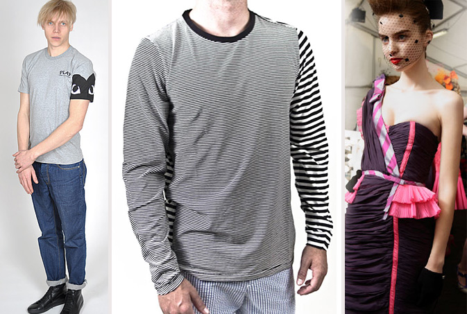
The commercialization of arm detailing is an interesting oxymoron, particularly when it bears rebellious roots.  Comme des Garçons, a continual front runner in fashion trends has toned down it’s usual flair with this dip-dyed shirt from their PLAY line.  Kazuo presents an extremely tame version of textile patchwork, though it should be noted that when I googled the company name, a mesmerizing film popped up, documenting the escape of a factory fabric roll. Adding a feminine twist to this trend, Luella’s one-shoulder cocktail dress incorporates varied textures to convey confident elegance.

Tracking Repetitive + Awesome.
On Instagram.