Pattern Pulp

Fashion: Marketing the Disco Ball


mirrorball

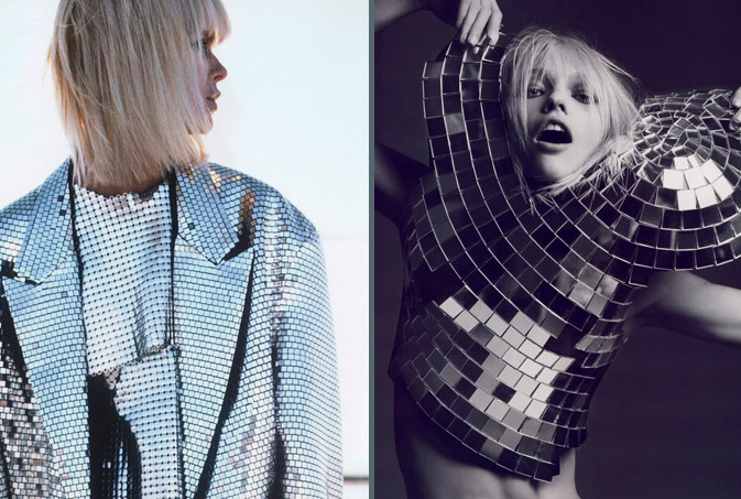
It’s always interesting to see fashion, print and marketing intersect unintentionally.  Having worked within the fashion and marketing worlds, we’re well aware of the power nightlife can have on a brand.  Mega bucks are spent on a daily basis to keep party goers dancing, drinking and living the lifestyle that their clothing, music and liquor choices convey.  With companies such as Mirrorball and The Happy Corp hitting their creative marks so precisely, it’s no wonder that nightlife’s most iconic symbol, the disco ball, has spurned it’s own fashion trend.

Garments bedecked in mesh metal mirrors are lighting up the night as well as glistening in the sunshine of day.  The jacket and the mirrorball blouse, as seen above, are Martin Margiela creations for his label, Maison Martin Margiela.  The eighties style jacket appeared in this past month’s US Elle, while Hedi Slimane‘s fiercely styled spread was a highlight French Vogue’s April issue.

Additional contributions by Emily Gup.

Fashion: Zip and Repeat


zippers2

Zippers, the commonplace closure, have been striped of their hidden functionality and thrust into the spotlight, proving they can double as innovative solutions as well as decorative patterns.  The results are striking, and slightly quirky.  Part of the zipper’s appeal, perhaps, when compared to its closure counterparts such as buttons, hooks, and snaps, is the fluidity of movement.  This is evident in Ji Woong’s Zip Up Tangles, a creative solution to the wiry mess we all experience when reaching for our ear buds.  Stepping it up a few notches, Van Cleef & Arpels has recently dove into it’s archival library to revive it’s 1950’s Zip Necklace.  While today’s version may be toned down, it’s no less elegant, and a primary example of how innovation can have timeless appeal.

zippers

In a French design studio not far from Van Cleep & Arpels’ headquarters, Julien Rivoire, an Art Director and Graphic Designer, has applied his own zipper technique to Sixpack’s infamous t-shirt collection. Revealing striped down beauty in the most simplistic of logos, the Z and the P are solidified by the I in this seamless application of the object’s functionality.  Continuing with the theme of black and white, this patterned skirt playfully mimics the sex appeal zippers posess when applied to women’s clothing.

Zoe Cotlenko, a French jewelry designer and zipper connoisseur, is the mastermind behind this line of candy-colored necklaces and bracelets.  Using his illustration skills, Eric Elm’s zipper and button bag made its debut at Colette a year ago this month.  Elm’s work has been equally influential in New York, as proven by this remarkable 3D installation at the Nike 255 space in NYC for the Make Something Project, which was held in collaboration with Aaron Rose & Beautiful Losers Show.

Additional Contributions by Emily Gup.

Trend: Natural Formations


clinique-nantaka-plantation

Nearly everyone can remember their first trip to the Science Museum.  Between interactive displays and ecological wonders, it’s easy to understand why these educational centers have always drawn endless crowds.  Interestingly, many of the natural formations that have educated the masses are now being tapped for inspiration.  Rock patterns, as noted in late February, are continuing to subtly nudge their way into the the commercial marketplace, both figuratively and literally, adorning home accessory lines and commercial advertisements.  This Nature Exploration Agate greeting card, designed by Joy Deangdeelert Cho is one of many nature inspired prints on her website, Nantaka Joy.  In an effort to imply timeless beauty, Clinique ‘s latest product push embraces the tortoise, nature’s slow and steady (not to mention, reliable) winner.  Taking this theme to the most literal level, this rock-covered pillow from Plantation, in San Francisco, glamorizes the everyday pebble.

Trend: Pixel Mashing


burton-bloomingdales

Photography and graphic design have become so interconnected in today’s marketplace that one medium rarely exists without the other.  Websites like ffffound and qbn showcase the best and the brightest, overshadowing what many print monthlies used to accomplish.  By offering a 24/7 stream of creative inspiration, designers and critics alike have been able to familiarize themselves with what’s current.  This photo, taken by Bueller Designs in LA, displays a cluster of translucent dots that are a result water and light.  By merely adding saturation and a grid, brands like Burton and Bloomingdales prove that the transition from natural beauty to commercial glam can be a quick (and profitable) one.

Print: Environmental Prisms


prism-pop

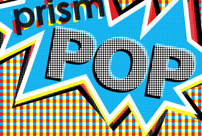
Just as chefs have an intimate relationship with their food, graphic designers are often tied to their pixels.  Much of the time these creative atoms are invisible at final execution, however lately, as our collective romance with the digital world has grown, so has the size of these geometric marks.  Lisa Toff, the blogger behind MyConey, exemplifies this design style with her recently founded card company, prismPOP.  Using bright vectors and soy inks to communicate her illustrations, Toff proves that you can be environmentally conscious while making a bold creative statement.

Toff will be showcasing her latest collection in Brooklyn this Sunday at the Handmade Cavalcade in addition to the Renegade Craft Fair in early June.  For 20% off your next order (on etsy or in person), sign up for the mailing list and reference Pattern Pulp  – you’ll receive a coupon via e-mail.

Trend: Pale Motifs


pale-motifs

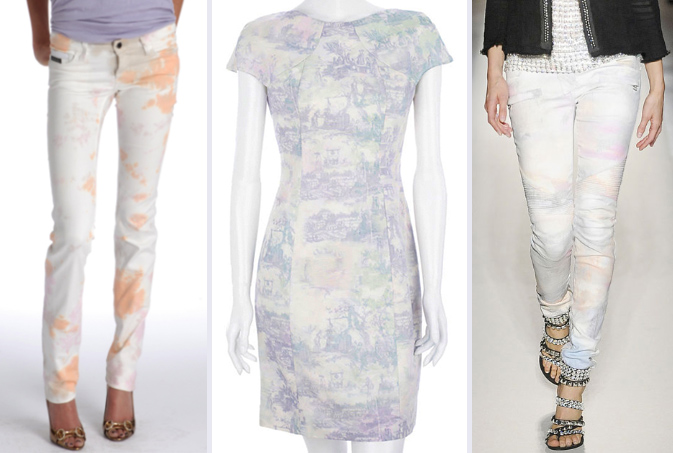
It appears that many designers are embracing bleach this coming season.  From the elitist corners of couture to the wider ranges of mass market, styles are purposefully paler, if not washed out, this spring. Paring pastel tie dye with white denim, Members Only has tapped eighties color palettes to create abstract graffiti slacks.  Moving in a more feminine direction, Erdem’s Lucina Tailored Dress is a modern remake of traditional French toile fabric.  Balmain, a rising favorite among fashion circles, merges these two concepts to create a hybrid of luxury denim.

faded-signage

When discussing how faded motifs are woven throughout our everyday lives, it’s interesting to note the natural wear and tear that occurs in metropolitan environments.  Be it an old wall in Paris, a faded stop sign in Ohio or the remnants of a house in Melbourne, all of these “eye sores” contain beautiful details that progressive observers tap for inspiration.  Peggy Noonan of the Wall Street Journal boldly predicts that we’ll be seeing rougher streets as city budgets dwindle in her article entitled, Goodbye Bland Affluence.  So we ask, are designers subconsciously glamorizing the decline of urban city living?

Tracking Repetitive + Awesome.
On Instagram.