Pattern Pulp

Trend: Designing Frequencies


audiowaves-pattern

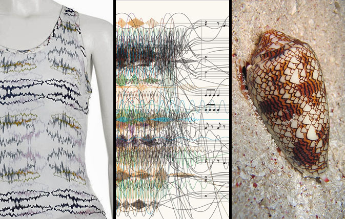
We seem to be taking our patterns back to the basics lately; finding new and interesting facets to things we see in everyday life — focusing on form rather than utility. Recently, we’ve been noticing an increase in the use of sound waves as a design element. With instant access to fresh new tunes served daily from music influencer sites such as RCRD LBL or Pitchfork, the general population has been able to “see” their music that was once invisible. Illustrating this concept in the most tactile of ways, Lorick’s SS ’09 collection romanticizes the audio file, while this New York Time’s info graphic proves that chaos and structure can be balanced with the simple use of argyle. This cone shell forces us to acknowledge nature’s ongoing influence, making us ask- what came first the ocean wave or the sound wave?

Additional contributions by: Emily Gup

Follow-up: Zip and Repeat


followup-zipandrepeat1

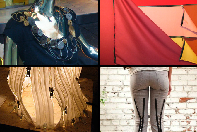
The zipper trend we reported on last month is revealing itself across the globe in fashion, fine art and furniture alike. From Catherine Malandrino’s zip applique collar to this brilliant malleable lamp featured at the Stockholm Design Fair, clever applications are finding their way into the design side of the creation process. In the southern hemisphere, Brazilian conceptual artist, Nielson Leirner covers large canvases with warm colored fabrics, which are delicately draped open with zippers. This example of the mundane is quickly forgotten though when designers add a punk point of view. Rag and Bone’s latest bondage experiment, as noted by New York Magazine, is the “skinny jean for fat days.”

BA coverage by: Rebecca Silver

Trend: Identity Crisis for an Online World


scattered-features2

The scattering of physical features is similar to how digital identities resemble a kaleidoscope – lots of colorful parts pieced together to create different patterns. We are constantly juggling multiple on-line identities which when built together illustrate who “we are.” It’s not hard to take a trip down the digital rabbit hole and become lost in a sort of Wonderland, a marvelous “imaginary” place where we experience a bit of an identity crisis. Imagery reminiscent of this theme has been popping up throughout the fashion world, be it in this Agent Provocateur military spread, this Dazed and Confused Beth Ditto cover, or as Diane Von Furstenburg’s signature lip toss. It’s like Alice in Wonderland where Alice grows too big and then too small and in a conflicted state exclaims, “I know who I was when I got up this morning, but I think I must have been changed several times since then,” as she struggles to answer the question, “Who in the world am I?”

scattered-features1

There are so many digital outlets for expression – video, photo, social networks, blogs, microblogs, mobile apps – that it becomes impossibly difficult to manage where our digital identities within these fields stand alone and where they merge and create hybrid channel identities. We ask ourselves, should I only tweet stories relevant to my work or career? Should my Facebook be just for friends or coworkers as well? I have three different blogs, so how do I distribute appropriate content and still manage to be “me?” At what point do I overwhelm my networks with repetition and duplication of thoughts?

One must ask where these identities overlap and weave together to write the story of who we are. And we’re not the only ones confused. Magazines are asking the same questions. Trying to find their place amidst a world that’s already started without them, they try to add digital value to their identities in an effort to temp users to pay for content. A few visual parallels of this are apparent in Bjork’s recent Interview cover, this Beautiful Decay photo collage by Bryan Schnelle, Katya Ford’s inspirational photography and this New York Times illustration by Fred Tomaselli.

scattered-features3

This investigation brings to light the question of how this splicing translates into our own expressive habits. Thinking about how our personal fashion and style is affected by our many influences, how do these digital personas add up into one fashion statement, one outfit? Or, does one just wake up and wonder, who am I today and which influence do I want to bring into the physical world? This Barbara Kruger piece entitled, You’re Not Yourself, illustrates this concept quite clearly, as does this Valium advertisement, where discomfort and instability are acknowledged in the decision making process.

As bilinguals, we look to the familiar, the iconic and seemingly unchangeable to make sense of the new and foreign. Acculturating into digital, we must examine physical pieces of ourselves in order to understand how to adapt in our ever-evolving world.

Compiled by: Kelsey-Lee LeGassick

BA Street Finds: Saving in Style


swines and savings

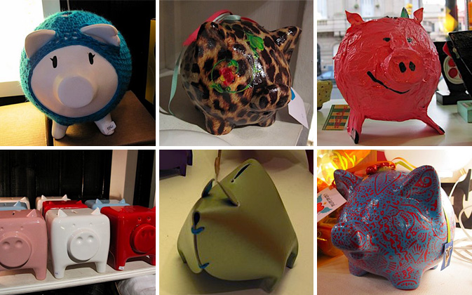
Saving money is certainly in style this season, and now so are piggy banks. Since everyone is pinching pennies, Argentine designers have transformed the kiddie version of a 401k into a design object for the style and money conscious. The colorful swine are dominating Buenos Aires’ boutiques, including Tienda Palacio, Puntos en el Espacio and Materia Urbana. Local kitsch brand Casicursi created two of our favorite piggys – one covered in leopard print, another in red and blue paisley. These two patterns have been dominating international trends, but look fresh when used in this unexpected way. Malba (Museo de Arte Latinoamericano de Buenos Aires), the premier modern art museum in Argentina, features colorful leather piggys in the must-see museum shop. The leather material of these banks celebrates the culture’s most popular export in a fun new way.

How else can you save in style?

By: Rebecca Silver

Trend: Doll Chronicals


Doll Chronicals

The idea of porcelain perfection has become fodder for the fashion and art worlds as of late. Be it society’s collective obsession with faultlessness or the idealization of homogeneity, wooden molds have been fused with human characteristics in the oddest of ways. Fashion’s stab at this concept has been illustrated quite literally in Citizen K‘s fall fashion spread, where a nude stiletto mimics the shape of a human foot. Playing homage to the notion of uniformity, this New York City restaurant setting, shot by our scout, Kelsey-Lee LeGassick, is reminiscent of the window displays we saw last Fall throughout many European store fronts. Departing from the idea of sameness, Bergdorf Goodman tackles this concept with a creative twist, surrounding their oversized wooden manikin with colorful outfits on either side.

Moving into the juvenile realm, it’s quite apparent that the relationship children have with their dolls is an interesting subject for many artists.  While the photographer for this Jblyth photo is unknown, the creative team behind the Italian design studio, Winkler + Noah make a clear case in their photography exhibition, The Puppet Show.  The mantra is clear and to the point, “The best present we can give to children is to let them be children.”

Additional Contributions by: Nicoletta Granati


Follow-up: Butterfly Beauties


followup-butterfly-beauties

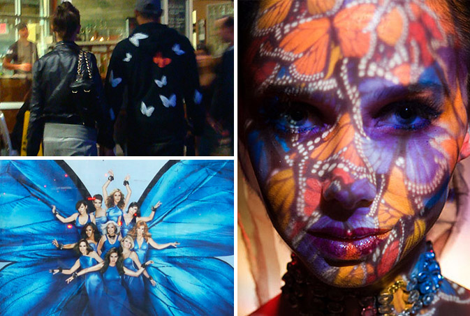
Butterflies have a way of stopping time.  Be it their delicate flutter or over-sensualized aura, nearly everyone stops to notice this insect’s vibrant wings during the summer months. As we noted back in early June, Butterflies signify many things, and their attachment to human personalities appears to be impacting fashion, print and photography as of late.  This quick snap shot was taken in Chelsea Market of a European couple.  The man is wearing a butterfly-clad sweatshirt.  The collection of women in the TV poster, She’s Got the Look, feminizes this insect to the greatest degree, while this portrait from Justin Blyth’s inspiration blog adds a new dimension to Heidi Klum’s LG advertising concept.

Tracking Repetitive + Awesome.
On Instagram.