Pattern Pulp

Trend: Expressive Body Script


expressive - illustration - patternpulp

There’s been a lot of talk about graffiti finding it’s way into high fashion. Miuccia Prada ushered in the conversation last summer with her About Face runway presentation. The latest examples have similarities in their raw essence, but take a bold, expressive typographic turn. We have Evisu, Die Antwood, Comme des Garcons and Dior Homme all using the body or page as a canvas for expressive thought.

shantell-martin-artist-may-issue-interview

All of these pieces feel connected in some way to the style and vibe of Shantell Martin’s illustrations. Her stream-of-contiousness drawings have been an influential style for a while now, and a stark contrast to the crisp colorful characters and collage work from Fall.


Trend: Grids & Motifs


Grids and Motifscanalstreet_subway_Lesley Morphy2vivienne westwood

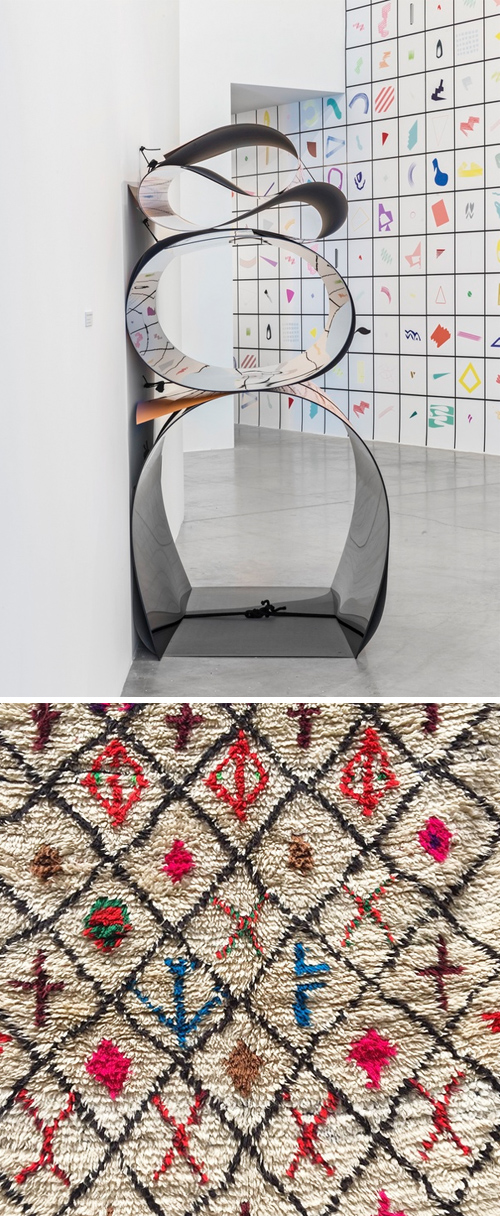
Grids, motifs and colorways have been finding their way into my social feed as of late. While the theme’s not necessarily a new concept, the minimalist and spatial approach feels quite current. A few favorites weave color, illustration and narrative into an organized grid.

Julia Dault’s Toronto exhibition, Color Me Badd showcases color and form in a highly graphic and flat way. The colors are bright and the shapes are abstract. Next up, is a snapshot I took while in Marrakesh of a Berber rug. While it’s old, it feels on trend for what interior stores are stocking these days.

Then there’s a snapshot by Lesley Morphy from the Canal Street station. I’m forever in a rush when I go left at this visual fork in the road, as it’s the subway stop closest to my office – but always wonder about the story behind the icons – does anyone know?

And the glue that holds this all together, is Vivienne Westwood’s latest commercial print ad. The sticker laden stall compliments the art world, just as it mimics real life.


Trend: Fractured Perspectives


fractured_Perspectives2a

Recently, I’ve been seeing a lot of fractals. Broken imagery, split into unpredictable shards  – presenting the world in varied multiples. The idea reminds me of a kaleidoscope gone awry – where perfect geometry is gone, but varied angles still exist. Amusingly, this seems like a metaphor for life online, but that’s a post for another day…

One of my favorite examples comes from the instagram account of Thalea MV. Her clothing and prop styling has a refreshing spin that combines a carefree and specific point of view. Balenciaga also follows a similar path. Their latest ad reveals the reflection of a model, owning and destroying the photographer’s image, by way of a mirror. It’s very much an art, power and action shot.

In a complimentary realm, lines and layering do the trick in W Magazine. This typographic spread compliments the Bewitched editorial theme shot by Mert Alas and Marchus Piggott. And balancing out the chaos, this image from Antonio Guzzardo- depicting a white gridded face covering shouts futurism and the apocalypse- two drivers to parallel the unpredictable future of broken glass.


Luke Archer's Natural Markings


Luke Archer Patterns

In the world of composition, inspiration and random pen marks, Luke Archer excels at all. His style incorporates natural stone surfaces, silhouettes, tools and machines to create uniquely patterned prints. Subtle and texture-filled, Archer’s style is reminiscent of a moving wave in the fashion world – one that cues the 80’s and early 90’s. It merges old school marbling techniques with clean-edged geometry – and brands like Acne, Aritzia and American Apparel have all been a part of resurrecting this style. To deep dive into Archer’s portfolio, click here. To see some other interesting interpretations, check out Jen AltmanSanttu Mustonen and Lisa Toff.


Colors and Artistic Commercialism


1Marni_Mondrian_Patternpulp

Art, is literally in this Spring. I started noticing all of the bright, retro accessories at the Hong Kong Airport last month. The common thread throughout links abstraction and art to fashion and commerce.

abstract-mondrian-style

Here, we have Marni and their Spring Summer ’15 bags. I subscribe to their blog, and upon opening their newsletter this morning, I came across this Mondrian inspired marketing mashup. The 2D meets 3D blend is a creative stab at a classic work, one which mixes color-blocked geometry with product overlays.

celine_bag

Then there’s Celine. Their infamous trapeze bag carries a multi-colored stripe, signifying a season and an art era. There’s a simple elegance to this accessory that feels independent from it’s leather, color-blocked counterparts.

hot-beat-1964-genedavis

If you’re connecting the dots to Gene Davis and his famous color exploratories, I am as well. Davis, an American painter, has continually influenced the art and commerce worlds with his large scale post-painterly abstractions and color stripes.

valentino

Moving into a playful category that feels more Katy Perry than Joan Didion, Valentino has applied rainbow chevron stripes to it’s Spring ’15 accessories. The move is bold, if not juvenile, in a lavish, cartoonish kind-of-way.

genedavis1

Bringing it back to the art, it wasn’t hard to connect this palette to another Davis painting. The vibrance is infectious, and the historical reference gives the collection weight. Curious, which one is your favorite?


Power Plays & Transparent Barriers


trasnparent_barriers2

I recently worked on four sets of FW 16/17 palettes for The Color Association for our biannual meeting. Whenever it’s time to convene, I spend a few weeks fixated on key visuals from the fashion, art, news and technology worlds and try to wrap my head around general cultural themes that have evolutional staying power.

I collect imagery and toy with ideas tied to politics, pop culture and generational shifts while attempting to trust my gut with what’s relevant and what feels tired. Sometimes it’s optimistic, other times it’s a bit grim. Mostly though, it’s a balancing act of positive and negative forces.

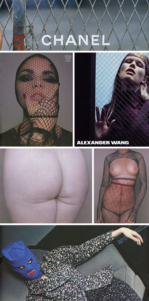
Here are a few magazine tears that caught my eye and fed some of my thinking in the last report. The palettes are for women’s fashion, so I always try to consider the commercial messaging I’m being fed. These fence and fishnet themes kept popping up in the pages of editorial shoots and fashion advertising. Looking at them, I see lust, capture, bondage, transparency, barriers, and female role playing.

Personally, this not-so-subtle messaging seems to both endorse and artistically react to the sexualization and confinement of women, a theme with unfortunate staying power in past and present realities.

This imagery contradicts the Lean In mentality society embraced in 2013.  Can you imagine Tavi Gevinson, Taylor Swift or Leandra Medine – all thought leaders and Gen Y role models modeling in fetishized meek poses? It seems to go against the grain of art by women for women – especially with a lack of underlying humor and irony (except for maybe the blue face mask).

There’s a fine line between art, fashion and propaganda, and while these magazine pages have abstract beauty to them, they also convey stark messaging. It’s simply hard to detach them from today’s political matters – specifically in regard to gender power plays and violence against women. In absorbing these works as a whole, I wonder where we’re headed over the next few years.

I’m also curious how you all read into them. Are you seeing what I’m seeing? And, does the 2016 election paint a brighter picture for women or are we just momentarily circulating within a culture that celebrates these ideals?

Tracking Repetitive + Awesome.
On Instagram.