Pattern Pulp

Advertising: Patterns in Print


1patterns_in_print_advertising_pratesi

2patterns_in_print_adverting_gap_katespade

3patterns_in_print_advertisingJimmy Choo Cruise

Fall advertising’s in full swing and today we’re sharing examples from the home, kids and fashion worlds. Patterns are woven into each spread in artistic, abstract, fluid ways. Pratesi‘s Gatsby bedding line shares the duality of crisp geometry and loose painterly lines. It’s a beautiful balance and particular colorway. It’s like seeing a moodboard alongside the final product- something we’re big fans of.

Following in the footsteps of DVF’s successful collaboration with GAP Kids, Kate and Jack Spade have teamed up to release a limited edition kids collection. From the looks of the ad, it’s going to be print focused. This camo christmas tree is a fun alternative to the red and green themes we’re used to seeing come Christmas time. And…taking things up a notch to a sexier Bright Lights, Big City tone, Jimmy Choo’s Cruise 2015 campaign melds light, movement, sex appeal and a city skyline. Harsh lines are met with loose light. It reminds me of the old Sex and the City Movie poster, right?

Raquel Allegra: To Live and Dye


1raquel allegra merci paris 2raquel allegra merci paris 3raquel allegra merci paris 6raquel allegra merci paris4raquel allegra merci paris 5raquel allegra merci paris

We love Raquel Allegra. Her textiles have a natural beauty to them that make you feel effortlessly put together. We’ve written about her collection and her patterns in the past, and wanted to share this recent collaboration with Merci Merci in Paris. To live and Dye in LA is an installation that overtook the store’s entrance and side wall. Everything about the strung up shirts, hombre gradient, mirrored case and chunky knit wall was breathtaking.


Branding: Examining Trunk Club


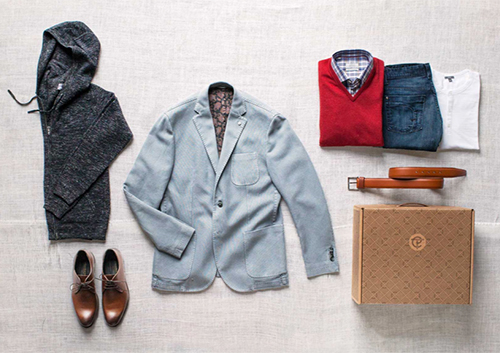
3trunk club1trunk club2trunk clubIn New York, you move a lot. I’ve packed my bags eight times in the past 12 years. It’s sort of funny, every time I look at my credit report, I oddly get nostalgic. The list of addresses laid out ever so clearly, mark the timeline of my personal and professional evolution. With moving, comes mail. Lots of mail. Your mail, past tenant’s packages, your neighbor’s coupons… I’m actually amazed that everything important (except for a tax return or two) has found it’s way to me over the years.

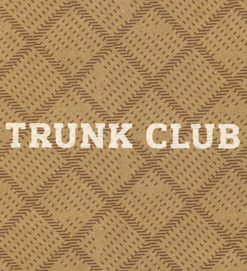
Yesterday, I got a mailer from Trunk Club – which was addressed to the previous tenant. Before tossing it into recycling, as I don’t typically don’t shop for men’s clothing, I was drawn to the pattern, and, to the velvet-smooth paper stock.

Trunk Club as a brand is an interesting concept, one that a few players are experimenting with these days. I listened to a bit about it on NPR two weeks ago, and was amused by the feedback from the male office reporters. Women have softened to the concept of clothing showing up weekly through Rent the Runway and same day shipping from Net-a-Porter and M.M. Lafleur, but this idea of a stylist sending you items that will most likely fit is a cool time saver.

The heritage look and feel of the pattern is great- the imperfect dotted line drew me in. It’s also an innovative way to play up the box’s strengths. I’m down with this packaging and curious who’s behind it- does anyone know?


Storytelling Through Patterns


1Nanushka_Zady3Nanushka_Zady

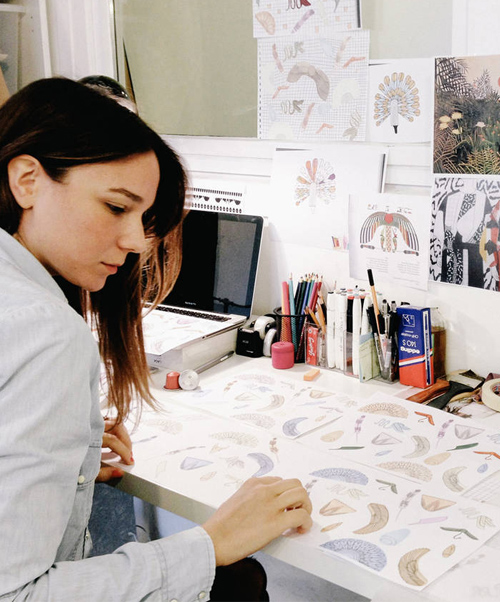
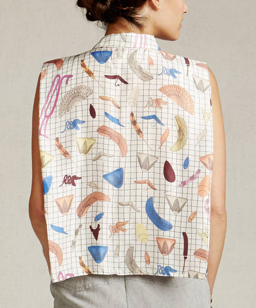
While scrolling through Zady this morning, the textile designer, Sandra Nanushka, and the story behind her work really popped. Beyond this beautiful blouse motif, Zady shares her creative process and a behind-the-scenes glance at the initial drawings that premeditated the final textile. Born and raised in Budapest, Hungary, Nanushka absorbed the fashion industry through both her mother’s work, and her studies at the London College of Fashion. This particular pattern pays homage to the shells and magical objects from the old biblical story, Dance of the Seven Veils. To learn more and/or purchase, click here.

MARY KATRANTZOU

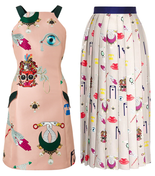
In the same world of storytelling with similarly beautiful but distinctly different motifs, we have Mary Katrantzou’s Fall Collection. Neutrals and blush backgrounds are continuing to shine in all creative worlds- from fashion and beauty to web and mobile, and these floating stories are a fun step forward for the new season ahead.


Dealtry x Of a Kind


dealtry_ofakind

Earlier this summer, I had the good fortune of meeting and dining with one of my favorite floral textile designers, Helen Dealtry. Over cous cous and vegetables, we talked pattern collaborations,  industry politics, and where to do aerobic yoga here in New York.  She casually mentioned working with Of a Kind (another favorite)…and I’m excited to finally share the release. Unsurprisingly, it’s a beautiful scarf (styled on our friend Chelsa Skees…to the left). There are only 25 – so nab yours before they disappear!


Retail: Denim & DIY Dip Dye


Dip Dye Retail Installations_patternpulp2

Anyone who works in retail display design knows there’s an endless amount of tlc that goes into every execution. Whether creativity is being sparked by budget constraints, deadlines, or oddball restrictions, the behind-the-scenes repertoire is intense and hands on.

Interestingly, the two photos I snapped above are a contrast of sorts. The ripped denim chandelier at Warm NY, is beautifully complimented by white brick and directional lighting. The fabric stripes break the height of the space, bringing a softness to an otherwise cavernous nook. The results are effortlessly cool and bohemian.

The indigo dip dye cotton below, in contrast, is used to hide the department store ceiling at Selfridges in London. Not an easy feat. Both simulate a paralleling story, only this version seems 10x more time intensive. The display is beautiful, and busy, and actually reminds me a lot of wedding decor. What are your thoughts? Is this something you’d recreate and incorporate into your space?


Tracking Repetitive + Awesome.
On Instagram.