Pattern Pulp

Trend: The Scale Standard


scale-standards

Scales represent the outer most layer of our skin and are therefore a significant part of our daily lives. Until we start aging, require additional protection, are injured, or are simply inspired by various layering techniques, most of us spend our time thinking about other things. Today we’re tying this theme together across several platforms in an effort to follow a visual timeline. This scale armor vest was a necessity during wartime as protection against bludgeoning. It appears as though Iceberg, a well-known fashion label has pulled inspiration from this exposed layering technique for their fall09 collection. Replacing traditional fish scales with shiny records, this graffiti collage from the Wooster Collective reveals pop culture at it’s finest, mixing things up.

Follow-up: Taping Spaces


taping spaces

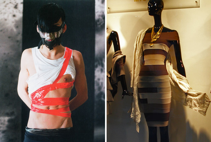
A few weeks ago, we found ourselves obsessing over Marc Jacob’s duct tape and bondage window.  Not long after, this Dazed and Confused spread landed in our mailbox.  While we’re not certain who’s influenced who here, it’s evident that creative teams across the board are embracing fashion friendly confinement this summer. Adding an elegant angle to this trend, Sussanna Petkov’s Viennese window along the Wollzeile, showcases color blocked striping for the less experimental types.  Once again, broad concepts have trickled into both market extremes, proving that the ‘wow factor’ is usually the invisible arrow pointing towards the more practical merchandise.

Greg Hopkins: Painstaking A-Peel


hopkinssmall

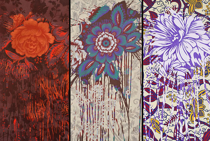
Greg Hopkins’ work is tediously created layer by layer with the use of masking tape and an exacto blade.  For each color layer, he covers the canvas, then cuts out the major details by hand, peeling away specific areas in an effort to expose a colorful design. Hopkins’ technique provides a level of unpredictability and reminds us of Poster Boy’s subway art.  While Hopkin’s work certainly has a DIY vibe, it’s subject matter is fairly traditional.  It almost appears as if the artist himself has gone into an old house, taken a knife to outdated wallpaper, and revealed decades of interior design. Each piece is as interesting as it is beautiful, and celebrates the tear, rearrange, and reveal concept.  We could easily see the integration of this technique in bedding, wallpaper and packaging design.

Coverage by: Emily Gup

Trend: Painterly Paths


bmw-expressionofjoy

“Not all artists are depressed,” is quite possibly be best tag line we’ve heard in a while. BMW’s latest Z4 campaign, Expression of Joy, has recently rolled out across several platforms, attempting to reach affluent customers of all of ages and interests.  BMW’s roadster has always been synonymous with intelligent design and has collaborated with select artists in the past to express this priority. Using GSD&M Idea City as their creative backbone, BMW has opted to jump into the driver seat this time around and let their product become the paintbrush, “While the original idea was to use the car to create artwork, over time, our thinking evolved from the final product to the process,” says David Matathia, VP and Idea Team Director at GSD&M Idea City. The results are both stunning and effective, as this vibrant spot translates seamlessly across all media platforms- be it print, tv, web, mobile or on premise entertainment.
tiretracks2

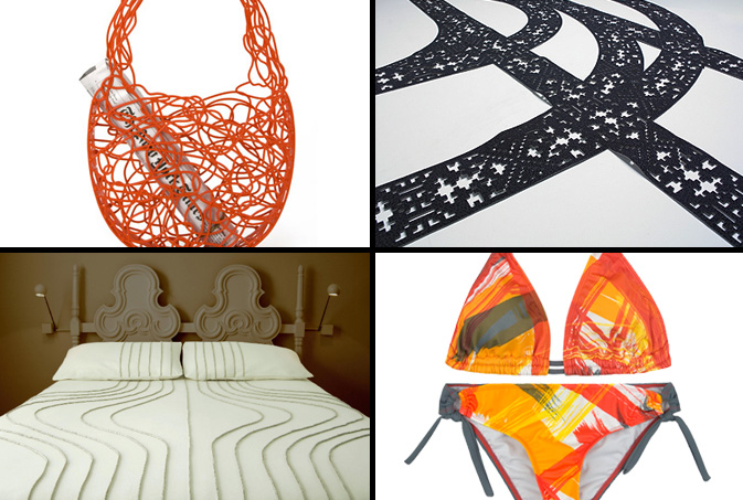
In an effort to embrace the concept, Expression of Joy, we decided to explore a few other products that inspire controlled chaos and negative space.  This Corallo Bag, a current feature on MoMA’s retail website, is an elegant, non-ending doodle that’s a durable alternative to the plastic throwaway.  Moving in a more literal direction, Hudson-Powell‘s patterned rug mimics tire tracks in the snow. Emulating tracks of another sort, Walter Onion’s wool and linen bed spreads are a minimalist and high-end interpretation of this trend.  This painterly Hurley bikini looks as if the roadster rolled over it while creating its 240 yard masterpiece.

Additional Contributions by Emily Gup.

Fashion: Curious Neckwear from Alexander Olch


alexander-olch

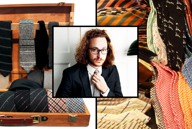
The motto, “unconventional meets conservative” is one that many brands aspire to achieve on a seasonal basis.  Alexander Olch, a filmmaker and designer from New York, has taken men’s neck ware by storm with his subtly vibrant patterns and tailoring.  After a brief browse through Bergdorf’s Men’s Department a few weeks back, it was obvious that Olch held his own beside Thom Brown and David Hart, two household names representative of upscale men’s fashion.  The greatest difference between these three designers was the fact that Olch’s designs playfully honored the bow tie without looking ancient or overly flamboyant.  After further research on Valet Magazine and The NYT’s fashion blog, The Moment, it’s quite obvious that this creative mastermind has a bright future ahead of him, check out his collection if you’re looking to give your professional wardrobe a face lift.

alexander-olch-ties

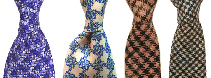
Olch’s ties nearly always possess a hidden surprise.  This secret ingredient makes a memorable impact as well as differentiates him from the commercial masses.  For a modern take on classic, here are two skinny Italian cashmere styles.

Trend: Linear Jumbles


barneys-southbeach

Over the weekend, I had the good fortune of escaping the cold wet city for Miami.  In between bouts of beach and people watching, I popped into the shops along Collins Ave to see if South Beach had more to offer than bedazzled Ed Hardy paraphernalia.  As predicted, Barney’s quenched my thirst for innovation.  I was astonished by the simple lighting solution that brightened the entire menswear floor.  “People will come from all over to visit the store, so we definitely wanted elements of memorability and surprise,” said Kent Wells, Director of Retail Planning and Design for RGLA .  Relying on new and creative ways to use utilitarian objects, Barney’s Miami CO-OP combined a mix of materials, fixturing systems and artisan objects to create an eclectic store environment, with an emphasis on wacky and fun.

dahlback-sunshineandshadow-jasperjohns

Speaking of wacky and fun, linear jumbles can be found across creative platforms in the homegoods, fashion and art worlds.  Åsa Dahlbäck, a Pattern Pulp favorite and recent interviewee, designed this vertically frenzied wallpaper from her studio in Sweden.  Each moving cluster is reminiscent of the motercycle traffic I experienced while traveling throughout South East Asia a few years ago- a snapshot of moving chaos. Lily Raskind, the founder and lead creative of Sunshine & Shadow, showcases boldly understated pieces in her Spring/Summer ’09 collection by combining feminine and masculine details.  At a quick glance, Raskind’s textiles look like an abstract version of pick-up-sticks.  Using color and line to create a maze of texture, Jasper Johns adds historical relevance to this trend in his untitled Lithograph from 1972, a work that’s currently on display at the MoMA.

Tracking Repetitive + Awesome.
On Instagram.