Pattern Pulp

Following Mosaic Collages Around the World


We’re mixing things up today! Whenever creative city tours go live, we usually try to focus on hotspots in a single city (not a bad thing, right?)- though today, I’m stringing a multiple city tour together, under the umbrella of a reoccurring pattern.
While I’m constantly in touch with friends and colleagues living abroad, grilling them on pop culture and random social trends, I’ll say that I’m quite fortunate to have a job that has me on the go when I’m not on the wacom tablet. Scouting inspiration and observing daily routine in cities and suburbs around the globe is absolutely fascinating and something I probably wouldn’t have fallen into had I not left my full-time job six years ago.
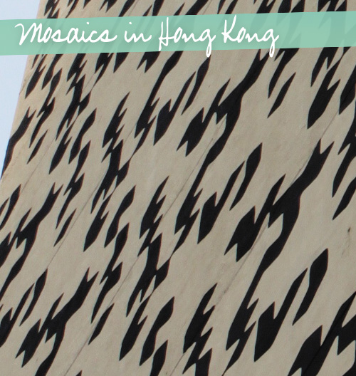
So today’s feature. Of the 9 photos, I took 5 of them over the past year. The theme is graphic with unexpected patchwork, reminiscent of mixed media mosaic tiling.
From the curated art world to reactionary street art to the commercialization of home, fashion and printed goods, it’s interesting to see how this trend has seeped into society’s subconscious, revealing an exciting departure from pixelated patterns.

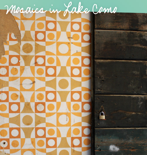
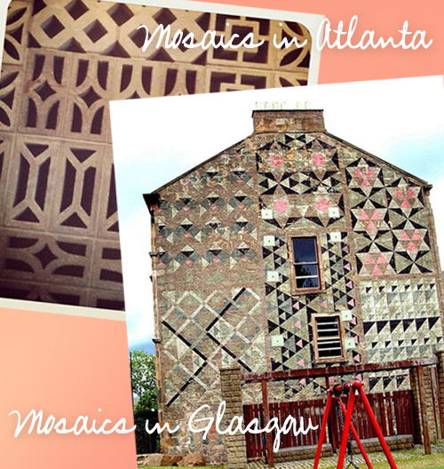
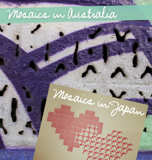
From stucco wallpapering in Lake Como to cement work in Atlanta (via little_ekd in my instagram feed!), to painted patchwork in Glasgow (thank you Pinterest) to a painted grate on Hoiser Lane in Melbourne and a segmented condo facade in Hong Kong, it’s easy to see an outdoor architectural trend here.
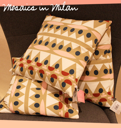
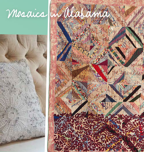
In the home sphere, the reinterpretation on soft goods is also obvious. The featured geometric pillows from La Rinascente in Milan are quite similar in color and form to the stucco wall in Lake Como. The unbelievable quilting and embroidered techniques from Alabama Chanin which was recently featured recently in NY Times T Magazine mirror the Glasgow wall with stunning precision.
Mimicking this technique in print, The overlapping hearts are a simple yet striking design I spotted last month in Tokyo. Giving gravity to the theme and tying loose ends where necessary, John Squire’s current show in London features dazzling mosaic work undone in chaotic organic nature.
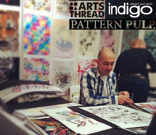
 

A Summation of Indigo PV with Arts Thread


Today’s feature is by our intrepid writer, Emily Gup.

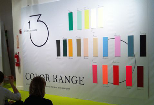
I was pretty jazzed when I learned that Pattern Pulp and Arts Thread would be teaming up to cover the Premiere Vision / Indigo New York SS13 textile show.  For those who are unaware, Arts Thread is an exciting platform based out of the UK for college students and graduates to post portfolio work and network with fellow grads and industry professionals.

Meeting up with Co-founder and Director Alex Brownless was a pleasure- we talked about the current work environment for recent grads and how exposure is integral in getting hired. The site is popular in the UK, Europe and Asia and is looking to expand into the US.

We also chatted about all-things textiles and viewed the five-level exhibition together. After weaving through each floor like kids in a candy store, it was evident that movement and transition were the strongest underlying themes throughout. Here are some supporting observations from the day.

Techniques:

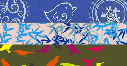
A range of hand-painted and hand-drawn designs incorporating luxurious splashes of color, loose detailed geometry and dense ethnic prints.

Digital Effects:

Photo-realism and free-form layering. Ethnic prints were manipulated so as to blur the line between popular pixilated themes and traditional ethnic patterns.

Large Scale:

Organic and freeform with lush movement. Smooth transitions with art-nouveau influences.

Coverage by Emily Gup


A Plaid Facelift for Babies


Every once in a while I’m tasked with designing baby patterns. While the American market predictably likes it’s pinks, blues, yellows and browns, categorized as barn animals, hearts or stars, it’s refreshing to see another take on the topic. Ratzer, a Danish home goods company’s recently sold out of their plaid baby line. The layout’s ethereal and soft in a very modern kind of way. I love the asymmetrical patchwork. What do you think?


Sparkling with Photorealism


We’ve all been watching photorealism evolve over the past few years. From cat humor to 80’s wolves to political commentary, if it’s on tumblr, it’ll soon be on a one piece bathing suit, a McQueen dress or a Threadless tshirt. Lately we’ve been noticing the celebration of jewelry on other accessories. From Dannijo’s iphone case to Lanvin’s satin scarf, the Man Repeller-coined term, arm party has leaped past the wrist and onto product. Are you a fan?


Global Pattern Trends with Lala's Pequenos


When’s the last time you dug a little deeper and thought twice about the purchases you make? Do you buy punchy colorful products or prefer soft, muted shades? Do you make impulse decisions online or in the store?

It’s a lot to think about when juggling a busy schedule, but we have to say we’re intrigued by various markets, both locally and abroad and today we’ll be sharing some fun facts that Alessandra, the creative force behind the children’s line, Lala’s Pequenos, has graciously shared with us about her global customers.

For example, Americans love gray, brown, pink, blue, and greens combined in any which way so long as there are animals for boys and flowers for girls.

Add a modern parent to the mix and there’s a good chance he or she will be buying geometric prints. If you’re wondering if organic’s an issue, Alessandra’s customers buy at a 50/50 rate in the US.

In the Canadian and Australian markets, parents prefer organic fabrics that are gray, brown, soft yellow and soft blue. Geometrics and aviary prints dominate (particularly owls)!

In the Mediterranean and Middle Eastern territories, kid-like designs in bold primary colors are at the top and buying organic isn’t necessarily a priority.

The French and Germans enjoy bolder browns, pinks, blues and orange. Geometric prints nearly always dominate and buying organic is at a 50/50 split.

Rounding out the global territories, Lala Pequenos’ Asian customers prefer soft colors and organic if possible. A nice refreshing fact that we’ll admit is a joy to hear.


Textile Design: Warp & Weft


The verdict is in!  Warp & Weft has announced the winners of the Contemporary Creations: A Rug Design Competition for upper division Textile/Surface Design Program students at the Fashion Institute of Technology.  The winning designs were selected from a group of 24 entries.

The results are so impressive and inspiring and a reminder of the creativity that’s brewing outside the commercial world. All the rugs in the Warp & Weft Modern Collection are made from the purest Himalayan wool and Indian mulberry silk. The wool and silk are unbleached to keep the materials as close to their original state as possible and to develop color vibrancy and depth throughout the surface.

According to Michael Mandapati, president and creative director of Warp & Weft, “To say these students are talented is an understatement.  The competition was very tough and our jury had an incredibly difficult time making their choices. The results are so impressive, in fact, that even though we had originally committed to producing one top design and showing it at ICFF 2012, we will now be producing the two top designs.”


Tracking Repetitive + Awesome.
On Instagram.