Pattern Pulp

Trend: Expressive Body Script


expressive - illustration - patternpulp

There’s been a lot of talk about graffiti finding it’s way into high fashion. Miuccia Prada ushered in the conversation last summer with her About Face runway presentation. The latest examples have similarities in their raw essence, but take a bold, expressive typographic turn. We have Evisu, Die Antwood, Comme des Garcons and Dior Homme all using the body or page as a canvas for expressive thought.

shantell-martin-artist-may-issue-interview

All of these pieces feel connected in some way to the style and vibe of Shantell Martin’s illustrations. Her stream-of-contiousness drawings have been an influential style for a while now, and a stark contrast to the crisp colorful characters and collage work from Fall.


Trend: Grids & Motifs


Grids and Motifscanalstreet_subway_Lesley Morphy2vivienne westwood

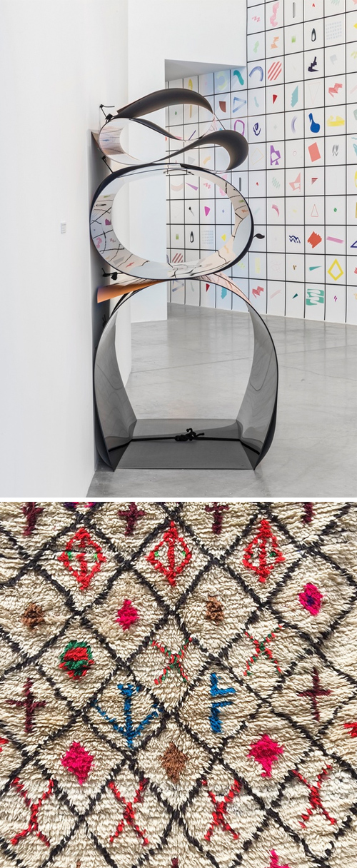
Grids, motifs and colorways have been finding their way into my social feed as of late. While the theme’s not necessarily a new concept, the minimalist and spatial approach feels quite current. A few favorites weave color, illustration and narrative into an organized grid.

Julia Dault’s Toronto exhibition, Color Me Badd showcases color and form in a highly graphic and flat way. The colors are bright and the shapes are abstract. Next up, is a snapshot I took while in Marrakesh of a Berber rug. While it’s old, it feels on trend for what interior stores are stocking these days.

Then there’s a snapshot by Lesley Morphy from the Canal Street station. I’m forever in a rush when I go left at this visual fork in the road, as it’s the subway stop closest to my office – but always wonder about the story behind the icons – does anyone know?

And the glue that holds this all together, is Vivienne Westwood’s latest commercial print ad. The sticker laden stall compliments the art world, just as it mimics real life.


Vibrance & Inspiration from Morocco


morocco_april2015

Pattern Pulp’s been kind of quiet as of late. There’s been a lot going on – some things have been really exciting, and all consuming in the work arena, while others have been difficult, and simply put, a pause on life.

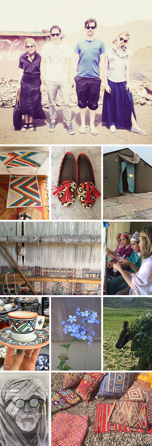
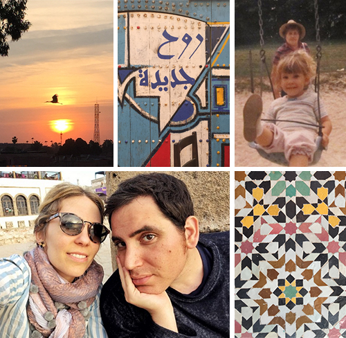
Today I’m back, and sharing a glimpse of recent travels. My beloved grandmother passed away nearly three weeks ago, and while this post isn’t necessarily about her, she was eager to hear about a trip to Morocco that was planned awhile ago. She wanted to see all of the curious inspirations and hear about the culture, the food, the birds and the music. After we laid her to rest, my husband and I decided that it was important to still go- that it would hopefully serve as a distraction, a transition and a reflective period while we mourned her loss. We joined good friends and took off in somewhat of a daze, with an itinerary that was loose but linear.

morocco_april2015b

The mornings and evenings were sad and reflective times, but the days were shiny and full of color and delight. We traveled from Casablanca to Fez to the Sahara Desert then Marrakesh and ended in Essaouira. It was an absolute whirlwind, one that felt appropriate and extremely inspiring. I’ll post more specifically over the coming days, but here’s a little overview of our travels – more to come soon.


Rotating Discs + Isabel Marant


Isabel Marant- Window Display- SS15

As of late, life’s been a bit hectic, and this site’s been a bit still. Luckily, it’s the good kind of hectic that makes the work day a massive juggle…

Last week, while running between my Chinatown office and a client’s office in Tribeca, I just sort of stopped in my tracks when I hit this window display at Broome and Greene. Isabel Marant has a way with motors and movement, and the geometric grandeur of this rotating disc series translates beautifully. The nuance of the movement steadies the eye and livens the scene. If you’re in New York, swing by the Soho store- hopefully you’ll enjoy the artistic mechanics as much as the inventory.


Geometry & Spatial Design


Phuong Thuy nguyenEsther Stocker_Patternpulp

I recently stumbled upon two artists with parallels so strong, it seemed appropriate to write a piece about the similarities in their work. Meet Phuong Thuy Nguyen and Esther Stocker. Nguyen is from Budapest and works with woven objects and sculptural textiles, while Stocker is originally from Silandro, and is a master at perspective and spatial ambiguity.

Both work within the confines of a black and white palette and create illusionary geometry that manipulates the context of space. I find both of these bodies of work to be very inspiring- from the cast shadows and collaged lines to the intricate folding and origami-like repeats. It would be fun to see a grand collaboration between these two women, wouldn’t it?


Colors and Artistic Commercialism


1Marni_Mondrian_Patternpulp

Art, is literally in this Spring. I started noticing all of the bright, retro accessories at the Hong Kong Airport last month. The common thread throughout links abstraction and art to fashion and commerce.

abstract-mondrian-style

Here, we have Marni and their Spring Summer ’15 bags. I subscribe to their blog, and upon opening their newsletter this morning, I came across this Mondrian inspired marketing mashup. The 2D meets 3D blend is a creative stab at a classic work, one which mixes color-blocked geometry with product overlays.

celine_bag

Then there’s Celine. Their infamous trapeze bag carries a multi-colored stripe, signifying a season and an art era. There’s a simple elegance to this accessory that feels independent from it’s leather, color-blocked counterparts.

hot-beat-1964-genedavis

If you’re connecting the dots to Gene Davis and his famous color exploratories, I am as well. Davis, an American painter, has continually influenced the art and commerce worlds with his large scale post-painterly abstractions and color stripes.

valentino

Moving into a playful category that feels more Katy Perry than Joan Didion, Valentino has applied rainbow chevron stripes to it’s Spring ’15 accessories. The move is bold, if not juvenile, in a lavish, cartoonish kind-of-way.

genedavis1

Bringing it back to the art, it wasn’t hard to connect this palette to another Davis painting. The vibrance is infectious, and the historical reference gives the collection weight. Curious, which one is your favorite?

 

Tracking Repetitive + Awesome.
On Instagram.