Pattern Pulp

Texturizing Moving Media


Moving into the realm of video game design, IBM’s recent banner ads promoting Pure Systems playfully animates their famous campaign graphics. Though the reel plays a bit too quickly to capture progressive screen shots, you get the idea. In our opinion, this teaser illustrates a meeting of the minds and tools needed in a toolkit. Do you get it?


DIY: How to make a Tablet Protector


For all of you design-crafters out there, we have a treat today from our Paris-based DIY contributor, Tiffany Iung. Follow along and let us know if you end up making one for yourself (send photos too)! – Shayna

*            *            *

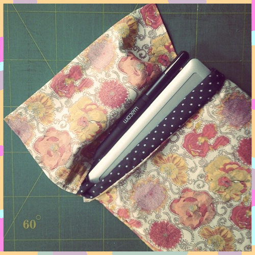
I waited a long time to get a Bamboo tablet. Now that I have it, I treat it like a little baby. I thought it only right to make a pretty pocket to keep it safe. I had high hopes of making a fancy closure, but when I finished the first part of sewing I realized I was happy with the simplicity of the fold over closure. I figured the proportions of this pocket could be adapted to keep any of your goodies safe and sound.
Materials :

1. thin cotton padding (about 1/2 cm thick), cut into a 56 cm x 21 cm rectangle

2. fabric for exterior (I used this LUCY DAISY C TANA LAWN Liberty Art Fabric), cut into a 112 cm x 24 cm rectangle

3. fabric for interior (lining), cut into a 56 cm x 21 cm rectangle

4. basic sewing materials (color-coordinated thread for top stitch and bobbin)

5. sewing machine or materials for hand-sewing

 Process:

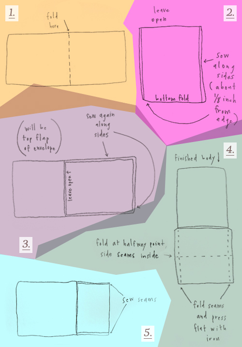
1. Fold cotton padding and lining fabric pieces in half, the lining fabric wrong-side out. Line up folded edges (this will be the bottom of the pocket).

2. Sew along sides, leaving a 1/2 cm seam allowance.

*Turn work inside out. This is the padded lining.

3. Fold exterior fabric right-sides together, leaving a 24 cm allowance for the top flap of the envelope). Place padded lining on folded portion, again sewing sides with a 1/2 cm allowance.

*Turn right-side out. Body is finished.

4. For the Top Flap portion of fabric fold 1/2 cm seams and press flat with iron. Fold again at halfway point (the seams you just folded should be tucked inside, making a clean rectangle).

5. Sew along side seams.

(I wanted to say thanks to Eva Black, on Emmadime, for inspiration from her Top-Notch Type series. I’ve been introduced to so many cool fonts, including this one, thanks to her!) – Tiffany Iung

 

Is Instagram the New Fashion Advisor?


I’ve had my eye on Black Milk since since crossing paths with their skeleton bathing suit. Though I didn’t buy it -medium’s been out of stock since day one – I keep noticing their line in my Instagram feed.

A majority of the imagery seems to be from LA & Williamsburg hipsters as well as inked influencers. The dollar leggings at the top brought me back to their site (I’m a fan). After giving the collection another perusal, I noticed something interesting.

Aside from the underground, in-your-face themes and general punk design ethos, there’s a button to the right of each style that offers styling advice.

When you click it, a collective aggregated feed appears, compliments of the brand’s many fans. Reminiscent of Fashism‘s self styling sight, Black Milk and their design team have figured out a way to reassure potential consumers while creating comradery among their customers.

Brilliant, if you ask me- a simple idea with great execution. This is a nice example of ecom marketing that feels organic and in line with the ethos of the brand.

From the top: Dollar Leggings | Cathedral Leggings | Galaxy Leggings | Mucha Black Leggings | Jelly Fish Leggings


Accessorizing Your iPhone


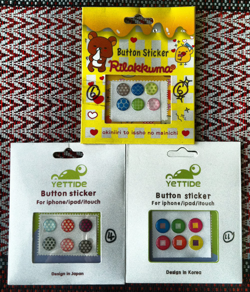
A few months ago the button on my iPhone broke. I’ve sort of just been managing. Like, each press is super aggressive and every third click results in a screen change. Apparently it’s a known hardware problem at Apple which sort of blows my mind. Fast forward and a cute accessory later, it looks like I may have solved my problem. While I was recently in Singapore I went into stimulus overdrive- you can imagine all of the cute accessories one can buy for their phone in a mall bodega. I came across these texture buttons from Yettide and Rilakkuma and the good news is that I’ve temporarily solved my desensitized button issue, go figure, all in the name of fashion.


Interactive Storytelling at Anthropologie


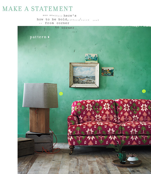
It’s been interesting to follow fashion’s toe-dip into the digital sphere. While the translation over the past few years has been a bumpy ride for many (some food for thought here as to why), some brands keep innovating, infusing their gift of storytelling through interactive mediums. Currently, Anthropologie is sharing it’s pattern, color and scale story through poetry-like pins.

Directing the eye using bright focal points, a la Lifestyle Mirror, each of Anthro’s home spreads teaches the reader more about the creative process. The patterned page reads like a styling mantra.

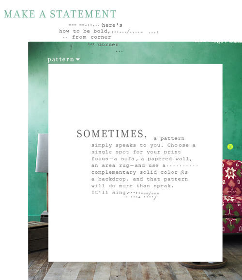
Sometimes, a pattern simply speaks to you. Choose a single spot for your print focus- a sofa, a papered wall, an area rug- and use a complementary solid color as a backdrop, and that pattern will do more than speak. It’ll sing.


Trend: Patterns in Advertising


When you consider the advertising industry at large, it’s simply a means to sell many messages. Regardless of the need versus want factor, it’s interesting to follow the creative thinking behind various campaigns. At least, from a trends perspective.

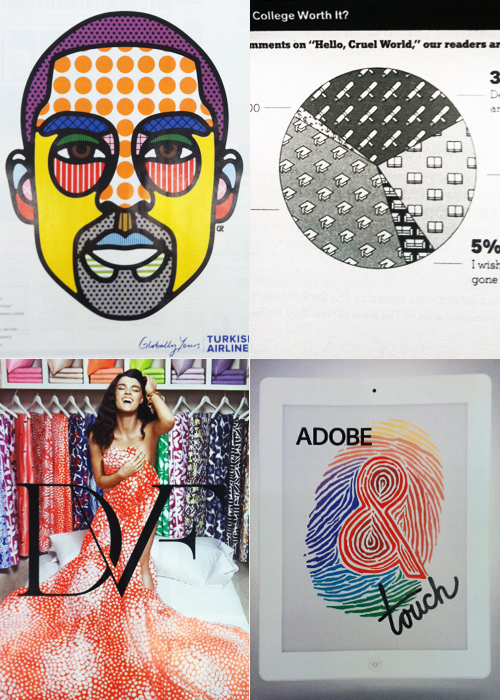
This Kobe Bryant portrait for Turkish Airlines highlights the brand’s unlimited amenities (flat beds, realtime entertainment, chef services) through the technical mechanism of an info graphic. Infusing similar texture into a more journalistic illustration, this New York Times pie chart assesses college debt through the lens of perception and worth.

Keeping in tune with the graphic nature of these layouts, Diane von Furstenberg’s recently launched home collection highlights the brand’s coveted archival duvet covers- a partnership recently launched with Bloomingdales. Sharing a similar color palette and graphic layout, Adobe’s Touch for the iPad app gets playful with tiger-striped typography.

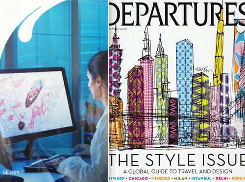
Since we’re sharing the softer side of tech in today’s round up, it seems relevant to showcase GE’s Imagination at Work campaign, highlighting the microscopic organisms that lead to innovation. The palette mimics this vintage American Express Departures cover in a global-fabric kind of way.


Tracking Repetitive + Awesome.
On Instagram.