Pattern Pulp

Color & Pattern: Apple's iPhone5 C


2iphone5c

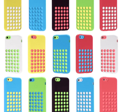
The anticipation’s over and even Apple’s in back-to-school mode with their latest iPhone C product launch. Combining matte and shiny surfaces, gridded netted covers, and a very bright color palette, these phones have a decidedly childish twist- taking a 180 diversion from the stark monochromatic days of the past.

The palette feels very American in a naive, almost unglamorous way. The playfulness of the colors are rather commercial and we suspect will have a good deal of influence over the coming years. When you’re a brand like Apple, you have serious sway. You set the mass market trends in the world of tech and product design.

I’m assuming the male market will veer towards the white C or any of the S phones, while the female buyers will be more varied (hello, coral), though it’ll be interesting to see how this palette plays out and inserts itself into our subconscious vernacular. If you’re planning to buy one, which color will win?


Color, Conversation & Hanes Underwear


http://www.youtube.com/watch?v=gRJ9ko0nZmI

1color_marketing_hanes

2color_marketing_hanes 3color_marketing_hanes

Have you seen the latest Hanes spot? Chances are, maybe not, as the YouTube page has only 118 views. Parts of it are pretty cool, we’d recommend giving it a go. The concept reminds us a bit of Gap’s Be Bright campaign from a while back, but has clever synchronization and pattern mash-ups that transition human puzzles into cotton graphics.

Complimenting the TV spot, the social media component plays off of color, hoping to create chatter about an otherwise taboo topic. Would you tweet the color of your underwear? Hanes is hoping you will, by utilizing a Pinterest-like layout and pre-populated tweetable content, with a campaign entitled, What’s Your #undercovercolor? Have a look, play with the wheel, and let us know what you think…


Trends in Overlapping Textile Mediums


houseofmaryanne Louisa Crompton - Knitted Textile Designs2Louisa Crompton1epsteinrichterstearns

As artists, we’re often thrown for a loop and inspired to create our own interpretations from normal everyday oddities. On Pattern Pulp, we celebrate the thinkers and makers who combine, reference and refresh traditional mediums. Let’s have a look at a few works that straddle varying mediums and are tied together through vibrant, modular, unexpected overlap:

1. Maryanne Moodie and her woven tapestries. Like other instagrammers on the hunt for fresh work-in-progress, House of Maryanne‘s feed is a fabulous one, sharing asymmetrical tapestries, DIY classes and vintage clothing.

2. Louisa Crompton and her knitted textiles. Each design has a tetris vibe that celebrates modular graphics as 3D knits.

3. Robert Otto Epstein‘s vibrant colors, patterns and pain-staking details are digital, pixelated and asymmetrical.

4. Gerard Richter’s Tapestries, which we covered a few months back, where he converts paintings to woven works, breaking down each stroke into thread. In a similar but also radically different fashion, we mention Philip Stearns, who’s known for his blankets and tapestries inspired from lovely patterns formed from digital glitches.

The basic idea: “Transcode glitches in the cold, hard logic of digital circuits into soft, warm textiles.” When you think about the three, we have utilitarian textile patterns transformed into art, art transformed into tapestries and a fleeting digital moment captured forever in utilitarian tactile objects. What do you think of this trend?


How Flat Art Influenced Flat Design


1Ingeborg Panjer Roombeek 2Ingeborg Panjer Roombeek 3Ingeborg Panjer Roombeek 4Ingeborg Panjer Roombeek 5Ingeborg Panjer Roombeek 6Ingeborg Panjer Roombeek

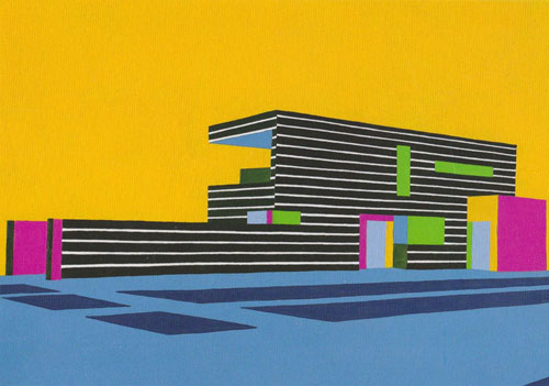
While reviewing and researching palettes, I recently came across Ingeborg Panjer Roombeek‘s paintings. Roombeek’s a master with color, space, and geometric balance. This series, dating back to 2010, emulates the beauty of flat design – a digital trend that’s evolved out of skeumorphism over the past year. It’s interesting to see it from the angle of the art world, as opposed to the design world, as this ‘less is more, 2D meets 3D’ layout has gained serious momentum thanks to creative overhauls from Microsoft and the tech startup world. What do you think of the connection? Would you say Roombeek’s work contributed to this creative trend?


Bold Banners, Jay-Z, & Samsung


samsung_jayz_banner

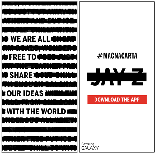
It’s rare when a banner catches your eye- they’re always a bit pesky and quite honestly, as a designer, they’re one of my least favorite items to create for clients. I’ll do everything I can to suggest other advertising methods before doing a banner-specific media buy. That said, this one, in particular, is interesting. It’s bold, it’s graphic, it’s minimal, and Samsung’s let Jay-Z and his latest album, Magna Carta Holy Grail, really shine. Rounding out a hefty social media campaign, this is one part of the puzzle preparing the world for Samsung’s Magna Carta app and Jay-Z’s July 4th release. Getting excited?


Around the Globe: Weaving Landscapes


1DTS3 DTS DTS2

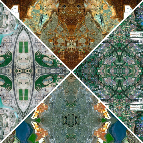
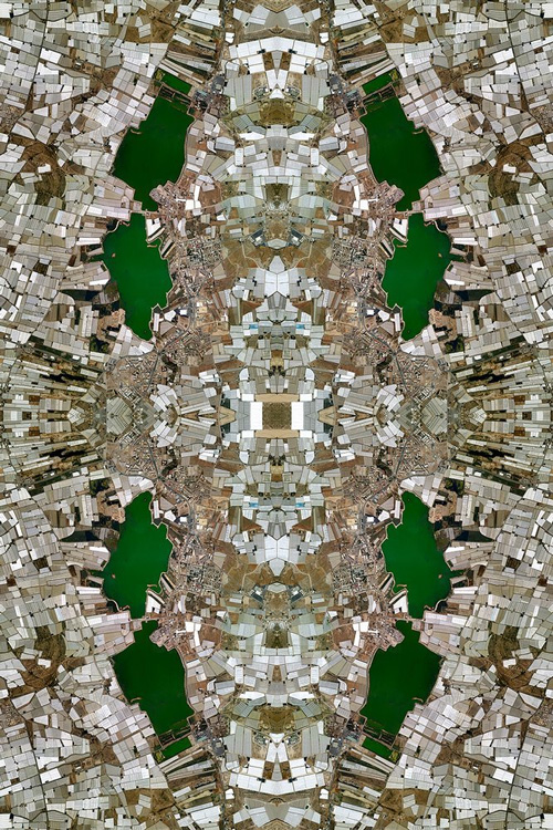
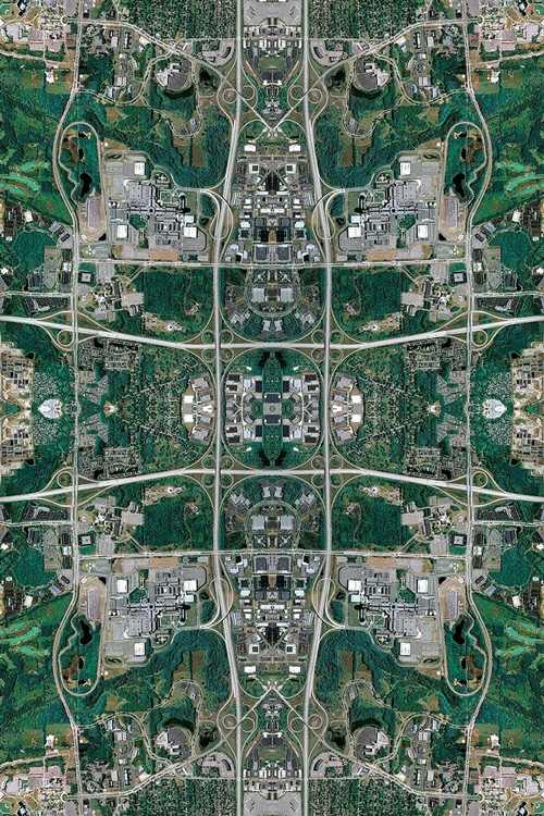
Afghani rug makers are known for weaving patterns that parallel the stories of their lives, often representing the war torn land which they are surrounded. Intrigued by this ancient  practice and rich storytelling tradition, photographic artist, David Thomas Smith decided to use a similar technique when examining how global landscapes have been affected by the activities of humanity.

Smith’s imagery is a composite of thousands of thumbnails extracted as screen grabs from Google Maps, reconstructed piece by piece using Photoshop. The results are compelling and similar to that of an ancient rug, reminding us that our landscape is a product of creation, reflecting on our society and culture, an art of sorts on it’s own. Click here for event info.

The Copper House Gallery: St Kevin’s Cottages, Synge Street, Dublin 8


Tracking Repetitive + Awesome.
On Instagram.