Pattern Pulp

The Physics of Pattern Making


Physics of Pattern Making

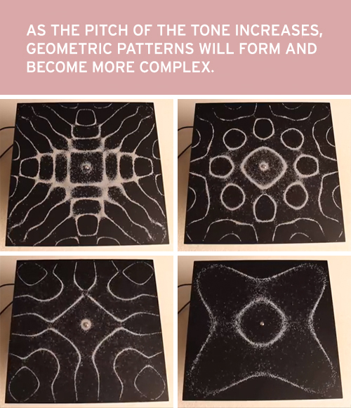
Watch this, I promise it’ll amaze you. It’s the visualization of frequency and sound waves through the use of salt.

Sometimes it’s easy to forget that patterns and symmetry lay the foundation of life. This demo’s a nice reminder, simplifying complex equations for everyone to understand.


The Topography of Tears


topography of tears2

Have you seen this study? It’s absolutely fascinating. Our tears have personalities that mirror our moods. A simple concept that seems so obvious. Tears from happiness, sadness, athletic release and even onions are all different.

During a period of personal change, Rose-Lynn Fisher started examining her tears under a light microscope and was shocked by the different patterns. To read more, visit her site, you’ll find 100 unique topographic formations.


Trend: Complex Formations


Complex Formations

Today, we’re doing a simple compare and contrast of nature, art and fashion. The similarities are breathtaking, as each image feels like it’s within two degrees of each other in regard to form and complexity.

The top photo is a colony of mussels from Laguna Beach. They feel rather ordinary in a spectacular way. Then we have origami V-Pleats. Each diamond has been folded in half so that the top corners touch every edge with perfect precision. Go ahead and try to replicate…not so simple. Then, singing Marni’s praises yet again, this jacket is a phenomenon on it’s own. The texture bunches are both futuristic and life-like. I’m a huge fan.


Banner Trends & Pattern Design


tech_patterns_patternpulp

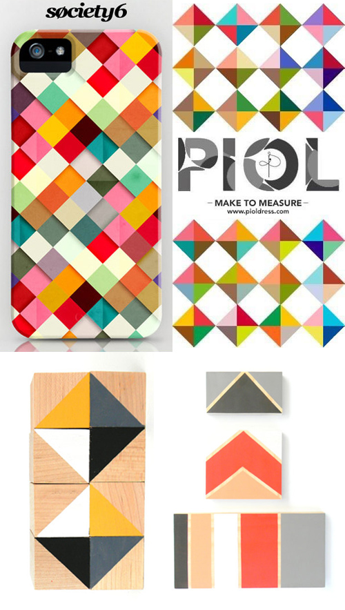
Designers have a love/hate relationship with the pixel. We dislike being called pixel pushers, yet glorify the square throughout our work- whether it’s a conscious celebration (like in today’s feature), or a small part of the greater landscape.

We’ve been tracking the life cycle of this motif for a long time, as it’s a geometric staple that’s never going away. What’s interesting though, are the vectorize alterations and evolving color palettes. We started picking up on the trend from Matt W Moore’s murals a few years back, then watched the corporate giant, Chase bank jump in on the action. Percolate then released iOS wallpapers in deep jewel-toned palettes, and now we have pastel grids from Society6, Piol and Squared Array.

The top two designs double as web banners, which is fairly unique in the digital ad buying world. Both caught my eye before starting in on the content…though someone like me may be a bit skewed. The punch of color and linear movement stands out in the sea of model and type heavy advertisements. Big fan over here.


Using Instagram to Spot Trends


neon_camo_patternpulp

For better or worse, Instagram keeps me in the loop. Anyone else feel this way?

From observing work-in-progress from inspiring creatives to following design shows I can’t attend, the influx of imagery is really useful and pretty inspiring. Oftentimes, it helps confirm theories that have been floating around in my head- in regard to trends popping up in various design communities around the world, (say in Australia, Helsinki and L.A), and also leads me to new ideas and talent. It’s a pretty useful tool beyond selfies and party pics.

Yesterday, I took a screenshot of the Phillips Auction House invite. It seems fairly standard at first, but I loved the combination of camo and metallic in an upscale layout. This artistic commerce pays homage to Andy Warhol, presenting part of a timeless series. This lead me along the path of neon camo and got me thinking about where it’s popping up this season. You can always expect reinterpretations, so it’s worth following the art world to stay abreast, if not ahead of curb. Art always leads fashion (in my humble opinion).

Here we have sneakers, (bags and wallets) from Valentino. The kicks straddle a unisex vibe, but are sold in the men’s department. This chambray/camo/drawstring pullover by General Idea is another commercial, yet creative direction for guys that feels fresh this season. If you’re looking to simply add elements of the concept to your wall or iPhone, check out Joe Van Wetering’s work. His prints speak to the camo-loving monochromatist.

 

Custhom's Digital Embroidery


1Custhom embroidered wallpaper_patternpulp2Custhom embroidered wallpaper_patternpulp3Custhom embroidered wallpaper_patternpulp

I always look forward to emails from CUSTHOM. Their collections are unique and boundary-pushing, with meticulous technique and execution. You’re always left wondering, how did they pull that off and why don’t we have a store selling their products in the US? 

Their latest launch, Aves, presents an Otomi pattern rooted in Mexican tradition with modern edge. Digital embroidery’s been used and the final product exists on both wallpaper and fabric. What’s most impressive, to me, at least, is the tonal aspects using a single color- through careful overlap, the objects have a 3D feeling.


Tracking Repetitive + Awesome.
On Instagram.