Pattern Pulp

Comparisons + Visual Cues


elephant_covernyc_ballet_advert

In a world where we’re constantly consuming content in various mediums, it’s hard not to draw comparisons on an image-by-imgae basis. As you scroll through instagram, it’s interesting to see similarities between posts, especially when there’s no geographical or thematic connection between the accounts.

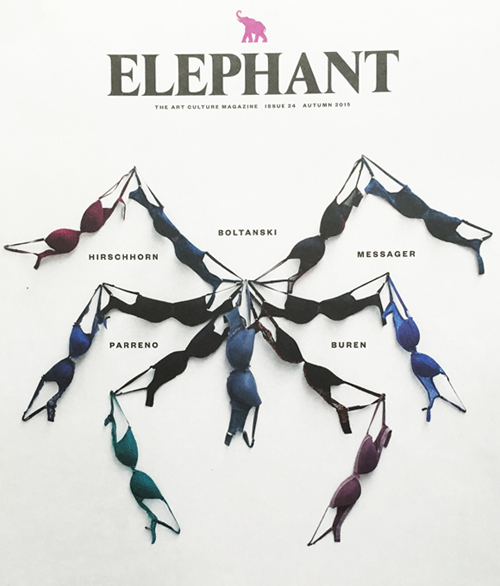
These two printed pieces struck me in a similar way, as they share a familiar energy yet come from divergent design worlds. Elephant is an art and culture magazine that’s printed and produced in the UK. It has fantastic coverage of the art world. Just below, is the New York City Ballet‘s Fall advertising campaign. In describing both spreads, they feel lyrical, lanky and muted. Do you also see a common thread?


Color, Patterns & Collage


patterns and plaid_patternpulp

Whether you’re a fan of bold brights, muted tones, photography or flat design, all of these styles have been combined in the imagery above to create beautiful succinct collages.

The fabric swatch pile-up represents the latest of the season, citing a menagerie of reds, oranges and salmons. The Soho House graphic by Craig and Karl emits an entirely different vibe, while using a similar plaid palette. While the saturation is certainly turned up on the converse illustration, it’s easy to make comparisons between the two worlds – and see how slight variations can translate across fashion and marketing platforms. Which do you gravitate towards?


Patterns in Packaging from Birchbox


1Birch Box Patterns

I recently came across the packaging and graphic design work of Mary Rabun. Her aesthetic is bold, bright and feminine – and a playful departure from the minimalist illustration styles we’ve been seeing for a bit. In exploring her portfolio, I was struck by her full-time design work for Birchbox – it’s all very vivid, maximalist and distinct.

2Birch Box Patterns

While these boxes were released in March, they have a timeless appeal and reveal how a brand can successfully apply print and pattern. Using bold brush strokes and a harmonious color palette, Rabun excels in keeping Birch Box at the forefront of unique and cool packaging.

3Birch Box Patterns

In addition to the boxes, the accompanying insert cards play to the same creative mood and get interactive with a Q&A contest. If you have time, dive into Rabun’s past work, it’s beautiful, engaging and a great fusion of commercial pattern design.


Book Review: Behind Collections


1Behind Collections Book

Graphic Design in branding and communication has always been important. Something well designed can create customer loyalty, monetary benefits, and an edge on competition. Insert pattern and texture into this conversation and you’ve elevated it, giving the audience more visuals to identify with.

2 Behind Collections Book

Behind Collections is an encyclopedia of the best graphic design and promotional materials in the fashion industry today. It hits a certain aesthetic that’s quite popular at the moment, and reveals the varied methods of achieving a luxurious brand through color, embossing, typography and photography.

3 Behind Collections Book

It includes promotional design from ACNE, HONOR, AKIN, Vogue, Hermes and more…and an index of the creative studios behind the work.

4 Behind Collections Book

Here are a few spreads that that caught my eye. If you’re looking to add another book to the library, I highly recommend investing in this one. Click here to purchase.

Crowded Spaces + Flat Design


crowded_spaces

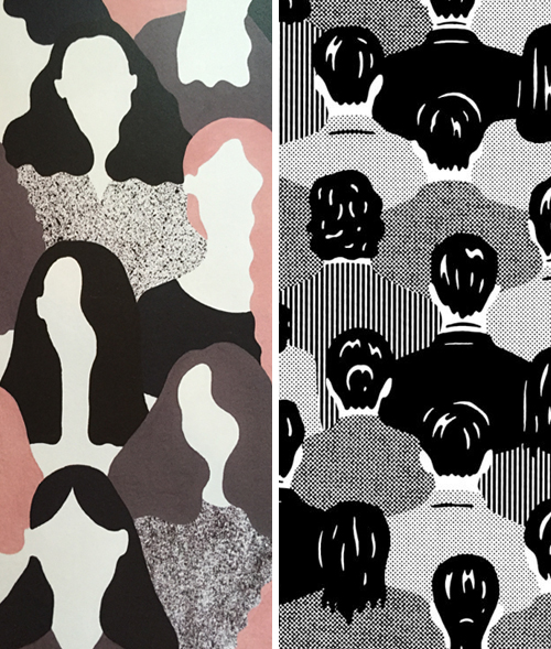
There’s an interesting optics play going on here. We have two very talented graphic designers creating varying crowds. While one feels like the Barnard graduation, filled with promising young women, the other has a metropolitan rush hour vibe. You can feel the hustle and bustle through the pattern blocking. The drawing on the left is by Alessandra Genualdo, an Italian illustrator living in London. I came across the layout while on a trip to Toronto. It was on the cover of Double Dot Magazine. The black and white crowd on the right is a piece by the Japanese artist Hisashi Okawa, who I recently discovered on Pinterest. It’s a beautiful juxtaposition, no?


Max Mara's Texture Blocking


1maxmara-ss2015 2maxmara-ss2015

A set designer, a pattern maker and a photographer walk into a bar together…

Just kidding….but in all seriousness, this Max Mara’s Spring ’15 ad campaign kinda goes there. It’s hard not to love the balance of complex simplicity in the collage work. Between the pattern contrasts and varied scales, we get lost in the chaos- the only thing that saves us from a maze of black and white shapes is the color red and the focal point of a face. Using shape, flow and a beautiful model, the art direction guides us to the floral flow of the red jumper…the perfect step forward for the pattern on pattern look, wouldn’t you say?


Tracking Repetitive + Awesome.
On Instagram.