Pattern Pulp

Music: Terry Poison Patterns


[slideshow id=4]

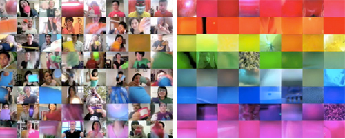
While trolling Terry Poison‘s facebook fan page, we stumbled across these video stills of a project they’re currently working on. The loud bright geomtrics remind us of Santigold’s Light’s Out video from last Januray. Excited to see the final product!

Trend: Tribal Narratives


Tribal narratives, wood cutouts and sumi-ink drawings have been around since the beginning of time. While geometric interpretations have been surfacing in art and fashion for over a year now, it’s refreshing to see a more fluid technique taking hold across several mediums.  A major influencer in this space is the Sumi Ink Club. Based in Los Angeles, this creative community is producing work at a rapid pace. From this Keith Haring-like blazer to this Lucky Dragon’s Open Power Record, it’s pretty clear that this topsy turvy style is gaining traction in several branding markets. Contrasting the soft shapes of the sumi brush, Dennis McNett reminds us that black and white texture can be sharp, surly and folk-like. Barneys Department store recently commissioned him to design their summer windows, bringing this underground skater-style art to the mainstream.

Pattern Pulp's in Tokyo!


Greetings from Tokyo!

First off, I hope that our readers from the States had a fantastic 4th of July weekend.  While I missed the festivities, I have had the pleasure of visiting one of the most inspiring cities in the world.

From the back alleys of Harajuku and Daikanyama to the high streets of Omotesando and Ginza and the mega department stores of Shinjuku and Shibuya, Tokyo has been stimulating all five senses.

Next week we’ll be back with highlights from the trip.

In the meantime, check out our favorite new Japanese export, The Suzan, who’s new album was produced by Bjorn Yttling (of Peter, Bjorn and John fame) and will soon be released on Fool’s Gold/Downtown Records.

Let us know what you think!

Free Giveaway! Factory Records Book


Between 1978 and 1992, Factory Records was one of the most influential record labels in Britain. Following the punk phenomenon of the ’70s, the time was ripe for Factory to usher in the innovative sounds and styles of the Post-Punk and New Wave Era. Factory launched the careers of Joy Division, New Order and the Happy Mondays; opened legendary Hacienda club and Dry bar in Manchester; and introduced high-quality, cutting-edge design to the music world. Working side by side with musicians, designers such as Peter Saville, Central Station Design, 8vo and Mark Farrow developed an entirely new visual vocabulary, the idioms of which are still widely recognized and imitated today.

In my pursuit to expand my own home library, I ordered two copies of the book– one to keep and one to give away. Let us know via twitter, or a comment below what album art you’re most inspired by creatively. We will chose a comment or tweet at random!

Follow-up: Spin It, Web Cam Style


Oh, the proverbial question: Which came first, the chicken or the egg? The debate can go around and around. Much like the debates of who inspired whom, what inspired what, and where on earth do ideas come from. And of course, how do they become adopted by society and wind up as trends.

Because, we think we called it via our Interior Design Takes a Spin feature: people, they like change. They also like pixels. And in this case, web cams. We recently spotted Pepsi’s Refresh Project, One People tv spot, where a variety of people on their web cams interact with one another. Each paper conveys a pixelated vibe, and as objects are “magically” passed between squares, the concept is unified as global sharing. Naturally, we delighted at the synchronicity to our fun interior finds. Of course, in that ad’s comment section, we were then led to the Japanese band, Sour’s music video, Hibi no neiro” which has a very, very similar idea and was posted in July before Pepsi’s ad was released.

It’s speculated that Pepsi was heavily inspired by Sour’s music video which involves using the band’s fans in a fun series of web cam adventures. It’s not impossible to find other videos using a similar concept, though not necessarily as well executed as these two. In fact, watching these videos sparked the thought of another web sensation, Chat Roulette, where anyone can log online and through their web cam talk to people from around the world. They can switch to someone else quickly just by pressing a button. It’s Spinning It: People Style.  Maybe they’re all inspired by our increasing hunger for the new and the next, the impatience it inspires, and our desire for change. Now.

Coverage by: Emily Gup

Trend: Brands Burning


As 2010 rolls on ahead, artists, writers, designers are all pondering the future, and it seems that burning the past (esp. 2009) might be a way to move forward. Burning, a cathartic ritual for many religions, releases the energy of the past to spark new beginnings.

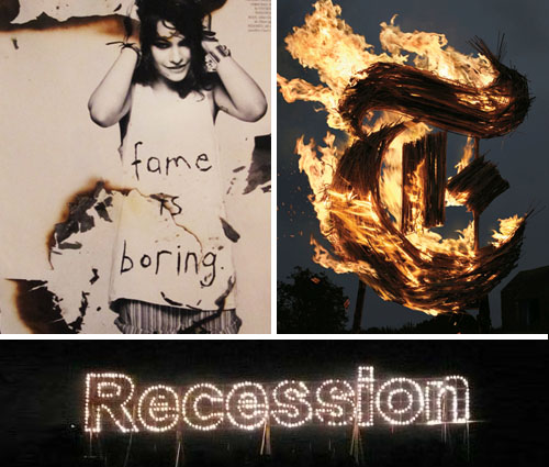
The New York Times Magazine recently featured a stunning cover with the “T” scorched and engulfed in flames. Pyromaniacs set designer, Gary Card and the photographer, Jacob Sutton, were inspired by the “Wicker Man” 1973 horror movie and commissioned a welder to fabricate a 10-foot-tall steel T. After layering it with sugar cane and soaking it in alcohol, they lit it with a blowtorch and “ran for their lives”. Although the T was intended for an Anglomania themed issue, you couldn’t help but feel it symbolized the current demise of the great newspaper in crisis to its internet nemesis.

Paralleling this theme, artist Karmelo Bermejo recently presented “The Grand Finale” at Art Basel Miami in December. The fireworks show ignited the word “Recession,” commemorating the failure caused by the worldwide economic crisis. Though controversial, this celebratory event emphasized art’s fleeting, yet explosive nature.

Using burn marks as a design element with a more lasting effect, the designers at LOVE Magazine recently styled Coco Sumner, incorporating past, present and future themes into the shoot, spread and article.
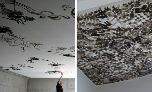
Art that isn’t so fleeting is best exemplified by Olivier Kosta Thefaine, who uses a cigarette lighter to burn his graffiti-inspired patterns into the ceilings of galleries. Inspired by Paris street culture, his illustrative strokes transform bare white rooms with complex smoke mosaics. Rather than desecrating to create the desired effect, the flame’s byproduct is in fact the “paintbrush.”

And lastly, burning has emerged as a tangible art in the fashion world. Balmain’s Spring 2010 Ready-to-Wear collection presents an array of tattered clothing with visible signs of distress. From beaded jackets to bullet strewn tees to ripped jeans. A tough sexy trend is already resonating with the fashion glitterati. Be ready to rock this look for major bucks or get inspired go DIY with your bleach, scissors and lighters. Layer up with skinny pants, embellished tops and jackets to complete the look. Tough girl attitude optional.

By: Angela Chen

Tracking Repetitive + Awesome.
On Instagram.