Pattern Pulp

City Perspectives from Above


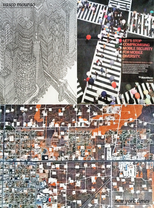
It’s always fascinating to see how illustrators, photographers and editors choose to portray a city. Recently a crop of overlapping interpretations have been surfacing online and in print. Vasco Mourao is an illustrator-turned-architect with an arsenal of highly detailed drawings. This Mourao image of Manhattan recently appeared in The New Yorker.

Stepping into a more commercial category, the Blackberry Bold campaign has chosen to express mobile diversity by taking an overhead shot of a city intersection on a rainy day. Rounding out the category with the overhead image frequent flyers are all too familiar with, we have a photograph that was recently published in The New York Times T Magazine (photographer unknown).


The Latest in Product Photography


We’ve all gotten used to white-washed backgrounds with shallow shadows thanks to Terry Richardson. Interestingly (and refreshingly), we’re starting to see an evolution of this high-low trend that incorporates a wash of color. From Sous Style’s weekly Tip Off shot by Lianna Tarantin where house-hold products become still-life perfection to Christopher Griffith‘s translation of Jill Lapore’s Battleground America to Tim Small’s The Milan’s Review, the sum of these examples simplify the story for a stark message translated through a punchy color backdrop.

Bringing commercialism (and Terry Richardson) back to the stage, Aldo’s latest campaign playfully incorporates type with a flat monochromatic background. Are you a fan?


Trend: Patterns in Advertising


When you consider the advertising industry at large, it’s simply a means to sell many messages. Regardless of the need versus want factor, it’s interesting to follow the creative thinking behind various campaigns. At least, from a trends perspective.

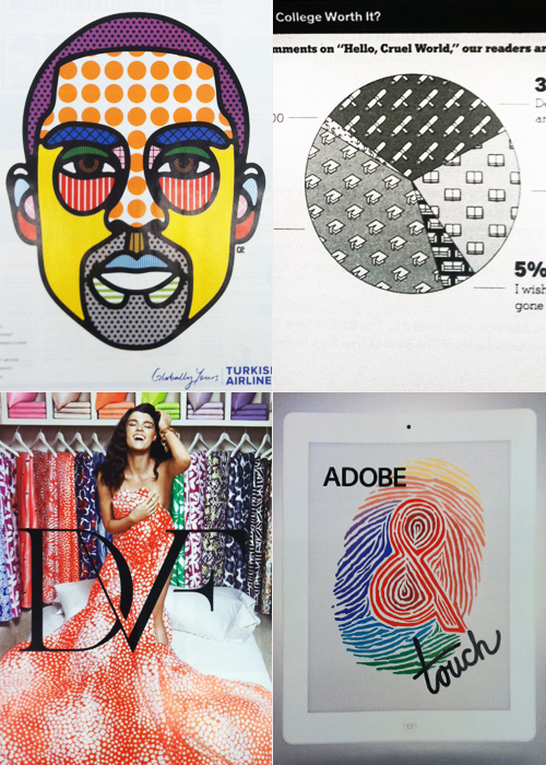
This Kobe Bryant portrait for Turkish Airlines highlights the brand’s unlimited amenities (flat beds, realtime entertainment, chef services) through the technical mechanism of an info graphic. Infusing similar texture into a more journalistic illustration, this New York Times pie chart assesses college debt through the lens of perception and worth.

Keeping in tune with the graphic nature of these layouts, Diane von Furstenberg’s recently launched home collection highlights the brand’s coveted archival duvet covers- a partnership recently launched with Bloomingdales. Sharing a similar color palette and graphic layout, Adobe’s Touch for the iPad app gets playful with tiger-striped typography.

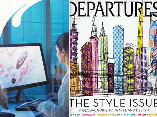
Since we’re sharing the softer side of tech in today’s round up, it seems relevant to showcase GE’s Imagination at Work campaign, highlighting the microscopic organisms that lead to innovation. The palette mimics this vintage American Express Departures cover in a global-fabric kind of way.


Patterns & Branding at the Arizona Biltmore


Last weekend my friends and I packed our bags- from various parts of the world and headed to Phoenix, Arizona to celebrate the wedding of one of our dearest friends who’s currently living in London.

Upon arrival at our hotel, the intricately designed Arizona Biltmore, Lily, the bride, exclaimed (as many friends and family members do these days), “this hotel’s perfect for Pattern Pulp!”
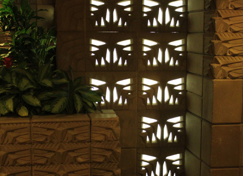
She was right. The deco pattern motifs were quite literally, everywhere.
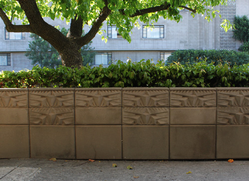
Frank Lloyd Wright in collaboration with Albert Chase McArthur were responsible for the masonry “Textile Block” construction which was implemented throughout the hotel and grounds in 1928.
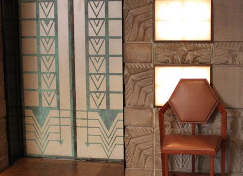
From cement blocks to geometric carpeting, to back-lit lighting, landscaping and interior furniture, the deco theme transports you to old-world Hollywood, emitting a mood of what LA or Las Vegas may have been like in the 30’s, 40’s and 50’s.
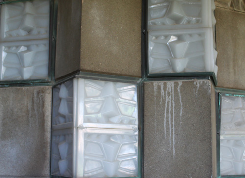
Barely using their typographic logo, you know the vibe of the hotel. The surface design and architecture cooperate in telling the story of a unique destination beyond the cookie-cutter expectations of a chain resort.
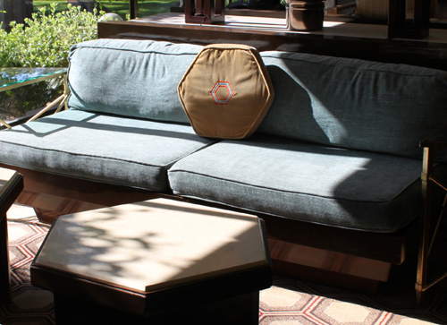
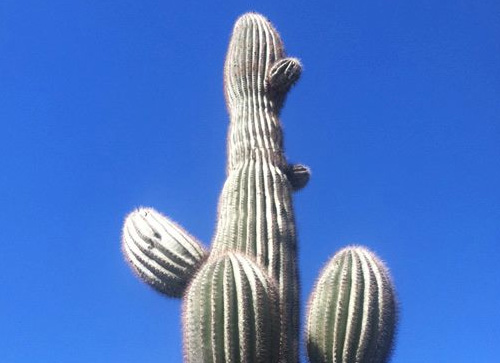
Large, expansive grounds allow for privacy, quiet pools are hidden behind cacti gardens and a wall devoted to presidential photos reveals the extensive history that’s walked the halls.

Looping back to the mission of the trip, it was such a treat to escape the east coast for a warmer climate, overdue reunion and tremendous celebration.

Here’s an instagram of pre-pool time on game day. I hadn’t been in a pool since July. I was excited, to say the least.

And with that, I’ll also admit that I’m officially old. I preferred the adult pool, where people read, veg and don’t twist down slides.

This little (or rather big) number made it’s way out of storage. Stains, holes and all, it’s still my favorite summer dress.
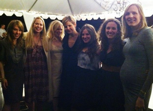
And finally, a few shots of the ladies (if you’re interested) from Shabbat dinner.

And a glammed-up wedding night. Have you been to Arizona? What do you think?

 

The Language of Wood with Daniel Moyer


http://vimeo.com/36303401

This video celebrates the launch of Daniel Moyer’s wooden furniture collection. It’s a beautiful narrative highlighting the design process of felled wood to table and chair. The storytelling is soft yet strong and invites the customer into the workshop to understand the TLC behind woodworking. What a powerful marketing reel to support a solid product.


Bright & Energetic for Spring


Spring’s around the corner- from a no sock and ice coffee perspective (New York’s been WARM) to an advertising and merchandising rollout. The color palettes are vibrant and have been populating the digital, print and TV airwaves since Super Bowl Sunday. Launching a new take on design, style and influencers, Gap’s tapped several bloggers and online personalities to showcase their latest collection. Have a look at Styld.by, the very sharable home for this execution.

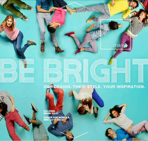
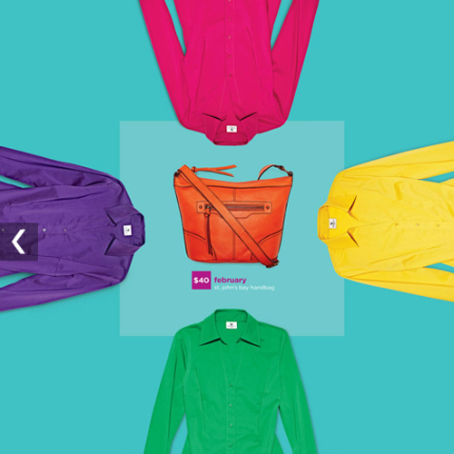
Continuing with the overhead vibrant theme, JCPenney’s recently launched an entire facelift, revealing a paired-down, optimistic, curated approach to shopping. The catalog is easy on the eyes with playful photography and bold typography.

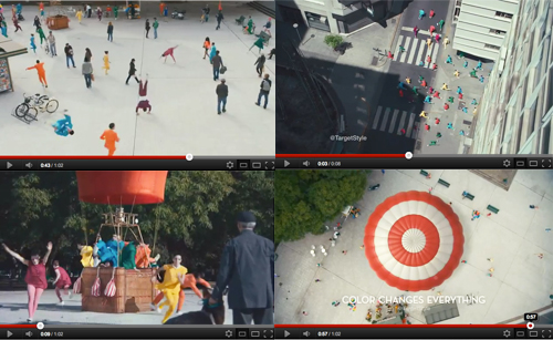
Tying the theme together, Target’s latest explosion of color spot reminds us all to get moving and douse our winter palettes with saturated hues.

http://www.youtube.com/watch?v=rMi5fFtye6o&feature=relmfu

Exciting to absorb, let’s hope the weather continues to follow suit.


Tracking Repetitive + Awesome.
On Instagram.