Pattern Pulp

Interior Color Stories from Dubai


1kate_lewis-harpersbaazar_dubai 2kate_lewis-harpersbaazar_dubai

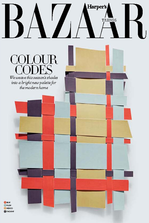
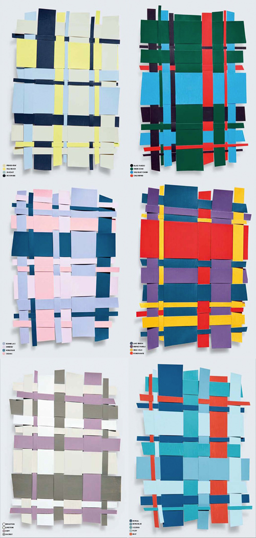
Paging through instagram this morning, I came across the work of Kate Lewis. Lewis is a photographer living in Dubai with a gifted eye for chic, modern, magazine-worthy moments. She recently shared these still life color collages from the March edition of Harper’s Baazar Interiors on her tumblr. They’re inspiring in more ways than one, as they convey an interesting balance in color harmony while doubling as unexpected plaids, worthy of art or fashion. Do any of these translate to your home?


Frankie's Homage to Pattern


1frankie_magazine2frankie_magazine6frankie_magazine3frankie_magazine4frankie_magazine5frankie_magazine

Happy Monday! With temperatures swinging from 34 to 55 today, it’s  another confusing day for the east coasters. Many of us still have Fall fashion on the mind, but with imminent Spring on the horizon, we’re all on the cusp. Frankie’s latest issue hits a nice balance between the seasons- complimenting this sentiment.

Focusing on pattern through design, art, photography and fashion, the latest edition pays homage to texture. Showcasing work from Dinara Mirtalipova (the cover art), Elizabeth Olwen,  Kendra Dandy and plates from Crown Lynn, Mikasa, Johnson of Australia and Casual Cream, the layouts are eclectic and the DIY activities, useful. It’s fun to see how various mediums showcase and celebrate the art of pattern. Pick up a copy, I personally think this issue’s a collector’s item.


Custhom's Digital Embroidery


1Custhom embroidered wallpaper_patternpulp2Custhom embroidered wallpaper_patternpulp3Custhom embroidered wallpaper_patternpulp

I always look forward to emails from CUSTHOM. Their collections are unique and boundary-pushing, with meticulous technique and execution. You’re always left wondering, how did they pull that off and why don’t we have a store selling their products in the US? 

Their latest launch, Aves, presents an Otomi pattern rooted in Mexican tradition with modern edge. Digital embroidery’s been used and the final product exists on both wallpaper and fabric. What’s most impressive, to me, at least, is the tonal aspects using a single color- through careful overlap, the objects have a 3D feeling.


A Kleenex & Mizrahi Collaboration


Kleenex_Mizrahi_PatternPulp

When’s the last time you were sick, and at the drugstore buying tissues? Did you opt for design over softness…or both? Whenever I’m restocking, I’m always annoyed at how loud the patterns are and entirely unsuited for my apartment. Then, I realize I’ve been standing in the aisle for an embarrassingly long time and just choose whatever’s softest and cheapest and dash for the cashier. I have to believe I’m not alone.

Here’s where Kleenex has amped up their visibility. They’ve partnered with Isaac Mizrahi in the hopes of adding a fashion touch to a clinical product. I’ll admit it’s a valiant attempt. While the patterns are still rather loud, (I’d love to see a subtler textured collection), the marketing video’s fun- a street Q&A, asking regular people if the patterns are from fashion or tissues. Have a watch– what do you think?


Textile Trends & Moon Phases


moonphases_patternpulp_trend

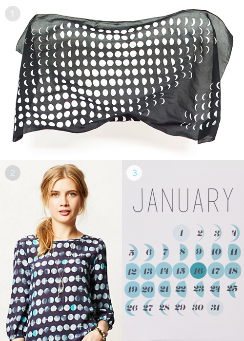
Moon phases have been a mechanism for counting from the beginning of time. The ability to track progress through shadows and light is magnificent concept, and artists from all over the globe have been harnessing this as inspiration for their work.

At the top (1), we have art printed on textiles from the Bulan Project. Bulan means “moon” in Indonesian, and is the guiding light for Elle Luna, the artist behind the series. (2) is a peasant blouse by HD in Paris, that’s a new arrival on Anthopologie’s website and (3) is one of twelve unique calendar pages by the print studio, Clementine and Pickle. To purchase, click here.


This Week in the Pattern World


1printsource_patternpulp2printsource_nottene

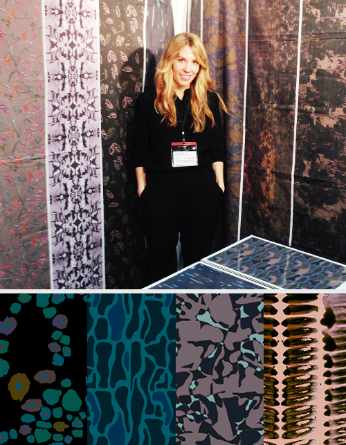
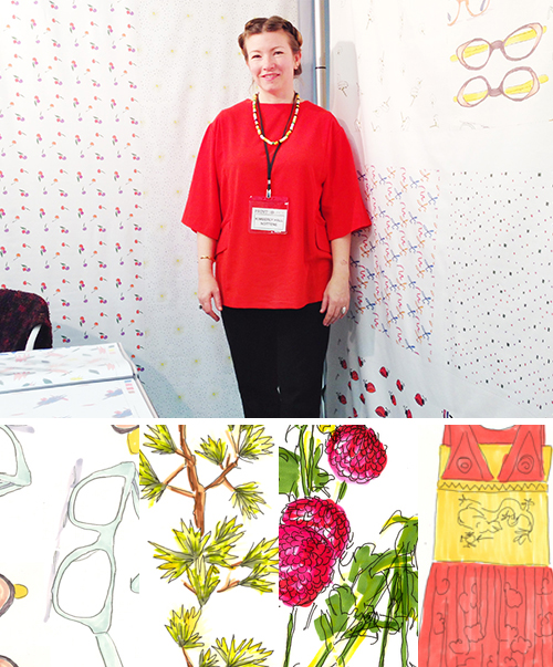
It’s been a big week for the print and pattern world, especially if you’re in the midst of designing for Spring/Summer 15. I wore a few different hats over the past few days, which was an interesting learning experience- one that’s been fun but a little draining. In reality, being a jack of all trades isn’t that different from the day-to-day tasks of being a consultant, but in regard to Printsource and Premiere Vision/Indigo, it was a small feat to hop between being press and a presenter. Just a little note, I kept the shows separate, so there was never a conflict of interest.

Big News from Pattern Pulp Studio

For those of you who who don’t know, I just opened shop with a library of over a 100+ new prints for Pattern Pulp’s Textile Studio (yay)! It’s been wonderful and exhausting to juggle the balancing act of client work with painting and pattern production of an entirely new collection. That said, I’m pretty happy with how things have turned out…

As soon as the new website launches, everything will be online, and if you’re interested in licensing, purchasing, or potentially collaborating on product development together, please don’t hesitate to reach out. The categories are across the board, ranging from home, apparel and accessories for men, women and children.

Reflecting on Printsource

In all honesty, Printsource was as I had remembered it when I worked in corporate footwear design: a bit more conservative, a bit more mass. Kim and I had a wonderful time presenting and meeting with waves of buyers, artists, new business owners, fellow presenters and students. Interestingly though, we kept hearing that our work was particularly artsy and “haute couture” for the show. Weird, right? At first, it makes you wonder, “well hey, that’s cool, thanks!” But then you start to think, am I in the right place, among the right buyers?” It’s all a learning experience, you see…figuring your place in the market, deciding what brands are best suited to collaborate with. It makes me think that Premiere Vision might be a better fit for our next presentation.

Which leads me to the press portion of this post- the valuable tidbits from the shows. As usual, the Italian, French, British, Australian and Taiwanese presenters blew me out of the water.

Notable trends from Premiere Vision | Indigo

1. Wooden buttons with color accents were a thing, much like the furniture design world (Bottonificio)
2. Prisms are still a big deal, only now they’re a bit more messy, a bit more decayed
3. Texture collages are still an interesting form of storytelling, particularly in regard to ethnic prints
4. Landscape printed lace…absolutely stunning (Goutarel)
5. Large sketchy portraits (a la Great Gatsby)
6. Florescent geometric wovens
7. Shells, sea creatures and other animals out of context

A few studios from both shows that blew me out of the water:

1. Malhia Kent (France)
2. Alcantara
3. Liberty Art Fabrics (London)
4. Manitoba (Buenos Aires)
5. Amy Ormond (New York)
6. C.O.T.O by Takisada Osaka (Japan)
7. Gratacos
8. Seterie Aegunti
9. Kuku Kachu (Australia)
10. Ulysse Pila (France)
11. Gimoar (Italy)
12. Shinkong Textile Co (Taiwan)
13. Abby Lichtman Design (NYC)
14. Susanna Samson Design (London)
15. Minakani (France)
16. Philomela (California)
17. Print Fresh Studio (Pennsylvania)

 If you’d like to discuss the wrap up a bit more, feel free to get in touch!

 

Tracking Repetitive + Awesome.
On Instagram.