Pattern Pulp

Trend: Linear Jumbles


barneys-southbeach

Over the weekend, I had the good fortune of escaping the cold wet city for Miami.  In between bouts of beach and people watching, I popped into the shops along Collins Ave to see if South Beach had more to offer than bedazzled Ed Hardy paraphernalia.  As predicted, Barney’s quenched my thirst for innovation.  I was astonished by the simple lighting solution that brightened the entire menswear floor.  “People will come from all over to visit the store, so we definitely wanted elements of memorability and surprise,” said Kent Wells, Director of Retail Planning and Design for RGLA .  Relying on new and creative ways to use utilitarian objects, Barney’s Miami CO-OP combined a mix of materials, fixturing systems and artisan objects to create an eclectic store environment, with an emphasis on wacky and fun.

dahlback-sunshineandshadow-jasperjohns

Speaking of wacky and fun, linear jumbles can be found across creative platforms in the homegoods, fashion and art worlds.  Åsa Dahlbäck, a Pattern Pulp favorite and recent interviewee, designed this vertically frenzied wallpaper from her studio in Sweden.  Each moving cluster is reminiscent of the motercycle traffic I experienced while traveling throughout South East Asia a few years ago- a snapshot of moving chaos. Lily Raskind, the founder and lead creative of Sunshine & Shadow, showcases boldly understated pieces in her Spring/Summer ’09 collection by combining feminine and masculine details.  At a quick glance, Raskind’s textiles look like an abstract version of pick-up-sticks.  Using color and line to create a maze of texture, Jasper Johns adds historical relevance to this trend in his untitled Lithograph from 1972, a work that’s currently on display at the MoMA.
Street Finds: Houndstooth Renaissance


houndtoothwear

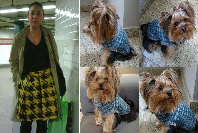
Once relegated to suiting basics and formal attire, the traditional Scottish houndstooth pattern has experienced a renaissance in recent months. While most people are used to seeing this checkered staple in black and white, interesting applications have begun to surface, ranging from bright and bold for humans to innovative and luxurious for pets.  This black and yellow skirt, worn by a fashionable New York City commuter, is as punk as it is feminine.  Tankers replace checks, adding edge that is quickly softened by broad feminine pleats. Hopping into the world of pet fashion, this subdued intarsia sweater from Vogue Knitting is a sophisticated must for the knitters out there.

houndtoothhome

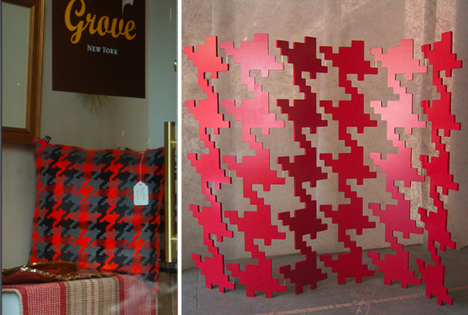
Grove, a high-end home goods store in the West Village always provides an inspiring browse.  The items on display usually translate trends throughout other home good categories.  This houndstooth pillow is a tactile translation of journalism-inspired palettes.  Next time you’re reading The Economist, Newsweek or The Daily Beast, take note of the color schemes, as red and black take center stage and are used to communicate urgency- a message many home designers have recently embraced.  Courtney Skott, a west coast creative, solves the age-old dilemma of the room divider with her life-sized Houndstooth Screen.  This pivoting sculpture provides a functional and artful way to interact with your furniture.

houndstooth-tent

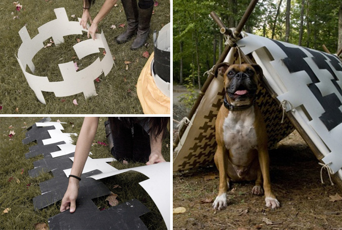
As noted on Inhabitat a few weeks back, Commonspace’s collaboration with Matt Penrose produced a collapsible dog tent for apparel and lifestyle brand Freeman’s Sporting Club.  Made from biodegradable plastic and pieced together by interlocking puzzle-piece components, the sum of the parts result in a houndstooth print. It’s wonderful to see a traditional pattern applied in innovative ways, even if the idea is geared to an unrealistic process.

Follow-up: Digital Dividers


cristian-zuzunaga

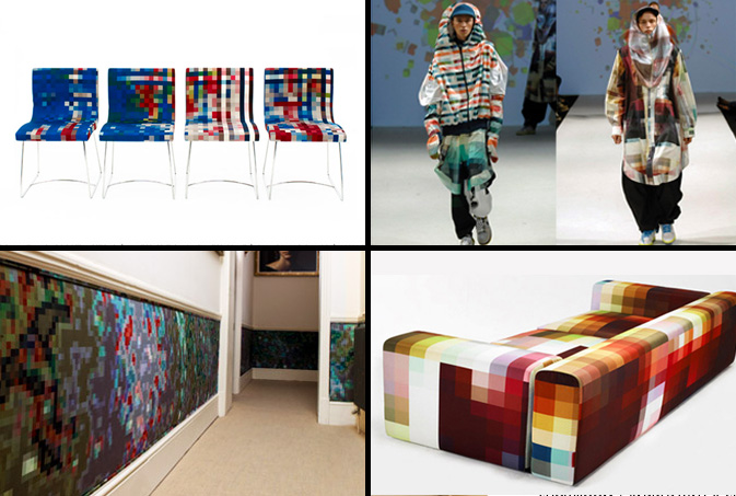
Cristian Zuzunaga and his pixilated prototypes have gained notable buzz as of late.  Similar to Kashiwasato’s vibrant animations, Zuzunaga’s printed textiles provide a softer, more tactile alternative to digital geometry.  Each work is heavily influenced by architecture in addition to the metropolitan landscapes Zuzunaga has traveled to, including Barcelona, Paris, London and Shanghai.  Each product, be it a chair, couch, wall covering or jacket showcases a playfully abstract vibe, providing an intricate snapshot that’s as detailed as it is abstract- eye candy for the artistic nerd.

Trend: Bottling Sustainability


randy-polumbo

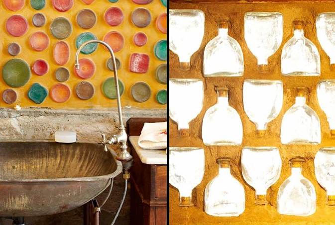
Artists throughout time have always been inventive with the objects around them, continually searching for beauty in most unusual places. Similarly, marketing teams and packaging gurus are continually on the hunt for new inspiration, hoping to design appropriately for the future.  Though the motives often differ, the end results are generally similar.  Artist Randy Polumbo of Joshua Tree, CA has always been passionate about using found objects to create art and was recently highlighted in the New York Times about his life long architectural endeavors. “I had very specific rules, to use nothing new except steel — it’s already a recycled material and no paint and no Sheetrock,” rules that laid the groundwork for creative explosions.  Inside there are embedded tequila, wine and soda bottles in the wall, a flashlight chandelier and countless other treasures that most anyone would agree, is quite striking.

stuarthaygarth1

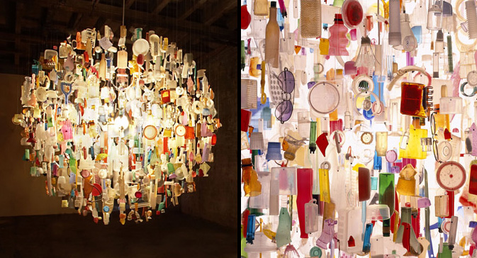
Lighting designer Stuart Haygarth creates beautiful pieces from man-made debris, breathing life into objects that would otherwise be tossed away.  His “Tide” chandeliers are literally created from washed up trash found upon the Kent coastline.

costaverdehotel

Looking for an eco-friendly kitsch vacation stay?  Look no further than the Costa Verde Hotel in Costa Rica, recently featured on Inhabitat.  A salvaged boeing 727 jet from San Jose was transported piece by piece through the jungle where it was then reassembled onto a 50 ft. pedestal and now doubles as a hotel.  No matter the size, sustainable methods for living can be applied to products of all shapes and sizes, proving that creativity paired with determination can lead practical, inventive, and beautiful solutions.

Additional reporting by Emily Gup.

Interview: Åsa Dahlbäck


asa-dahlback1

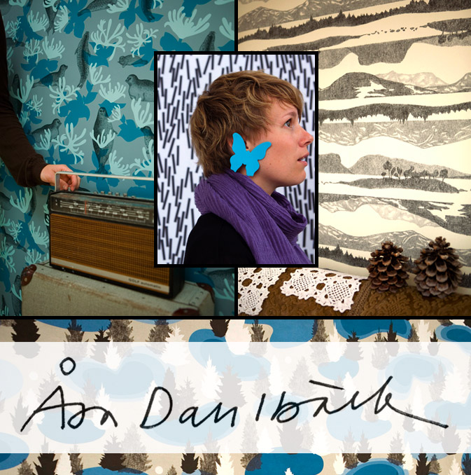
Åsa Dahlbäck is as calculated as she is original, particularly when it comes to pattern making.  Born and trained in Sweden,  Dahlbäck brings her design expertise and knack for reinterpretation to Lula, a multi-disciplinary art and design studio based in Gothenburg, Sweden. Her patterns are often nature-inspired and possess a graphic flair that incorporates relevant iconography.  “The patterns are built from what I find characteristic for the different (local) provinces,” a consistent theme throughout much of Dahlbäck’s portfolio.  Check out our Q+A for a glimpse into her daily design routine.

*            *            *

PP:  What websites do you generally start your day with-do you have a daily routine for news/blog/information consumption?

AD: I start my morning by reading a Swedish newspaper site and when I need a break and something beautiful to look at I usually visit my friend Elisabeth’s blog. Her photographs make my day sunny.

PP:  How did you discover your talent and how has it evolved over your career?

AD: Talent is something very abstract. For me it has been about allowing myself to do what feels natural for me.  This is still the case and probably what drives me forward.

PP:  Do you discuss your work with other designers?  If so, how does that impact your creation process?

AD: When I’m into something I can be a bit introvert. This is something I try to change, because I want to share my process and I know the result is always improving when I invite others.

PP:  Where do you usually work on your patterns and what is your preferred method of creation + execution?

AD: In the sketching process I try to have a variety of different methods going on at the same time. Pen and paper, using scissors to do cutouts, computer drawing and photographic collages. I mostly work with a chosen theme where I combine stories with different forms of sketching.

PP:  When is the last time you took a professional/creative risk?

AD: When I feel I’m taking a risk I know it means I’m doing something different from the last time. I try to welcome and stay safe in this feeling, because it usually leads me in a new direction.

PP:   Do you incorporate commercial trends into your work and if so, is this a factor that drives your design?

AD: I can’t say it drives my design, but it usually affects me in one way or the other. Trends usually say something about the time we live in and my curiosity for what’s going on around me is probably colouring my work.

Trend: Digital Dividers


gordinjen-oumi

Digital influences are everywhere- from Invader’s pixelated street art to fashionable home goods and clothing themes, typically invisible details are gaining recognition across non-digital platforms.  Dutch designer Nienke Sybrandy‘s sheer curtains are a coder’s delight. Her tree branches are compiled of assorted letters and numbers and are laid out within a monochromatic palette.  In an alternate world, the LA designers behind the Oumi label have embraced this fashion friendly fusion by pairing transitory pixels with satin and knit.

kashiwasato1

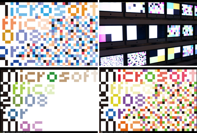
When assessing which patterns are most successful, it’s important to consider the role of color.  If a palette isn’t balanced, the eye will wander to the dead spots or over accentuated details.  These pixelated animations by the Japanese design team, Kashiwasato display type and movement for Microsoft Office’s 2008 for Mac launch.  Carefully choreographed squares cover the screen in chaotic movement, revealing digital disarray reminicent of a visual virus.

Tracking Repetitive + Awesome.
On Instagram.