
Pattern Pulp

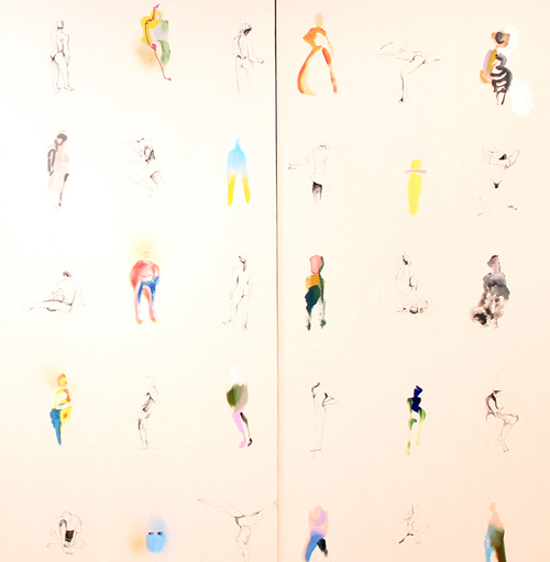
Voutsa's Hand Painted Wallpaper


1voutsa 2voutsa 3voutsa6voutsa4voutsa 7voutsa

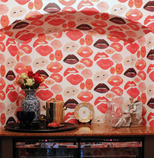
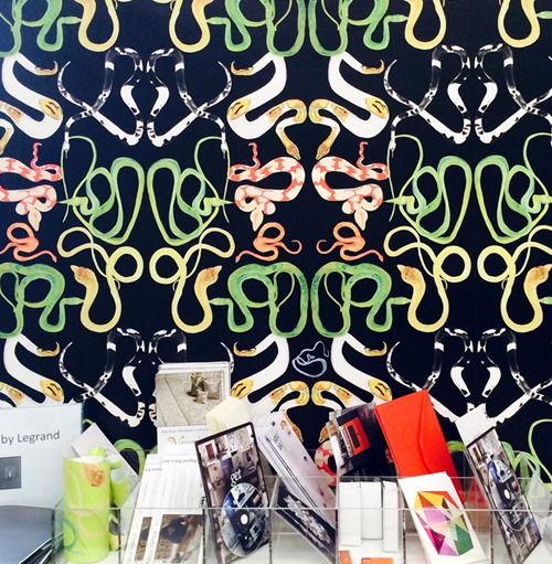
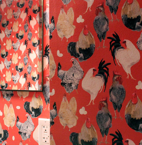
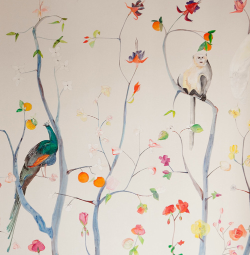
I have a soft spot for wallpaper – it’s the easiest and most direct way to add personality to a room. Is it an investment? Sure. Do you want to install if you’re renting? Maybe not. But if you’re able to make the commitment, the payoff is creative gold. I recently discovered Voutsa while browsing through instagram – their collaboration with The Sabah Dealer caught my eye. The texture, movement and color palette in each pattern conveys luxury in the most playful way – reminiscent of the loose painterly vibe found at The Carlyle or Crosby Hotels…but a hint more modern.

Based in New York, and founded by George Venson, the brand has evolved over the past year, with a nice array of collaborations, ranging from a partnership with Anthropology to custom work with ASH, to a limited edition shoe extension with The Sabah Dealer. I’m excited to see what’s next, as these textures feel really timeless. I’m a fan, are you?


Advertising: Patterns in Print


1patterns_in_print_advertising_pratesi

2patterns_in_print_adverting_gap_katespade

3patterns_in_print_advertisingJimmy Choo Cruise

Fall advertising’s in full swing and today we’re sharing examples from the home, kids and fashion worlds. Patterns are woven into each spread in artistic, abstract, fluid ways. Pratesi‘s Gatsby bedding line shares the duality of crisp geometry and loose painterly lines. It’s a beautiful balance and particular colorway. It’s like seeing a moodboard alongside the final product- something we’re big fans of.

Following in the footsteps of DVF’s successful collaboration with GAP Kids, Kate and Jack Spade have teamed up to release a limited edition kids collection. From the looks of the ad, it’s going to be print focused. This camo christmas tree is a fun alternative to the red and green themes we’re used to seeing come Christmas time. And…taking things up a notch to a sexier Bright Lights, Big City tone, Jimmy Choo’s Cruise 2015 campaign melds light, movement, sex appeal and a city skyline. Harsh lines are met with loose light. It reminds me of the old Sex and the City Movie poster, right?

How Designers Make Their Beds


designers_bedroom

Here’s a fascinating little window into the brain of a designer and their attachment to sleep and bed-making. Meet Shanan Campanero, founder and creative director of Eskayel design studio, Ghislaine Vinas, founder of Ghislaine Vinas Interior Design, Jasmine Takanikos, the branding expert behind Jasmine Takanikos Consulting Group and American Design Club co-founder Kiel Mead.

https://www.youtube.com/watch?v=ZuRIL8T8BgQ#t=142

The video has each designer making their bed and either wearing or showcasing something meaningful to them. We’re all an opinionated bunch, and when it comes to  personal space, nothing holds a candle to the spot where you spend 1/3 of your life. I really enjoyed this short. Interestingly, nearly everyone opted for crisp white sheets…


DuPenny's Burlesque Silhouettes


dupenny_home

The first time I saw DuPenny‘s catalog of work was at the New York Gift Fair a few years back. The installation reminded me of the repeats I used to work on when I was full-time corporate designer at Playboy. The pin-up as art, regardless of style, taste or preference has a timeless component to it and Emily Dupen, the founder, has found a good deal of success in it’s reinvention. Her latest exploration into furniture design has given the mainstay theme new life. Dupenny’s use of line is a refreshing take, and a reinvention of sorts, of the classic sailor tattoo. Imagine having this lounge chair amidst your lawn furniture- it’s definitely a conversation starter.


Retail: Denim & DIY Dip Dye


Dip Dye Retail Installations_patternpulp2

Anyone who works in retail display design knows there’s an endless amount of tlc that goes into every execution. Whether creativity is being sparked by budget constraints, deadlines, or oddball restrictions, the behind-the-scenes repertoire is intense and hands on.

Interestingly, the two photos I snapped above are a contrast of sorts. The ripped denim chandelier at Warm NY, is beautifully complimented by white brick and directional lighting. The fabric stripes break the height of the space, bringing a softness to an otherwise cavernous nook. The results are effortlessly cool and bohemian.

The indigo dip dye cotton below, in contrast, is used to hide the department store ceiling at Selfridges in London. Not an easy feat. Both simulate a paralleling story, only this version seems 10x more time intensive. The display is beautiful, and busy, and actually reminds me a lot of wedding decor. What are your thoughts? Is this something you’d recreate and incorporate into your space?


Retail Installations & Hanger Art


anthropolgie_window

When I saw this at Anthropologie a while back, I was floored at how dry cleaner hangers could live an ethereal life beyond their intended purpose…but that’s what good retail installations do, right? They take ordinary, everyday objects and give them new meaning. These triangular ribbons mimic an avian theme and I love it. What do you think?


Tracking Repetitive + Awesome.
On Instagram.