Pattern Pulp

Interactive Storytelling at Anthropologie


It’s been interesting to follow fashion’s toe-dip into the digital sphere. While the translation over the past few years has been a bumpy ride for many (some food for thought here as to why), some brands keep innovating, infusing their gift of storytelling through interactive mediums. Currently, Anthropologie is sharing it’s pattern, color and scale story through poetry-like pins.
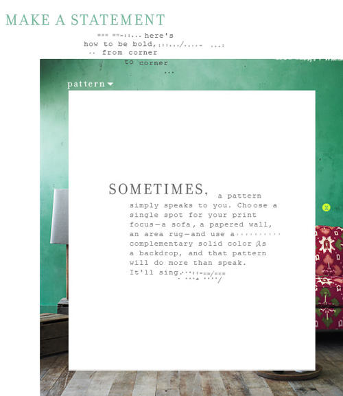
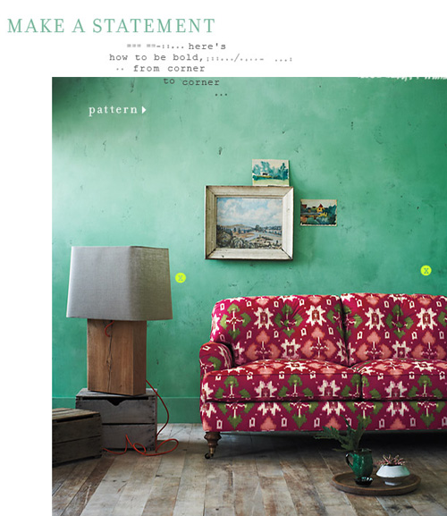
Directing the eye using bright focal points, a la Lifestyle Mirror, each of Anthro’s home spreads teaches the reader more about the creative process. The patterned page reads like a styling mantra.

Sometimes, a pattern simply speaks to you. Choose a single spot for your print focus- a sofa, a papered wall, an area rug- and use a complementary solid color as a backdrop, and that pattern will do more than speak. It’ll sing.


Graphical Homegoods with 56thStudio


Meet 56thStudio. The newest player to the field and the pickings are wondrous. An email recently found it’s way into my inbox decked with adjectives such as “luxe-personified yet kitschy, neo-ethnic, eclectically bold and youthful.” Off the bat, it’s hard not to agree!

Mixing graphic collage, vintage themes and old-school chairs (don’t they remind you of the 80’s? ) a fresh coat of paint paired with a textile refresh has produced a product line of note.

The collection includes chairs, pillows, wall decor, fabric, totes and customized orders and focuses on the caricature as furniture, familiar faces and is a tribute to The Beatles and Hollywood culture.

If you’re in Milan this week, stop by Spazio Rossana Orlandi for their debut exhibition.

So…which one’s your favorite?


Gift: The Coaster Puzzle Tray


While in Providence this past weekend, my mother-in-law and I found ourselves wandering around Wayland Square, passing time before our second seder. We walked into Runcible Spoon, which ended up being really fun – the store’s beautiful and the owner’s very friendly.

One item that really popped was this puzzle tray. It may be that I’m going to many housewarmings lately, but it’s really the perfect gift for anyone looking to accessorize beyond IKEA. Each coaster is part of a tile grid and lives happily on it’s own or as a group.


Trend: Patterns in Advertising


When you consider the advertising industry at large, it’s simply a means to sell many messages. Regardless of the need versus want factor, it’s interesting to follow the creative thinking behind various campaigns. At least, from a trends perspective.

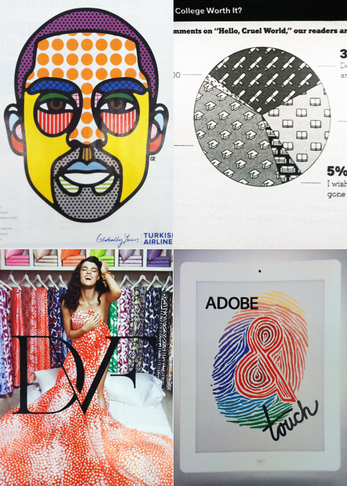
This Kobe Bryant portrait for Turkish Airlines highlights the brand’s unlimited amenities (flat beds, realtime entertainment, chef services) through the technical mechanism of an info graphic. Infusing similar texture into a more journalistic illustration, this New York Times pie chart assesses college debt through the lens of perception and worth.

Keeping in tune with the graphic nature of these layouts, Diane von Furstenberg’s recently launched home collection highlights the brand’s coveted archival duvet covers- a partnership recently launched with Bloomingdales. Sharing a similar color palette and graphic layout, Adobe’s Touch for the iPad app gets playful with tiger-striped typography.

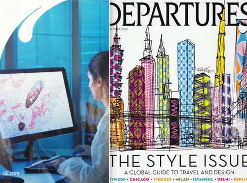
Since we’re sharing the softer side of tech in today’s round up, it seems relevant to showcase GE’s Imagination at Work campaign, highlighting the microscopic organisms that lead to innovation. The palette mimics this vintage American Express Departures cover in a global-fabric kind of way.


Arty Farty Walls with Minakaniwalls


Forever a fan of wallpaper, this afternoon we’re sharing a few favorites from the Paris-based studio, Minakaniwalls.

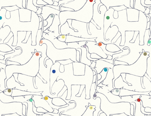
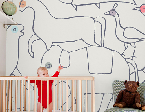
This is the animal edition. It reminds us of an evolved version of Wee Gallery’s stationary. It also might feel like you’re on a prolonged visit to the zoo.

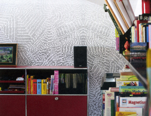
This Copenhagen edition translates busy city living and almost looks like layers of windmills from afar.

Up close though, the lines simulate aviation flight patterns.

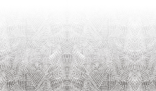
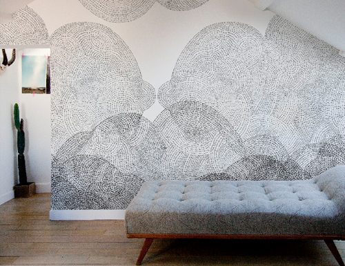
Combining what looks like charcoal and tracing paper effects, the Cloudy edition could double as an xray of the sky.

However, up close, the pointillism is breathtaking.

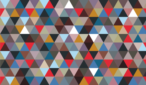
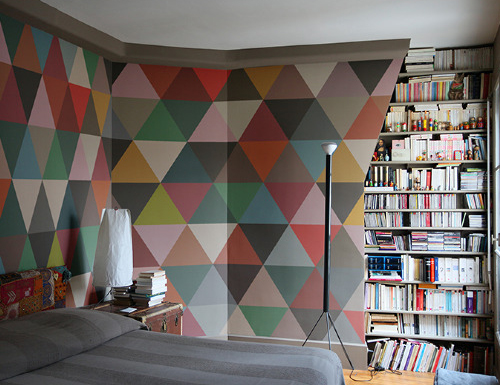
No collection’s complete without a vibrant tanagram set, otherwise known as the Mosaic edition.

So…which one’s your favorite?


Digital: Vectors & Stereo Systems


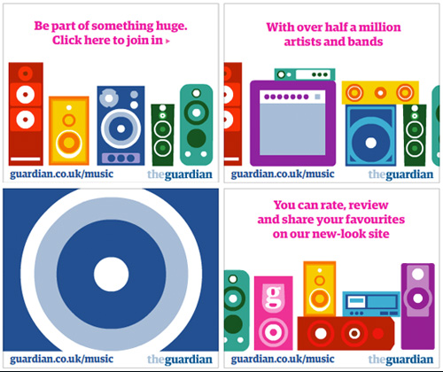
While reading PSFK this week, The Guardian banner caught my eye. The color was vibrant, the lines crisp and the theme, playful. With the design direction and ad buy, it appears as though the newspaper’s aiming for a younger audience.

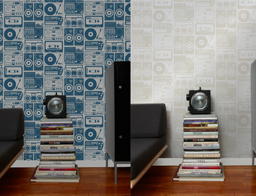
Interestingly, the stereo graphics mimic Aimee Wilder’s analog nights wallpaper. So much so it makes me wonder if the two collaborated on the latest execution. What do you think- do you like the home to digital translation?


Tracking Repetitive + Awesome.
On Instagram.