Pattern Pulp

A Portugal Tile Study


Big treat for you today! Our dear friend, (and super star stylist) Amy Stearley is on a bit of a world tour at the moment. Following her on Facebook’s been really fun, as she’s trekked through Slovenia, India, Frankfurt, Paris and now Portugal.

Viewing the world through the eyes of our friends is a gift and it’s been a treat to see her creative interpretations streaming through Instagram and Facebook…particularly as it relates to print and pattern.

Back in 2008 I visited Lisbon with a few girlfriends and everywhere we went, I was that friend who had to photograph everything…the floors, the walls, the subway ceilings, practically any and all exposed surfaces.

Without a doubt, Portugal’s one of the most colorful and geometrically adorned places you can visit. In Amy’s photos, cobalt grids appear to dominate with splashes of lime, terracotta, hay and blush.

While I collaged these spreads together for spacial reasons- the large-to-small ratio is quite popular at the moment (and a personal favorite). Abrupt mix and matching can be a cool fusion, so long as the silhouette’s polished.

The tiles are truly inspiring. Every building features a new color way, texture, print or pattern. I’m constantly dreaming about what cut of dress I would construct with each new blocking that comes my way. I hope everyone can enjoy as much as I have. Thailand is next on my list…excited to see what that beholds! – Amy Stearley

So that brings us to you, our lovely reader. What surfaces inspire you? Where do you find yourself snapping and are there any trips on the horizon before summer ends?

Street Shots: Housewarming Treats


It seems like many of my friends are moving these days. Perhaps it’s a product of the early 30-something set and life transitions. A lifetime childhood friend recently bought an apartment just over the bridge in Brooklyn Heights and I wanted to share in the joy with a little treat for her home.

My default local gift-buying spot is Mxyplyzyk, a local shop filled with treasures for every budget located on Greenwich Ave in the West Village. I’m always able to find something special on the fly. Anyway, here’s a little before and after. This cushion found a happy home!


Merging Soft & Sharp


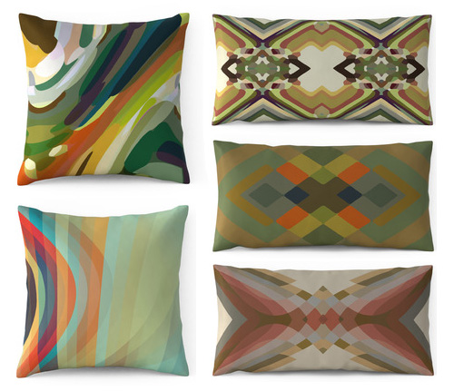
Over the past few seasons we’ve seen watercolors flood the home, type and paper markets. From organic textures to electric florals, soft bleeding edges have counter balanced the pixel trend. Today we’re discussing a merging of the concepts.

Parris Wakefield Additions, a UK-based interiors company founded by Howard Wakefield and Sarah Parris creates pillows, rugs and wallpaper merging crisp transparencies with graphic kaleidoscopes. Feeling both painterly and digital, the patterns are unique with broad, modern appeal, thanks to commercial color palettes. We suggest checking out their blog, as it’s an interesting window into their design process.


Textile Infused Homewear from Walter G.


Not long ago, I got an email from a good friend in living in Sydney, letting me know about a new home wear line that recently launched.

It took a quick perusal of Walter G‘s collection to know that the product was special. Made in India and Australia, with touches reminiscent of Paris and Japan, these simple, yet textural collages are beautifully applied to home wear.

Founded by longtime friends, Lauren Bennett and Genevieve Fennel, the collection is a reflection of their travels and a desire to infuse color into the Australian home.

The line includes pillows, ottomans, lamps shades and textiles. One of the most interesting parts of the site, second to the product, is the collection of artisan bios behind the craft. Have a look– you’ll learn how the process comes together.

All photos are from the Walter G’s site.


Textile Inspiration & Plate Illustrations


For those of you on holiday last week, welcome back! Today we’re featuring the after to this before post from May. Remember the plate face collection and Pebeo pens? They’re these amazing markers that let you draw and paint on ceramics and pottery. So…from the collection of thrift store plates, here’s what I came up with.

I find when I’m searching for inspiration for patterns or textiles I often start by looking at objects rather than the actual patterns on things. I love to find (or make) a collection of objects with a similar purpose or hand that I can group together to discover a new shape or texture. Here’s my most recent inspirational collection.

Coverage by Kimberly Hall


Trend: Chaotic & Melodic


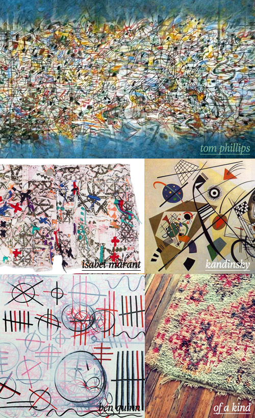
Today’s feature is all about the crazy. Organized chaos will forever be a part of the design process. When I think the number of versions that get made before that final goes up and out, it’s remarkable. The artists and designers showcased today have honed their style documenting energy and movement through texture and while some of the pieces may look like a work in progress, they’re final, and in my opinion, beautiful.

Emulating musical notes, Tom Phillips reveals a love of mixed-media which reminds us a lot of Kandinsky‘s later work. Bringing a street angle to the mix we have Ben Quinn‘s graffiti markings. Translating that energy through embroidery, print and fashion, we have Isabel Marant’s SS12 shorts and a recent instagram of a worn and torn rug from Of a Kind‘s new Downtown office.


Tracking Repetitive + Awesome.
On Instagram.