Pattern Pulp

Rotating Discs + Isabel Marant


Isabel Marant- Window Display- SS15

As of late, life’s been a bit hectic, and this site’s been a bit still. Luckily, it’s the good kind of hectic that makes the work day a massive juggle…

Last week, while running between my Chinatown office and a client’s office in Tribeca, I just sort of stopped in my tracks when I hit this window display at Broome and Greene. Isabel Marant has a way with motors and movement, and the geometric grandeur of this rotating disc series translates beautifully. The nuance of the movement steadies the eye and livens the scene. If you’re in New York, swing by the Soho store- hopefully you’ll enjoy the artistic mechanics as much as the inventory.


Children's Costumes at Le Bestiaire


Animal_costumes_Vautrin Biennale

I recently came across these adorable children’s costumes. They’re part of an exhibition entitled, Le Bestiaire, that’s currently on display at the Biennale internationale design de Saint Etienne 2015. The idea revolves around dressing up and becoming marvelous or monstrous. Getting into character is a part of being a child, and these imaginary creatures encourage children to become unexpected hyper realistic animals.

These stunning costumes are born out of the graphical fantasies of an eclectic team comprising Studio Brichet Ziegler, Perrine Vigneron and Gilles Belley, Louise de Saint Angel, Anne Lutz, Joachim Jirou-Najou, Felipe Ribon, Les Graphiquants, Twice, Helkarava, Bonnefrite, Malika Favre, Amélie Fontaine, Leslie David and Ionna Vautrin.


Coveting Kid's Footwear


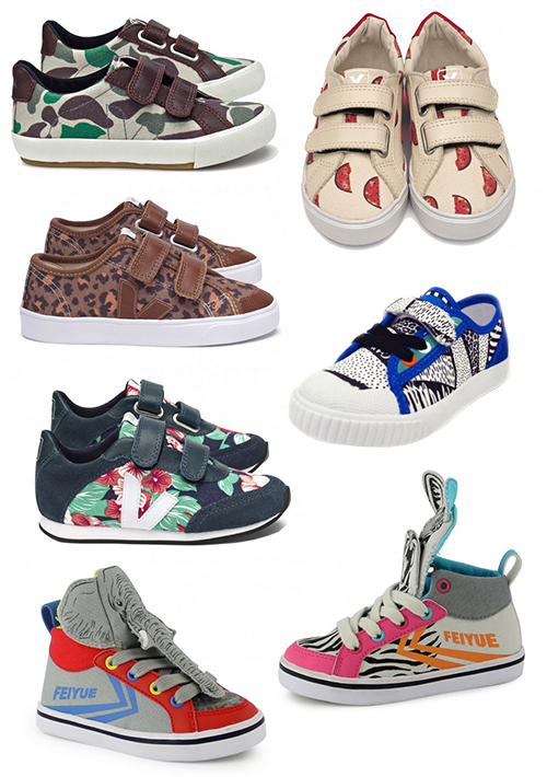
kidsshoes_veja_feiyue

Kid’s footwear is usually more fun than what’s served up to the adults – and these kicks from Veja and Feiyue prove that exact point. Maroon and teal camo, a watermelon toss, graphic florals, line markings and animal prints are all on sale this spring. Peruse French Blossom (a site devoted to Parisian designers) to buy and find more.


Trend: Fractured Perspectives


fractured_Perspectives2a

Recently, I’ve been seeing a lot of fractals. Broken imagery, split into unpredictable shards  – presenting the world in varied multiples. The idea reminds me of a kaleidoscope gone awry – where perfect geometry is gone, but varied angles still exist. Amusingly, this seems like a metaphor for life online, but that’s a post for another day…

One of my favorite examples comes from the instagram account of Thalea MV. Her clothing and prop styling has a refreshing spin that combines a carefree and specific point of view. Balenciaga also follows a similar path. Their latest ad reveals the reflection of a model, owning and destroying the photographer’s image, by way of a mirror. It’s very much an art, power and action shot.

In a complimentary realm, lines and layering do the trick in W Magazine. This typographic spread compliments the Bewitched editorial theme shot by Mert Alas and Marchus Piggott. And balancing out the chaos, this image from Antonio Guzzardo- depicting a white gridded face covering shouts futurism and the apocalypse- two drivers to parallel the unpredictable future of broken glass.


Max Mara's Texture Blocking


1maxmara-ss2015 2maxmara-ss2015

A set designer, a pattern maker and a photographer walk into a bar together…

Just kidding….but in all seriousness, this Max Mara’s Spring ’15 ad campaign kinda goes there. It’s hard not to love the balance of complex simplicity in the collage work. Between the pattern contrasts and varied scales, we get lost in the chaos- the only thing that saves us from a maze of black and white shapes is the color red and the focal point of a face. Using shape, flow and a beautiful model, the art direction guides us to the floral flow of the red jumper…the perfect step forward for the pattern on pattern look, wouldn’t you say?


Morag Myerscough for J.Crew


Morag Myerscough_Jcrew

J.Crew recently teamed up with the talented Morag Myerscough to design their London storefront on Marylebone High Street. Here are a few images from their blog, shot by the talented Kasia Bobula, where Myerscough’s creative process is documented. As you can see, the colors bounce around with a vibrant fluidity. This piece is a playful exercise in color theory – one that has beautiful movement. Artistic brand partnerships are quite common these days – and a stellar one plays up to both strengths. We think this one falls under that category, what do you think?


Tracking Repetitive + Awesome.
On Instagram.