Pattern Pulp

Woven Planters & Textile Experiments


mrkitly.com.au:collections:new-friends:products:pla-nf06#.U9R0lFaFZkg

Ever since I laid eyes on Doug Johnston‘s rope bowls and planters, I’ve been more attuned to this type of textile coiling. The style lends itself beautifully to asymmetry and  imperfect subtleties. Fast forward, and while perusing Mr Kitly, the Australian-based homewear site, I stumbled across work from a design studio based out of Brooklyn, called New Friends.

newfriends_web_ar-20_905 1280-delivery-1_905 2.2014_Swatch_style-1_905newfriends-hudson-ar-1_905newfriends

Founded by Alexandra Segreti and Kelly Rakowski, with a joint interest in textiles and housewears, their products combine weaving and a collage to create unique combinations and one-off pieces. Beyond the planters, if you’re int he market for a rug, you can’t go wrong with one of these beauties.


Shades of Pink Around the Globe


Pink Accents2

In America, the color pink is often associated with youth culture. If you’re trying to be younger, or more feminine, or even more girly, you go for pink- it’s the defacto color of the female gender. Move across the Atlantic though, and you’ll find that pink serves as a cool, edgy accent. Vivid, florescent tips, paired with white or cream send an entirely different message- one that the French and the Swedes have embraced for a long time. Then, we have Karen Mainenti’s humorous painting that captures the conflict and dichotomy of color and the sexes. Here’s a quick round up of some favorite applications:

1. Hanro’s handmade dip-dyed paper torn window display in the Meat Packing District in Manhattan 2. A DIY maxi skirt on a pair & a spare 3. Very cool coasters from the Caribbean restaurant Glady’s in Crown Heights, Brooklyn 4. Youth retail display at ABC Carpet in Manhattan 5. A spectacular painting I took a photo of at my airbnb in Stockholm earlier this Spring 6. Revlon No.450 Gentlemen Prefer Pink by Karen Mainenti


Taking a Class in Shibori Dying


1shibori_dying_class_patternpulp

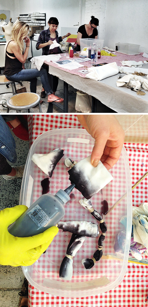
A few weeks ago, I signed up for a last minute class in Shibori Dying. I’ve been wanting to take a proper course at the Textile Arts Center for ages, but have had conflicts most of the weeks and weekends it’s been held.

2shibori_dying_class_patternpulp

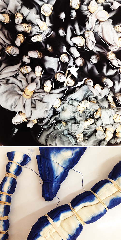
Shibori’s become a sought after style this summer. From high-end linen homewear and accessories to upscale and low key fashion, the DIY indigo look is something that’s accessible, yet cool, and not necessarily easy to replicate without a significant amount of practice. That is, unless you end up with happy accidents…which are cool if you’re a beginner.
3shibori_dying_class_patternpulp

My friend Linda and I were shooting emails back and forth, talking about how cool a set of shibori-dyed yoga leggings would be…which lead to her stumbling upon the Make Workshop website. Surprisingly, I’d never heard of the site or the classes, though I very familiar with the building, thanks to many visits a few years back to Laurie Rosenwald’s studio.
4shibori_dying_class_patternpulp

Before we knew it, we were meeting an enthusiastic bunch of fellow lady dyers and discussing our expectations for our untreated raw items. I want to say that the course was excellent and that you should all sign up for it, but in all honesty, it was a bit vague and open for the true beginners looking to understand the technique and the steps that go into varied dye results.
5ashibori_dying_class_patternpulp

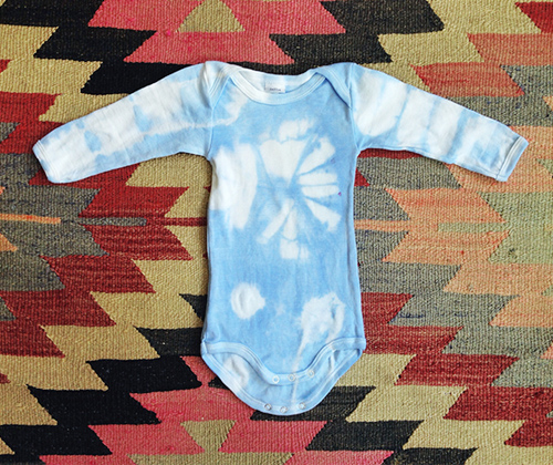
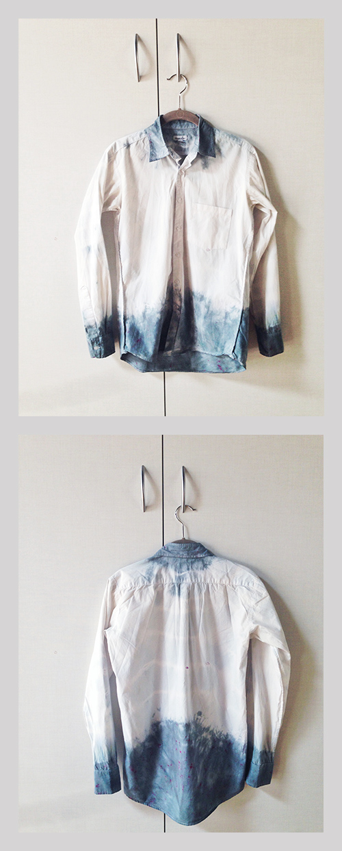
Here are my final products. I brought an old Steven Alan button down and a baby onesie, Linda brought dinner napkins and our friend Kate brought white vans and an American Apparel shirt. My goal was to get a sweet (but not too sweet) heart shape in the middle of the onesie. As you can see, rubber bands were used in abundance and clips helped secure crisp folds. The final color is about five shades lighter when it drained and dried, but overall I’m pretty pleased for a first go at it.



Trend: Textural & Tonal Blush


textural & tonal blush_patternpulp

It seems like a funny thing to write that blush is everywhere these days…but in all honesty, it kind of is. The color (also known to many as rose gold) has transcended gender lines and is making it’s way through the fashion, art, home and beauty worlds this summer.

Stylists are putting male models in blush colored t-shirts for insurance ads, just as beauty brands are decorating eyelids in high-end campaigns. Cut collages, ribbed packaging, shimmering surfaces and natural patterns are the markers of variation, and it’s almost fun spotting new interpretations. Here are a few examples that hop between continents and genres, proving the sophisticated seasonal staying power of this minimalist hue.

1. Maison & Object Asia Print Advertisement 2. & 3. Collage: Absence and Rediscovery by Anthony Gerace 4. Brit Rhythm Fragrance by Burberry  5. Volcano Keepsake from Ya Wen Chau’s Heirlooms Collection 6. 3D Printed Housewears by David Steiner of The Royal Academy of Art 7. Plaid floral appliqués for Carven 8. Rose gold Tattoo Eyeshadow by Maybelline for Marie Claire


Brushstrokes for Your Library


kyletwebster

Kyle Webster is a mastermind with brushstrokes. His ability to illustrate and story tell within Adobe’s perimeters is unparalleled and one of the reasons his regular clients include The New Yorker and The New York Times. In addition to creating, he’s dipped his toe into the world of  instruction and has started selling his infamous strokes. They’re extremely reasonable and life-like in presentation. Click here to explore, purchase and watch a tutorial.


Crafts & Commercialism with Marni


marni_dots

My clients really range. Some have massive budgets with serious production, ad-buying and PR capabilities, while others are start-ups. In the new business environment, every dollar counts, while we find a platform and craft a message to share with the world. You’re probably wondering, well, what does that have to do with the Marni pictures above? Are they one of Shayna’s clients? I wish they were…

I’m sharing these layouts, as they prove a point about creativity. You can hire models and do over (or under) stylized photoshoots, sure, but you really don’t have to…if you have a creative team willing to take risks.

By no means is Marni a budget brand (hello!), but they know that their customer is artistic and wealthy, if not a little out there. They have foresight that they’ll appreciate a quirky campaign showcasing the thought behind the product. So, with paper, scissors and ribbons, one of the cheapest newsletter campaigns that ever existed made it’s way into my inbox…and I loved it.

What do you think?

Tracking Repetitive + Awesome.
On Instagram.