Pattern Pulp

Making Music with Sam and the Womp


Who remembers this post from April? The one about color, backdrops and photo trends? Today we’re translating those palettes to music and media with the London ska/dance trio, Sam and the Womp with their latest video, Bom Bom. 

The beat’s surprisingly catchy, isn’t it? I recently heard the tune off my husband’s laptop and fell for the video’s playfulness. It’s clear creativity works best on a budget, what do you think- are you a fan?


Is Instagram the New Fashion Advisor?


I’ve had my eye on Black Milk since since crossing paths with their skeleton bathing suit. Though I didn’t buy it -medium’s been out of stock since day one – I keep noticing their line in my Instagram feed.

A majority of the imagery seems to be from LA & Williamsburg hipsters as well as inked influencers. The dollar leggings at the top brought me back to their site (I’m a fan). After giving the collection another perusal, I noticed something interesting.

Aside from the underground, in-your-face themes and general punk design ethos, there’s a button to the right of each style that offers styling advice.

When you click it, a collective aggregated feed appears, compliments of the brand’s many fans. Reminiscent of Fashism‘s self styling sight, Black Milk and their design team have figured out a way to reassure potential consumers while creating comradery among their customers.

Brilliant, if you ask me- a simple idea with great execution. This is a nice example of ecom marketing that feels organic and in line with the ethos of the brand.

From the top: Dollar Leggings | Cathedral Leggings | Galaxy Leggings | Mucha Black Leggings | Jelly Fish Leggings


Interactive Storytelling at Anthropologie


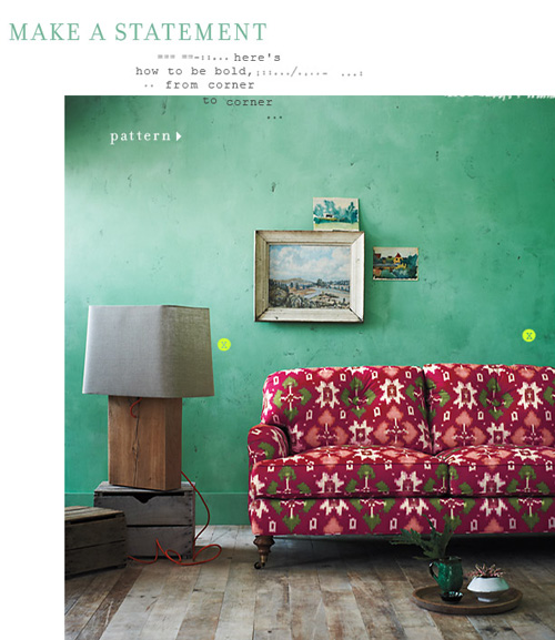
It’s been interesting to follow fashion’s toe-dip into the digital sphere. While the translation over the past few years has been a bumpy ride for many (some food for thought here as to why), some brands keep innovating, infusing their gift of storytelling through interactive mediums. Currently, Anthropologie is sharing it’s pattern, color and scale story through poetry-like pins.

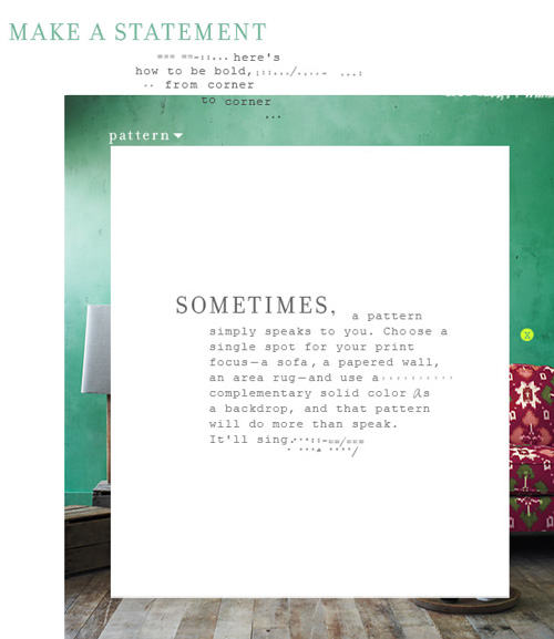
Directing the eye using bright focal points, a la Lifestyle Mirror, each of Anthro’s home spreads teaches the reader more about the creative process. The patterned page reads like a styling mantra.

Sometimes, a pattern simply speaks to you. Choose a single spot for your print focus- a sofa, a papered wall, an area rug- and use a complementary solid color as a backdrop, and that pattern will do more than speak. It’ll sing.


Gift: The Coaster Puzzle Tray


While in Providence this past weekend, my mother-in-law and I found ourselves wandering around Wayland Square, passing time before our second seder. We walked into Runcible Spoon, which ended up being really fun – the store’s beautiful and the owner’s very friendly.

One item that really popped was this puzzle tray. It may be that I’m going to many housewarmings lately, but it’s really the perfect gift for anyone looking to accessorize beyond IKEA. Each coaster is part of a tile grid and lives happily on it’s own or as a group.


Share Your Patterns on Instagram


Who here loves Instagram? All of us at PP are huge fans. The simplicity and ease of the filters has made the act of photo taking (and sharing) rather addicting. The fun news is that Dan, our talented (and patient) developer has recently added a permanent live feed to our homepage (!)

The feature’s called, From the Streets and we’re inviting  all of you to share your photos. Just add the tag #patternpulp and they’ll magically appear to the right.


Trend: Patterns in Advertising


When you consider the advertising industry at large, it’s simply a means to sell many messages. Regardless of the need versus want factor, it’s interesting to follow the creative thinking behind various campaigns. At least, from a trends perspective.

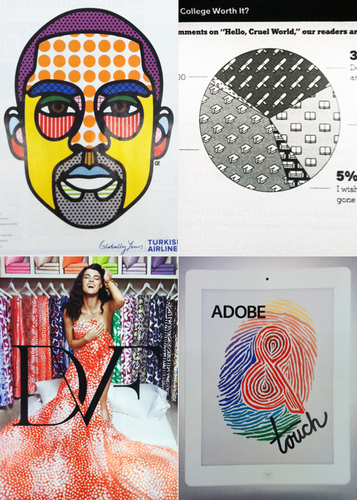
This Kobe Bryant portrait for Turkish Airlines highlights the brand’s unlimited amenities (flat beds, realtime entertainment, chef services) through the technical mechanism of an info graphic. Infusing similar texture into a more journalistic illustration, this New York Times pie chart assesses college debt through the lens of perception and worth.

Keeping in tune with the graphic nature of these layouts, Diane von Furstenberg’s recently launched home collection highlights the brand’s coveted archival duvet covers- a partnership recently launched with Bloomingdales. Sharing a similar color palette and graphic layout, Adobe’s Touch for the iPad app gets playful with tiger-striped typography.
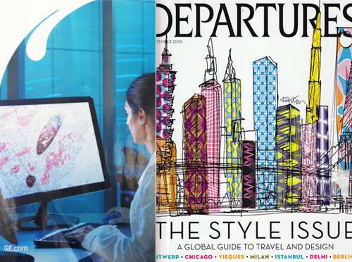
Since we’re sharing the softer side of tech in today’s round up, it seems relevant to showcase GE’s Imagination at Work campaign, highlighting the microscopic organisms that lead to innovation. The palette mimics this vintage American Express Departures cover in a global-fabric kind of way.

 

Tracking Repetitive + Awesome.
On Instagram.