Pattern Pulp

Fashion Tech & DIY: Print All Over Me


2printalloverme

1printalloverme

Over the past two weeks, several guy friends have emailed me about a new pattern-centric site. I’ve taken note. Who else has heard of Print All Over Me?

The concept behind this company’s a playful and inviting one, offering clothing templates, printing, and web storefront services to designers and fashion enthusiasts alike. The shapes are simple, yet interesting, in an American Apparel kind of way. We love the idea of simplifying the design process, where all you need to do is upload an image or a pattern to get started. Hopefully there will be quality control and a curatorial eye to keep the merchandise as fresh as the shapes.

Kudos and congrats to co-founders Jesse and Meredith Finkelstein on the launch. Excited to see how and where it evolves.
Color & Pattern: Apple's iPhone5 C


2iphone5c

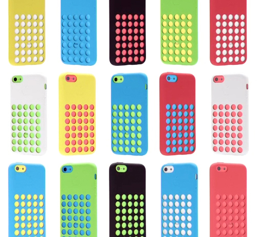
The anticipation’s over and even Apple’s in back-to-school mode with their latest iPhone C product launch. Combining matte and shiny surfaces, gridded netted covers, and a very bright color palette, these phones have a decidedly childish twist- taking a 180 diversion from the stark monochromatic days of the past.

The palette feels very American in a naive, almost unglamorous way. The playfulness of the colors are rather commercial and we suspect will have a good deal of influence over the coming years. When you’re a brand like Apple, you have serious sway. You set the mass market trends in the world of tech and product design.

I’m assuming the male market will veer towards the white C or any of the S phones, while the female buyers will be more varied (hello, coral), though it’ll be interesting to see how this palette plays out and inserts itself into our subconscious vernacular. If you’re planning to buy one, which color will win?


Rebus Puzzles & Hong Kong Emoticons


1hongkong_smiles

If you’re a bonafided texter, you’ve probably downloaded the extensive emoji library on your phone and are commenting via instagram, facebook and twitter with banana bunches, dancing girls, hearts, flames, waves and planes.

I recently was caught red-handed, texting pools, thumbs, suns and rainbows to my niece in California…confirming my oldest brother’s assumption- that I’m the eccentric sibling in the family (something I’ve always gotten a kick out of considering how organized and calculated I am in relation to my otherwise nontraditional profession).

So, let’s talk emoticons and rebus puzzles. When I’m scrolling through pictures and commentary, it’s almost a battle of the wits, wading through hilarious pictorial subs. The west has finally caught on that cartoons and illustrations are as funny, awkward and amusing as words are- particularly when coming from an untraditional (adult-like) source.

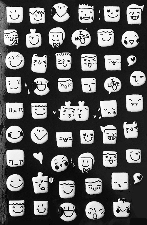
Today’s post highlights a package of stickers I got in the Hong Kong airport last month. They’re hand drawn, glow-in-the-dark and encompass a wider variety of emotion- in the most adorable way possible. What do you think? Are you in your 20’s and 30’s and an avid emoji user? Would you plaster these all over your walls and ceilings instead of the constellation stars we all grew up with? Do share…


Color, Conversation & Hanes Underwear


http://www.youtube.com/watch?v=gRJ9ko0nZmI

1color_marketing_hanes

2color_marketing_hanes 3color_marketing_hanes

Have you seen the latest Hanes spot? Chances are, maybe not, as the YouTube page has only 118 views. Parts of it are pretty cool, we’d recommend giving it a go. The concept reminds us a bit of Gap’s Be Bright campaign from a while back, but has clever synchronization and pattern mash-ups that transition human puzzles into cotton graphics.

Complimenting the TV spot, the social media component plays off of color, hoping to create chatter about an otherwise taboo topic. Would you tweet the color of your underwear? Hanes is hoping you will, by utilizing a Pinterest-like layout and pre-populated tweetable content, with a campaign entitled, What’s Your #undercovercolor? Have a look, play with the wheel, and let us know what you think…


Trends in Overlapping Textile Mediums


houseofmaryanne Louisa Crompton - Knitted Textile Designs2Louisa Crompton1epsteinrichterstearns

As artists, we’re often thrown for a loop and inspired to create our own interpretations from normal everyday oddities. On Pattern Pulp, we celebrate the thinkers and makers who combine, reference and refresh traditional mediums. Let’s have a look at a few works that straddle varying mediums and are tied together through vibrant, modular, unexpected overlap:

1. Maryanne Moodie and her woven tapestries. Like other instagrammers on the hunt for fresh work-in-progress, House of Maryanne‘s feed is a fabulous one, sharing asymmetrical tapestries, DIY classes and vintage clothing.

2. Louisa Crompton and her knitted textiles. Each design has a tetris vibe that celebrates modular graphics as 3D knits.

3. Robert Otto Epstein‘s vibrant colors, patterns and pain-staking details are digital, pixelated and asymmetrical.

4. Gerard Richter’s Tapestries, which we covered a few months back, where he converts paintings to woven works, breaking down each stroke into thread. In a similar but also radically different fashion, we mention Philip Stearns, who’s known for his blankets and tapestries inspired from lovely patterns formed from digital glitches.

The basic idea: “Transcode glitches in the cold, hard logic of digital circuits into soft, warm textiles.” When you think about the three, we have utilitarian textile patterns transformed into art, art transformed into tapestries and a fleeting digital moment captured forever in utilitarian tactile objects. What do you think of this trend?


How Flat Art Influenced Flat Design


1Ingeborg Panjer Roombeek 2Ingeborg Panjer Roombeek 3Ingeborg Panjer Roombeek 4Ingeborg Panjer Roombeek 5Ingeborg Panjer Roombeek 6Ingeborg Panjer Roombeek

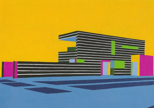
While reviewing and researching palettes, I recently came across Ingeborg Panjer Roombeek‘s paintings. Roombeek’s a master with color, space, and geometric balance. This series, dating back to 2010, emulates the beauty of flat design – a digital trend that’s evolved out of skeumorphism over the past year. It’s interesting to see it from the angle of the art world, as opposed to the design world, as this ‘less is more, 2D meets 3D’ layout has gained serious momentum thanks to creative overhauls from Microsoft and the tech startup world. What do you think of the connection? Would you say Roombeek’s work contributed to this creative trend?


Tracking Repetitive + Awesome.
On Instagram.