Pattern Pulp

Color, Memory + Culture


Color-TV-Fields

Everyone from the 80’s can remember this design and it’s symbolism. It represented a momentary pause in programming – one that accompanied a noise I don’t think I’ll ever forget. As with all things nostalgic these days, both the art and media worlds have harnessed this iconography to convey new messaging.

Francis Alÿs’s painting is part of a 40 work show in London titled, The Gap: Selected Abstract Art from BelgiumCurated by Luc Tuymans, the pieces focus on geometric abstraction and constructivism from the 20th century. The works touch upon cross-generational ties as well as distinct color fields.

In other more commercial realms, this Apple TV ad is a clever and simple throw back to a recognizable image associated with TV culture. Brilliantly, they’ve reclaimed the irony of the meaning. I wonder what millennials think when they see it.
 

Tuesday's Gallery Picks


gallerypicks_patternpulp99

This week’s gallery picks explore communication through patterns and symbols.

*            *            *

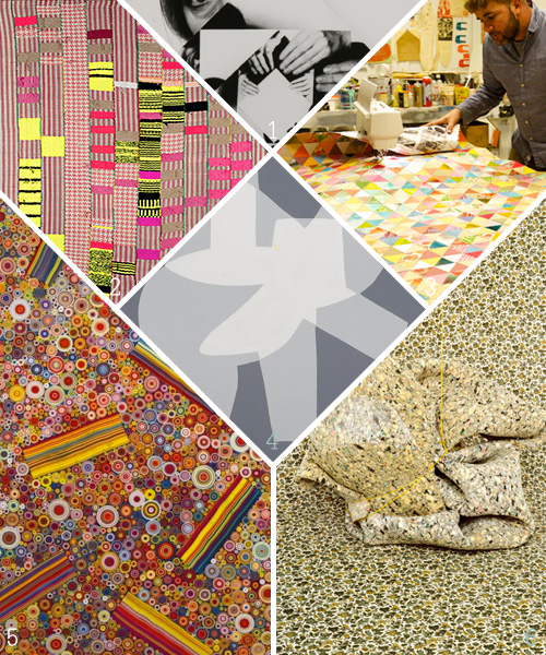
1. This epic show takes Kazimir Malevich’s radical painting of a black square – first shown in Russia 100 years ago – as the emblem of a new art and a new society. The exhibition features over 100 artists who took up its legacy. Their paintings, photographs and sculptures symbolize Modernism’s utopian aspirations and breakdowns at White Chapel Gallery
2. Diedrick Brackens’ frenetic textiles combine painting and sculpture, West African weaving and European tapestry, blunder and intention, domesticity and the wilderness of the imagination at Johansson Projects
3. Artist and filmmaker Thomas Campbell is internationally known for his artwork combining colorful renderings of figurative characters against bold graphic backdrops and a vocabulary of positive affirmations scrawled in a unique stylistic hand that often results in profound and inspiring views of human nature at Bolinas Museum
4. Hayal Pozanti has created a cipher system, titled “Instant Paradise,” whereby numbers and letters from the English language are replaced by her own iconic alphabet. Through this encryption, Pozanti’s works explore the polemics of communication, examining the privatization of information and the dissemination of data in the Internet age at Jessica Silverman Gallery
5. Hadieh Shafie layers thousands of strips of hand painted paper, which are the rolled into schools and placed within a frame or stacked flat. Persian words like eshgh (“love”) are inscribed and often concealed within the layers of paper, referencing the meditating practices of Sufism at Leila Heller Gallery
6. Mossy Cloak, curated by Third Object, is a group exhibition of work in photography, painting, sound and sculpture from six artists. It examines the layered vocabularies of camouflage, exploring its role as a visual surface patterning and as metaphor for social and historical concealment at Roots & Culture


Paridust: Where Fashion Meets Art


Paridust_Patterns

I stumbled upon Pari Ehsan’s instagram feed last night while procrastinating before bed. I clicked on her photo, and was completely taken by the art and color fields that followed.

Ehsan claims the stark minimalism that’s synonymous with gallery spaces. She merges herself within geometric rooms to create energy between herself, her outfits and the objects. Her presence paired with the square layout of Instagram produces a story – one that’s thoughtfully aware, if not a bit reserved. The minimalism or maximalism used in the styling works beautifully in the series. Here are a few personal favorites, but have a look at her website – it’s an interesting take on pop culture, fashion and the art world.


Patterns in Educational App Design


Home_app_tinybop_patterns

Tinybop‘s tagline reads, Toys for Tomorrow. Ever since this Brooklyn-based app company launched as an interactive learning platform, I’ve been really impressed with their mission, their gaming categories, and of course, their elegant graphics.

If you’ve visited their site before, you’re probably familiar with the Human Body app – which teaches kids how their bodies operate through playful touch and grab challenges. Today though, I wanted to showcase their new Homes app, which lets you play with weather, interact with your neighbors, and navigate 20+ heavily patterned spaces. Illustrated meticulously by artist, Tuesday Bassen, Tinybop continues to strive high with this latest endeavor, following the success of past creative collaborations – a refreshing step for the gaming world.

Has anyone tried it out yet? Would love to hear your thoughts.


Spotting Texture on Instagram


http://instagram.com/p/xgv8nwtu9L/?modal=true

I recently saw this image, screenshot it, and decided to do a quick post about the simplicity and dimension. A few days later, Megan Morton posted this prism-paper-cut-pineapple, citing Australian stylist, Marsha Golemac. As one does with Instagram, I dove into the exploration hole. To be expected, Golemac’s feed was fabulous. The array of work spanned cool styling, crisp photography and varied grids of all shapes and sizes.

http://instagram.com/p/x4udj4vnp4/?modal=true

Like me, I’m sure many of you used to find this kind of imagery in print publications – now, nearly everything is in real time and on Instagram. While I still buy bodega magazines for the editorial spreads, the never-ending stream of visuals has become my most valued source of inspiration.

http://instagram.com/p/nKt_bnAYtO/?modal=true

If you have a photographic memory, it’s almost sport to connect photos from unrelated sources. Scouring for new talent is much simpler as well. The interconnectedness of it all feels like we’re all intertwined, if not approachable – especially within niche communities.

So, back to 3D prisms. I think they’re great, and these creative variations explore a trend we’ve been seeing for a while. Curious to hear your thoughts, what’s the last thing you’ve seen multiples of in your feed? Share away!

Branding: Examining Trunk Club


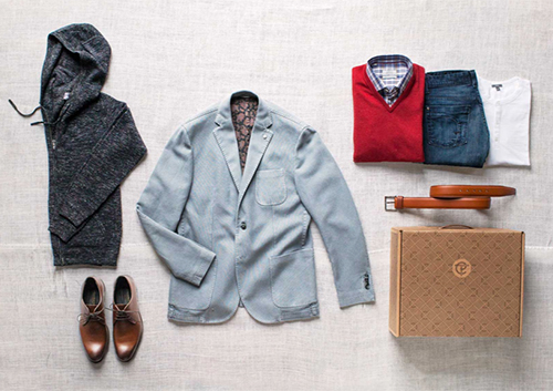
3trunk club1trunk club2trunk clubIn New York, you move a lot. I’ve packed my bags eight times in the past 12 years. It’s sort of funny, every time I look at my credit report, I oddly get nostalgic. The list of addresses laid out ever so clearly, mark the timeline of my personal and professional evolution. With moving, comes mail. Lots of mail. Your mail, past tenant’s packages, your neighbor’s coupons… I’m actually amazed that everything important (except for a tax return or two) has found it’s way to me over the years.

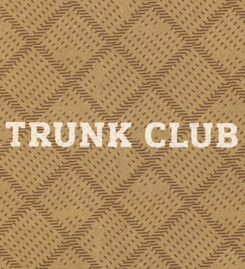
Yesterday, I got a mailer from Trunk Club – which was addressed to the previous tenant. Before tossing it into recycling, as I don’t typically don’t shop for men’s clothing, I was drawn to the pattern, and, to the velvet-smooth paper stock.

Trunk Club as a brand is an interesting concept, one that a few players are experimenting with these days. I listened to a bit about it on NPR two weeks ago, and was amused by the feedback from the male office reporters. Women have softened to the concept of clothing showing up weekly through Rent the Runway and same day shipping from Net-a-Porter and M.M. Lafleur, but this idea of a stylist sending you items that will most likely fit is a cool time saver.

The heritage look and feel of the pattern is great- the imperfect dotted line drew me in. It’s also an innovative way to play up the box’s strengths. I’m down with this packaging and curious who’s behind it- does anyone know?


Tracking Repetitive + Awesome.
On Instagram.