Pattern Pulp

Rebecca Atwood for Method Soap


Method-RebeccaAtwood-Collaboration3

Most people in the design and homegoods space are familiar with Rebecca Atwood’s stunning watercolors. Her nature-inspired patterns evoke calming worlds through soft dyes and beautiful handmade shapes. Recently, though instagram, I came across her most recent commercial collaboration – a limited edition packaging partnership with Method Soap.

Method-RebeccaAtwood-Collaboration2

Method is a simple, design-forward, no-fuss brand. It’s made it’s mark riding the transparency wave over the past few years and has become a trusted name in the bathroom and cleaning supply industry. It’s fun to see them branch out a bit and experiment with a high-end pattern collaboration. This one in particular feels extremely appropriate, as many of Atwood’s watercolors have a fluidity that feels right for a liquids-based company. If you’re looking to add subtle organic patterns to you home, this is an easy win/win solution.


Patterns in Packaging from Birchbox


1Birch Box Patterns

I recently came across the packaging and graphic design work of Mary Rabun. Her aesthetic is bold, bright and feminine – and a playful departure from the minimalist illustration styles we’ve been seeing for a bit. In exploring her portfolio, I was struck by her full-time design work for Birchbox – it’s all very vivid, maximalist and distinct.

2Birch Box Patterns

While these boxes were released in March, they have a timeless appeal and reveal how a brand can successfully apply print and pattern. Using bold brush strokes and a harmonious color palette, Rabun excels in keeping Birch Box at the forefront of unique and cool packaging.

3Birch Box Patterns

In addition to the boxes, the accompanying insert cards play to the same creative mood and get interactive with a Q&A contest. If you have time, dive into Rabun’s past work, it’s beautiful, engaging and a great fusion of commercial pattern design.


Trend: Textural & Tonal Blush


textural & tonal blush_patternpulp

It seems like a funny thing to write that blush is everywhere these days…but in all honesty, it kind of is. The color (also known to many as rose gold) has transcended gender lines and is making it’s way through the fashion, art, home and beauty worlds this summer.

Stylists are putting male models in blush colored t-shirts for insurance ads, just as beauty brands are decorating eyelids in high-end campaigns. Cut collages, ribbed packaging, shimmering surfaces and natural patterns are the markers of variation, and it’s almost fun spotting new interpretations. Here are a few examples that hop between continents and genres, proving the sophisticated seasonal staying power of this minimalist hue.

1. Maison & Object Asia Print Advertisement 2. & 3. Collage: Absence and Rediscovery by Anthony Gerace 4. Brit Rhythm Fragrance by Burberry  5. Volcano Keepsake from Ya Wen Chau’s Heirlooms Collection 6. 3D Printed Housewears by David Steiner of The Royal Academy of Art 7. Plaid floral appliqués for Carven 8. Rose gold Tattoo Eyeshadow by Maybelline for Marie Claire


Beauty: Gothic Facial Palettes


1cfacial-palettes_beauty

For beauty, music and art lovers, it’s been an interesting few months. All three have merged to form a trend that reared it’s head in early March. We labeled it expressive story telling and it’s managed to evolve from the art and photography worlds to the beauty, music and marketing arenas.

These images of Enya Bakunova, Lady Gaga, the goth models walking Vivienne Westwoods’s weekend fashion show, and Shu Umera’s recent print campaign all pay homage to Mario Testino’s 2001 portrait of Kate Moss.

This wave feels a bit more gothic though, more geisha, more painterly. The emphasis on the eyes, the lips and the cheekbones provide a sculpture-like interpretation to compliment Guim Tió Zarraluki’s abstract and piercing renditions.  As we’ve said before, portraiture represents more than a moment- it’s the culmination of a mood, an outfit, a setting and a style. What do you think of this artistic execusion, is it effective?


Manipulations in Advertising


2apatterns_manipulation_advertising1patterns_manipulation_advertising 3apatterns_manipulation_advertising 4patterns_manipulation_advertising

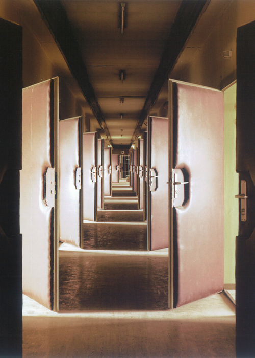
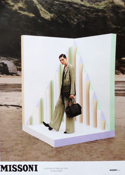
While flipping through British Vogue on my flight back to New York yesterday, the ads were plentiful. The September Issue’s out and prefall’s on display, along with rectangular manipulations and collaged scale. MAC’s amplification of the lash, Vivienne Westwood’s Gold Label as realized through white paint, long braids and lush leaves, and Missoni’s set within a set all play with scale, collage and perspective. If we were to make an art-related comparison, this print series is a visual tie back to Daniel & Geo Fuchs’ STASI – Secret Rooms featured in  Aperture Magazine (from a few years back). The comparison’s purely visual, though the idea of interrogation, memory and narrative are uncomfortable topics worth exploring that harness history, location and human indecency. Heavy topics to parallel print ads, but oddly relevant.


Trend: Expressive Storytelling


Expressive Storytelling

Portraiture represents more than a moment- it’s the culmination of a mood, an outfit, a setting and a style. When it’s journalistic, the meaning’s more obvious, but when posed, the message is abstract. Merging paint with portraiture, Boo Ritson, of London paints her subjects as sculptures, then photographs them as stills, capturing a surreal interpretation of reality. The beauty and fashion worlds have been doing the same to a lesser degree. These examples trace the evolution of painterly portraits, revealing a detached reality and imperfect narrative. It’s more interesting, isn’t it?

1. Gareth Cadwallader, Mudpac
2. LOVE Magazine
3. LOVE Magazine
4. Mario Testino & Kate Moss
5. Boo Ritson
6. Mert Alas and Marcus Piggott, LOVE Magazine


Tracking Repetitive + Awesome.
On Instagram.