Here’s the next batch of photos from my Asia trip- a few favorites from Shanghai! After leaving my brother-in-law in Hong Kong, my husband and I met up with our friends Mari and Naveen, who were also traveling from New York.
As you’ll see, there was a stark range from high to low throughout the city, but overall Shanghai was expansive (think Chicago, Boston and New York in one) and overwhelming to traverse. The people were friendly, the news highly censored, clothing was hanging from every window and the LED screens were super-sized. Here’s a mix of food, fashion, art and random observations along the way.
I’m a fan of circular symmetry just as much as the next designer, but when it comes to free form chaos, it can be really refreshing to just let loose. David Huffman’s done just that within a topographic landscape for Floating World #1, his mixed media on canvas piece that’s currently on display at the Patricia Sweetow Gallery.
Applying a similar layering technique with an explosive saturated palette, Yayoi Kusama’s latest project is just as eye-catching.
Pairing a white room with stickers and children, organized chaos creates a living, breathing installation.
The full pictorial set can be viewed on This is Colossal. It’s worth a visit, as the process is a nice reminder that beauty often has a singular focus.
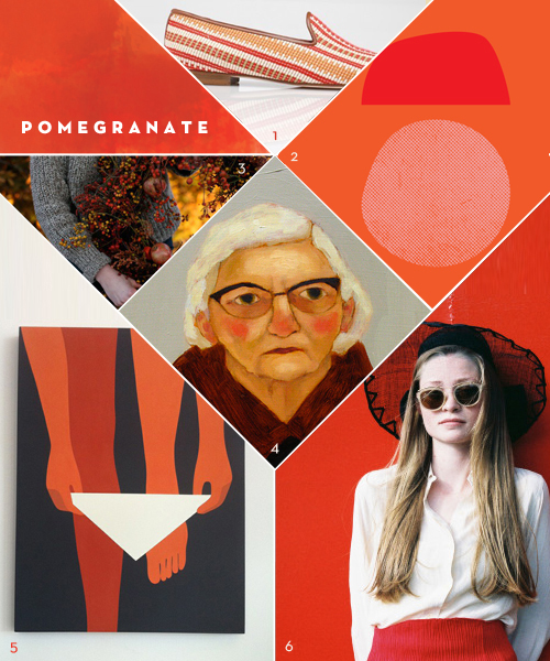
I recently stumbled upon the Geoff McFetridge print of the woman stepping into her bikini, and became mildly obsessed. (Geoff, call me, I need it.) It’s bold, graphic and semi-risqué, but the combination of orange and red was what really stuck in my brain. Maybe it’s the cranberry sauce or the turning leaves (or the chilled, rosy cheeks in Kate Pugsley’s paintings), but this color combo seems custom-made for the season change. In an attempt to recreate it, I tried to make Amy Merrick’s wreath while in Cape Cod a few weeks ago. Let’s just say that ship never sailed.
When flipping through the January 2012 Vogue, it took us about half a second to notice something familiar about the Lexus ad (as seen on the left). Immediately, we called to mind the meticulously dissembled works of Todd McLellan (example on the right) that we spotted last February whose images were quickly disseminated throughout the blogosphere with glee. Could Lexus have gotten their inspiration from Todd who incidentally also photographs cars and advertisements?
A little digging finds that this photograph from Lexus was only the beginning of a project in which four fashion designers – Moss Lipow, Eddie Borgo, John Patrick and Alejandro Ingelmo – were challenged to “rethink their notions of automotive design” for an ad campaign slated to appear in Vogue.
A Lexus CT 200h hybrid car was taken apart and from the pieces the designers created clothing and accessories. The results of the project were on display at the recent Art Basel Miami Beach.
We think the approach is interesting and certainly touches on a number of markets. Of course, fans of Todd’s work (and probably the mechanically inclined, too) will appreciate the peculiar beauty of seeing a machine taken apart and laid out piece by piece. Enthusiasts of repurposing goods, especially the parts of gadgets (example: watch parts) to make accessories will also likely take note. Intent on showing off both their goals for sustainability and their innovative engineering – and likewise an apparent appreciation for creative thinking – Lexus also might make you think about the cycle of inspiration and of the lines in which art, advertising and design blend, merge and where, if any, are there boundaries.
Ana Montiel‘s video autobiography for Little Paper Planes is intelligent, creative, and extremely inspiring. Have a watch! How do you document your creative process?
I’ve long been a fan of Ana Montiel’s amazing artwork and her keen eye for color, texture and pattern. Her style is unique, engaging and elegant and it’s exciting to share a tangible takeaway with all of you.
http://vimeo.com/15398238
The Visual Mantras Project is a work in progress in which Ana focuses on cycles and repetition. In her repetitive compositions, she meditatively studies the cycles in life, in nature, in relations, in everything and everywhere. The book is a limited edition, with each containing a surprise watercolor drawing enclosed as a bonus. Snap one up for yourself or someone in your life – it’s sure to be a treasured piece.
I’ll leave you with an adorable photo I snapped of Ana while I was last in London. She’s a true talent to the core and as lovely as you can imagine.