Pattern Pulp

More Tidbits from Singapore


noisesingapore_art_patternpulpflockcafe_singapore_patternpulpbooks_actually2_singapore_patternpulpbooks_actually_singapore_patternpulp2tiling_singapore_patternpulp

Last week I did a few short overviews, highlighting the spots I visited in Asia over the holiday. As I was combing through photos last night, I figured it might be nice to share more visuals and points of inspiration.

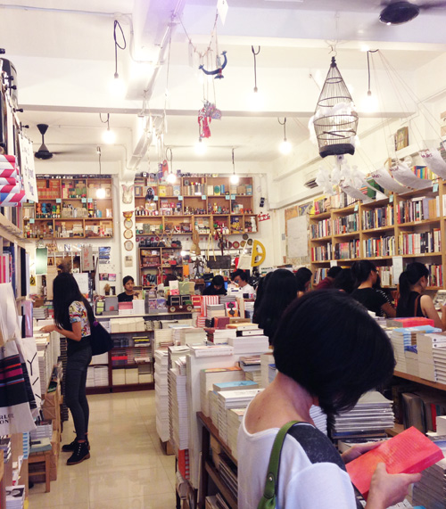
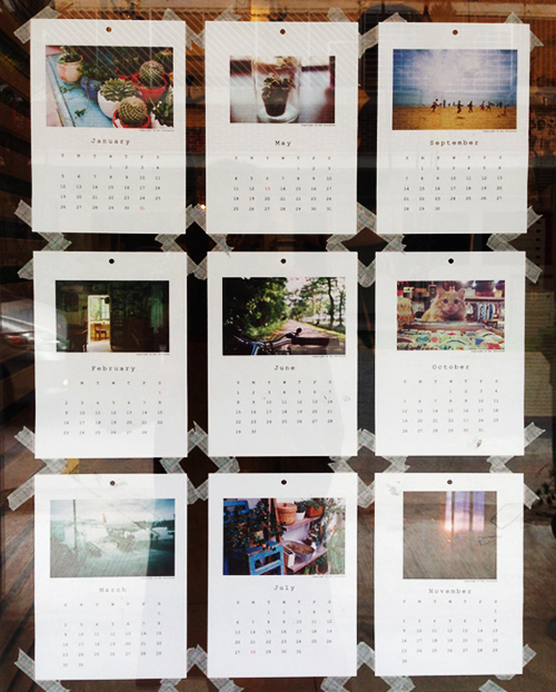
Books Actually is such a special bookstore. The owner does a wonderful job including local talent and curating authors and artists from around the world. Here’s a shot of the space and some art surrounding the store. On the inside of the front door, this photographic calendar was taped to the glass- a casual presentation that seems harmlessly cool, but in reality is a big deal for the perfect, clean-cut nature of Singaporean retail.

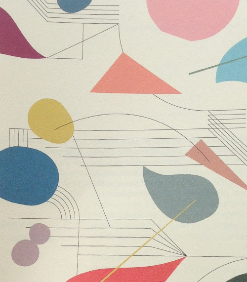
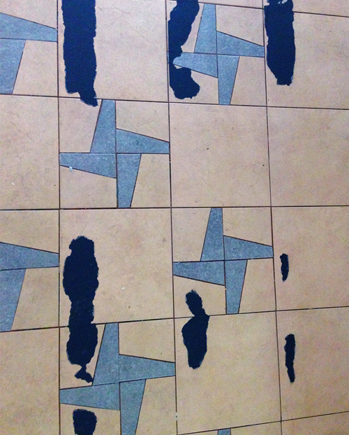
The pastel pattern at the top is a promo piece for Noise Singapore, a festival devoted to the 35 and under art world. It’s nice to see that they’re beginning to cultivate and celebrate homegrown talent (finally). Then, there’s decaying tile (which I’ll always be a fan of) and the Flock Cafe logo…it’s fabulous. Subtly bold with a patterned collage, my type of branding.


Tuesday's Gallery Picks


gallereypicks_patternpulp43

We’re taking a look at architecture and the systems that define our society in this week’s gallery picks.

*            *            *

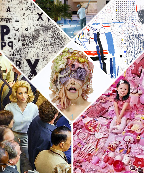
1. Tomoo Gokita’s artworks point to dated archetypes lifted from pulp fiction, Hollywood rags and film noir. The figures appear appear in a state of destruction or deterioration appropriate to their origine in memory at Mary Boone Gallery
2.Franz Ackermann creates cartographic watercolour drawings of urban areas undergoing rapid growth and development. These ‘mental maps’ form the basis of his multi-faceted site-specific artworks at White Cube Gallery
3. Daniel Rich’s new body of work continues to examine how the reproduction and proliferation of images shape our perception of physical structures and the ideologies that they embody at Peter Blum Gallery
4. By using traditional materials of oil on canvas, in the form of thick coats of paint to the canvas’s surface, Murat Pulat creates dotted textures. The texture the artist creates on his oeuvre defines the paintings from the realism of a film-still; however, these textural grains reference the pixels of a film, reminding the viewer of the origin of the paintings’ subject matter at Leila Heller Gallery
5. Michael Wolf has been consumed by the social and architectural fabric of Hong Kong since he moved there in 1994  at Flowers Gallery
6. Much of Thomson & Craighead’s recent work looks at how communications networks like the worldwide web are changing the way we relate to the world around us  at Dundee Contemporary Arts


Around the Globe, Visiting Hong Kong


hongkong

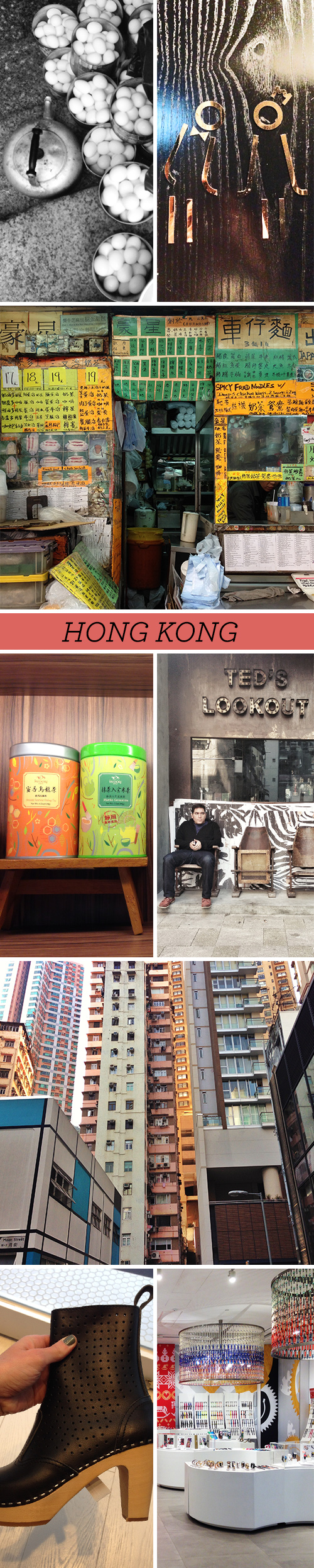
I’m ending this week with the final segment of my Asia series: Hong Kong…a place I’ve always felt I could live abroad (if Sydney or Melbourne were a no-go). The energy and pulse within Hong Kong City is electric. It’s been interesting to observe the transition from British rule back to Chinese leadership…the air quality’s become a bit more stifled, but the pace of globalization and commercialization of products, fashion and commerce have truly ramped up.

Here are a few shots from my stay (and a few tips). If you’re going, I’d recommend dining at the Press Room (if you’re yearning for a western meal), Ding Tai Fung (a Michelin Star causal-but-nice) Chinese restaurant, Rabbit Hole Coffee and Roaster to kick off your day, The Upper Room Bar on the top floor for incredible views of the city, lunch at Life Cafe (a fabulous healthy vegetarian spot in soho), and Star Street, where you’re find The Monocle Shop, Vie, and many other indie gems. If you’re looking for men’s custom tailored shirts at about $50 a pop, Roger Cheung of Roger Concept is your guy. For a more succinct list, feel free to follow my husband’s Foursquare tips.


This Week in the Pattern World


1printsource_patternpulp2printsource_nottene

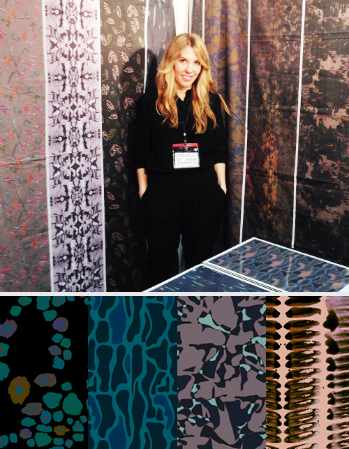
It’s been a big week for the print and pattern world, especially if you’re in the midst of designing for Spring/Summer 15. I wore a few different hats over the past few days, which was an interesting learning experience- one that’s been fun but a little draining. In reality, being a jack of all trades isn’t that different from the day-to-day tasks of being a consultant, but in regard to Printsource and Premiere Vision/Indigo, it was a small feat to hop between being press and a presenter. Just a little note, I kept the shows separate, so there was never a conflict of interest.

Big News from Pattern Pulp Studio

For those of you who who don’t know, I just opened shop with a library of over a 100+ new prints for Pattern Pulp’s Textile Studio (yay)! It’s been wonderful and exhausting to juggle the balancing act of client work with painting and pattern production of an entirely new collection. That said, I’m pretty happy with how things have turned out…

As soon as the new website launches, everything will be online, and if you’re interested in licensing, purchasing, or potentially collaborating on product development together, please don’t hesitate to reach out. The categories are across the board, ranging from home, apparel and accessories for men, women and children.

Reflecting on Printsource

In all honesty, Printsource was as I had remembered it when I worked in corporate footwear design: a bit more conservative, a bit more mass. Kim and I had a wonderful time presenting and meeting with waves of buyers, artists, new business owners, fellow presenters and students. Interestingly though, we kept hearing that our work was particularly artsy and “haute couture” for the show. Weird, right? At first, it makes you wonder, “well hey, that’s cool, thanks!” But then you start to think, am I in the right place, among the right buyers?” It’s all a learning experience, you see…figuring your place in the market, deciding what brands are best suited to collaborate with. It makes me think that Premiere Vision might be a better fit for our next presentation.

Which leads me to the press portion of this post- the valuable tidbits from the shows. As usual, the Italian, French, British, Australian and Taiwanese presenters blew me out of the water.

Notable trends from Premiere Vision | Indigo

1. Wooden buttons with color accents were a thing, much like the furniture design world (Bottonificio)
2. Prisms are still a big deal, only now they’re a bit more messy, a bit more decayed
3. Texture collages are still an interesting form of storytelling, particularly in regard to ethnic prints
4. Landscape printed lace…absolutely stunning (Goutarel)
5. Large sketchy portraits (a la Great Gatsby)
6. Florescent geometric wovens
7. Shells, sea creatures and other animals out of context

A few studios from both shows that blew me out of the water:

1. Malhia Kent (France)
2. Alcantara
3. Liberty Art Fabrics (London)
4. Manitoba (Buenos Aires)
5. Amy Ormond (New York)
6. C.O.T.O by Takisada Osaka (Japan)
7. Gratacos
8. Seterie Aegunti
9. Kuku Kachu (Australia)
10. Ulysse Pila (France)
11. Gimoar (Italy)
12. Shinkong Textile Co (Taiwan)
13. Abby Lichtman Design (NYC)
14. Susanna Samson Design (London)
15. Minakani (France)
16. Philomela (California)
17. Print Fresh Studio (Pennsylvania)

 If you’d like to discuss the wrap up a bit more, feel free to get in touch!

 

Tuesday's Gallery Picks


gallerypicks_patternpulp42

This week’s gallery picks are sure to inspire deep thoughts and interesting discussions.

*            *            *

1. Ramiro Gomez’s acrylic on canvas paintings use David Hockney’s iconic 60s Southern California scenes as a jumping off point, interrupting the original compositions with the introduction of Latino domestic workers into the works at Charlie James Gallery
2. This survey of Mira Schendel’s work reveals aspects of her dialogues with a diverse range of philosophers and thinkers, as well as her engagement with universal ideas of faith, self-understanding and existence at Tate
3. Readings on Albert Einstein’s theories of relativity provided a catalyst for this series of drawings by Paul Glabicki at Kim Foster Gallery
4. In Spoil, Jessica Stoller uses clay and the grotesque as a vehicle to explore the constructed, often idealized world of femininity, gathering imagery across cultural lines and histories, often fixating on the subjugation of the female body at P.P.O.W
5. In an age of increased communication through technology, where in some ways we are more connected than ever, Prager’s scenes of disconnected characters within the crowd remind us of the resulting decline of interpersonal contact in our media saturated society at Lehmann Maupin
6. JeongMee Yoon photographs young children in their rooms surrounded by their clothing, toys and accessories. Are their color choices their innate preference, or do they result from pervasive cultural and advertising influences now nearly universally experienced? at Rosier Gallery

Come visit us at Printsource!


patternpulp_printsource

Hi Everyone!

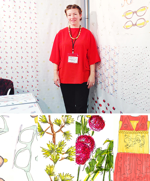
For those of you heading out to PrintSource today, come by booth A4, where I will be presenting along side my good friend Kimberly Hall of Nottene.

Over the past few months I’ve been creating a new library of over 100 prints for the new seasons.  Looking forward to sharing them with you guys.


Tracking Repetitive + Awesome.
On Instagram.