Pattern Pulp

Making Moodboards


moodboard_shaynakulik3

Today, I was in a zone. Once the basics were complete, I threw a few ink drawings together, collaged it up, and tinkered around with photoshop to see what would come. This is what happened. There’s lots of texture, overlap and some quiet storytelling.


Fused Geometry & Floating Shapes


trends_fusing_geometry_patternpulp

Trends are a funny thing to track. You can say that once they’ve gain momentum, they’re technically uncool and tacky (thank you Karl Lagerfeld for the insight), or that they’re simply an overarching theme hitting several sensory points. When you’re observing the things vibrating through culture, it’s important to look beyond the magazine headlines, as we all know that editors have word counts to fill and advertisers to please. It’s their job to sell quick digestible bites of content to keep us shopping…

When I wrap my head around a visual theme, I make sure to link as many worlds as possible…ranging from art and product to design, marketing and geography. Prisms have been an active element in the creative world for quite some time…they’ve gone from 3D to 2D and back again. This roundup highlights a mostly pink, red, mustard and blue palette of adjoined and floating shapes. Please have a look and share a few favorites of your own!

1. Elk Miracle Classic Pant 2. Work from Judy Kaufmann’s new website, Hello Pattern  3. Teva throwback, a collaboration by Bernhard Willhelm and Camper 4. Handmade prism kilm rug by Elk 5. Pretty pastel rings by Kenichi Kondo 6. Playful typographic art by Esther Tielemans 7. Expressive colorscapes by Melissa Thomson 8. Installation art by Sophie Smallhorn

 

Tuesday's Gallery Picks


gallereypicks_patternpulp70

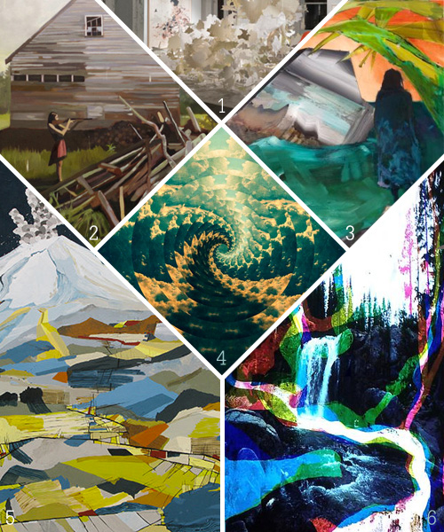
Get lost in the landscape with this week’s gallery picks.

*            *            *

1. Val Britton’s massive installation of her hand cut assorted papers in her thematic series of cartography inspired landscapes at Gallery Wendi Norris
2. The works in Samuel Denoncour’s This Land Is speak specifically to the comfort and beauty of self realization that comes only after allowing yourself to be lost at GRIN
3. Elizabeth Glaessner’s most recent paintings depict a highly detailed mythology of post-human existence on earth that features anthropomorphic, gelatinous figures in familiar, yet toxic, landscapes at P.P.O.W
4. Leif Podhajsky’s work explores themes of connectedness, the relevance of nature and the psychedelic experience. By utilizing these subjects he attempts to inspire the viewer into a realignment with themselves and their surroundings at Galerie Hors-Champs
5. Ryan Molenkamp’s Fear of Volcanoes at Linda Hodges Gallery
6. This group exhibition explores the seasonal rhythms of natural systems, the human disruptions of these once-balanced cycles, and the increasing alarms of global climate change at James Cohan Gallery

Shades of Pink Around the Globe


Pink Accents2

In America, the color pink is often associated with youth culture. If you’re trying to be younger, or more feminine, or even more girly, you go for pink- it’s the defacto color of the female gender. Move across the Atlantic though, and you’ll find that pink serves as a cool, edgy accent. Vivid, florescent tips, paired with white or cream send an entirely different message- one that the French and the Swedes have embraced for a long time. Then, we have Karen Mainenti’s humorous painting that captures the conflict and dichotomy of color and the sexes. Here’s a quick round up of some favorite applications:

1. Hanro’s handmade dip-dyed paper torn window display in the Meat Packing District in Manhattan 2. A DIY maxi skirt on a pair & a spare 3. Very cool coasters from the Caribbean restaurant Glady’s in Crown Heights, Brooklyn 4. Youth retail display at ABC Carpet in Manhattan 5. A spectacular painting I took a photo of at my airbnb in Stockholm earlier this Spring 6. Revlon No.450 Gentlemen Prefer Pink by Karen Mainenti


Tuesday's Gallery Picks


gallerypicks_patternpulp69

Exploring perception and its impact on the human condition this Tuesday.

*            *            *

1. Timothy Cummings’s exploration of dualities —insider/outsider, self/other, the collision of nostalgia and the present at Catherine Clark Gallery
2. Utilizing a wide range of materials, Erik Jones’ mixed media approach creates a hypnotic tension between the familiar and the fantastical at Hashimoto Contemporary
3. The paintings in this exhibition engage us in both the rich language of abstraction and in the mysteries of the human condition at Seager Gray Gallery
4. Thank You Paintings Exchange initiates a series of material, social, gestural, intellectual and monetary exchanges between artist and collector, with the commercial art gallery as site and passive participant at Denny Gallery
5. In Painter’s Nest the role of the artist is examined in various stagings and often the representation of the artist appears to reflect the beholder’s own imagination of an artist at Nils Staerk
6. Adrian Ghenie Golems explores Charles Darwin and the “texture of history” at Pace Gallery

Focusing on the Female Form


Rachel Levit3Rachel Levit1Rachel Levit2

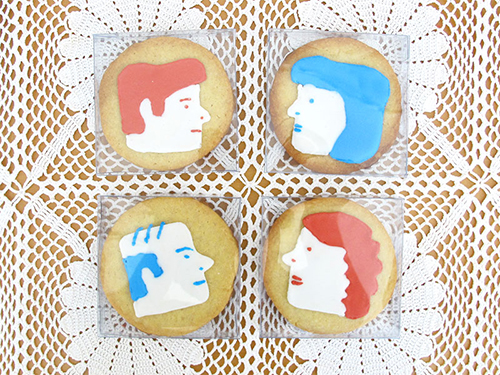
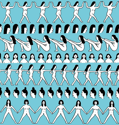
Rachel Levit is an illustrative force you should all be aware of. Her drawings are simple, yet carry immense storytelling through line, pose and profile. Her repetition feels a bit like modern day hieroglyphics as she swings from professional realms. One day she’s producing artsy leggings and the next, an illustration for the New York Times. Have a look at her blog, you’ll find delight in the scroll.


Tracking Repetitive + Awesome.
On Instagram.