Pattern Pulp

Spring Strollers with Åsa of Stockholm


asaofstockholm1

Spring has sprung in Manhattan and that means stroller season has once again returned.  As I enjoyed a leisurely Saturday afternoon of people watching and casual reading in Hudson Park, I watched gaggles of moms pass by- each with a luxury stroller darker than the next.  I found it odd that no one had decorated their hood, a prime canvas for art.  At that very moment, Åsa Rodgers and her beautifully accessorized stroller walked by. Pattern Pulp was lucky enough to catch up with her for a brief chat.   “As a new mom I quickly found that the stroller and diaper bag were to become my main accessories, and in my case I was not  ready to give in to the dull and practical products I saw in the stores,” said Rodgers.  Using her design background, Rodgers quickly solved her own dilemma by launching Åsa of Stockhom Baby Collection from her Tribeca studio.  

asaofstockholm2

Over the past year sales quickly increased as mothers began approaching Rodgers on the street and resultantly became walking advertising for her.  “I wanted something unique and beautiful that reflected my own personal style. My inspiration came from great fabric designers who incorporated impeccable quality with playful patterns that I knew my son would love!”  In addition to dressing up strollers, Rodgers’ collection now includes matching diaper bags, nursing bibs, baby aprons and booties.

Packaging: Carrying Patterned Protection


planned-parenthood1

Though today’s post could easily have been grouped in with yesterday’s brights, I felt like it deserved the spotlight. Proper Attire, Planned Parenthood’s latest campaign, addresses the issue of unwanted pregnancies and sexually transmitted diseases among 18-25 year olds.  While viewing Fangohr‘s latest projects, I stumbled upon this website and was awestruck by the clever and creative packaging.  Though simple, this campaign is a groundbreaking idea.  Strategically directed by the creative thinkers at Naked, Proper Attire is a fashionable approach to protection.  The condoms have been positioned as a must-have fashion accessory that women would be proud to carry and retailers would be willing to sell.  Let’s hope people’s penchant for vanity leads to better decision making.

Collections:

planned-parenthood2

Yigal Azrouel’s collaboation with Proper Attire can be found at Bungalow 8, W Hotels The Store, NY Fashion Week and his online store.  The general collection is a product of Planned Parenthood.

Trend: Kid Friendly Clouds


tsumori-chisato-dress

Though we’d typically hold off on our cloud postings til late March when pairings can be aligned with April showers, cumulous floaters have proven inspirational as of late.  Åsa Dahlbäck, a graphic designer from Sweden, creates sharp textured markings to form bold fluffy dimples.  Utilizing the largest markers in the box, Tsumori Chisato’s cloud dress portrays a dreamlike state, obscuring clarity with harmonious violets.

rose-clark

In a playful salute to “partly-cloudy” weather reports, Rose Clark’s collaboration with Sinem Erkas reveals a portable balloon installation series for fashion and art magazine, Exit. Continuing along bold and witty lines, the users of we heart it, found amusement in this hungry gutter by The 6emeia Project.  Harmless street art to make you smile.

alisonfoshee

Fusing photography with playful attainability, these pastel clouds encourage conceptual daydreaming.  Alison Foshee, of  California, explores the potential of everyday objects in her dynamic collages.  Here she has layered an assortment of stickers to form whimsical colorful droplets.

cloud-3d

Cloud and rain inspired accessories have infultrated the marketplace in a variety of forms.  This blue wooden sculpture by Flatland OK, solidifies unattainable pairings.  Modernizing Ming Dynasty Era alcove beds, Courtney Skott of San Francisco has carved out pixelated cloud patterns in an effort to decorate her “room within a room” concept.  Feminizing this concept, necklaces and other curious jewelry findings can be located here.

Homegoods: Dissecting Malachite


malachite-moss

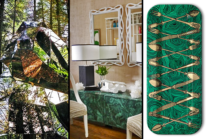
Originality is the benchmark for every creative release, particularly when a review’s involved. Designers love to observe, dissect then reinterpret.  Fusing mismatched edges with polished mineral patterns, malachite ensembles have begun to surface in many upscale home good departments.  This forest sculpture, comprised of glass angles and green reflections translates commercially as beautiful 2D cabinetry.  Merging wood, paint and pattern, Fornasetti achieves similar success with his gold cutlery malachite trays.

Artist Interview: Julia Rothman


julia-rothman

Julia Rothman is one of the most talented and original pattern designers in today’s marketplace.  I had the pleasure of catching up with her at “Design by the Book,” a collaborative event hosted by The New York Public Library and Grace Bonney of Design*Sponge.  Rothman has a the ability to beautify ordinary objects, using her unique style of illustration and layout to create whimsical repeats.  Her work has been featured in countless publications and dons home goods of every variety.  Check out our Q+A for a glimpse into her daily routine.

*            *            *

PP: What websites do you generally start your day with-do you have a daily routine for news/blog/information consumption?

JR: Design Sponge, Print&Pattern, Poppytalk, Oh Joy!, The Post Family, Grain Edit always start my day. And the NYTimes for news of course.

PP: Do you discuss your work with other designers?  If so, how does that impact your creation + execution process?

JR: I am on the video phone with Jenny Volvovski and Matt Lamothe, my Also partners all day every weekday. They see everything I am working on and give a constant critique on my work. That is always helpful. Sometimes they notice ways to improve my design that I would have never thought of. I think it’s always helpful to have designers you trust giving you feedback. You don’t always have to listen, but at least you are presented with other points of view.

PP: Where do you usually work on your patterns and how much time is devoted to illustration vs computer layout?

JR: I start with drawings I make with a pen in my sketchbook. I usually work on those hanging around my house, usually lounging on my couch. The time I spend making drawings varies but it’s usually the majority of the work. After the drawings are all done I go to my office and scan them in at high resolution. After that I manipulate and color the drawings using Adobe Illustrator.

PP: How has your work evolved over your career?

JR: In the beginning I was making drawings and then scanning them in and trying to make them into patterns. Over time when I decided making patterns was where I wanted to focus, I made drawings keeping in mind how they would later repeat. And then eventually when I started making specific products- wallpaper, mugs, stationery, it had to evolve one step even further. I had to give scale, colors and subject matter even more consideration for how it would specifically look on that object. For example, when I was making patterns to build up a portfolio I wasn’t worrying about the amount of colors. I put in as many as I wanted. But working recently on my wallpaper designs for Hygge&West, I had to limit my colors to three or less which was a fun challenge.

PP: What are some of your favorite creations/mediums/color palettes?

JR: I recently worked on a project organized by Design Sponge and the New York Public Library and made a very detailed navy men pattern. I was inspired by a book of uniforms and symbols of navy officers from around the world. I really love how it came out. I also recently made two patterns of vintage office supplies for Galison, a stationery company. I am really excited to see how those patterns get applied to a variety of products. They come out this Spring!

When I am painting I always use gouache. I love how flat matte the paint gets. It’s also similar to the flatness in silkscreen, another favorite medium.

One of the most often criticisms I get is about my color palettes. I tend to use really muted colors. Often art directors ask me to brighten up my colors. I’m more attracted to subtle tones with pops of brightness here or there.

PP: How do you incorporate commercial trends into your work- is this a factor that drives your design?

JR: I try not to think about trends too much. I make designs I think will be interesting whether or not they are popular themes or palettes at that moment. I’m sure with the amount of designs I look at on blogs every day, trends affect what I do, but it’s not on purpose.

PP: Do you have any advice for younger designers who are just getting started?

JR: I always tell new designers to be pro-active about promoting themselves. Nothing is going to come to you. You can be an incredible designer, but nobody will know that until you show them. And if the first person doesn’t think you’re great, don’t get discouraged. Maybe the next person will, or the next one after that.

Homegoods: Forest Tales


tuleh-lancelotti

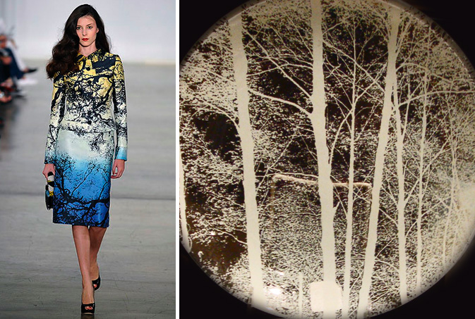
There’s nothing more symbolic of the February winter slump than bare trees silhouetted by dusk.  Designers from nearly every home goods and accessory category have infused their direction into this trend, moving away from the cozy appeal of eco-friendly design.  Tuleh’s S/S09 patterns possess a whimsical stillness that alludes to natural transition.  Flora detailing can also be found on glass plates sold at Lancelotti Housewares in downtown Manhattan.  Each plate is an interactive experience for both the chef and the diner, as the transparent canvas provides a scenic backdrop for every meal.

forest-tales3

Embracing tonal medleys, Forest Tales speaks to a darker feminine side of contrasts.  Selfridges of London sells pillows with sunrise/sunset references.  Using only a narrow silhouette and silver embossing, this metallic leather-bound notebook from ABC Carpet is both bold and simple.  Continuing to veer from prim and proper, this Black Forest China collection from Germany caters to the Tiffany-hating types, an under appreciated niche.  Armani Code combines transparency, gradients and nature to produce elegant, sultry packaging for it’s latest signature fragrance.

Tracking Repetitive + Awesome.
On Instagram.