Pattern Pulp

Fashion: Zip and Repeat


zippers2

Zippers, the commonplace closure, have been striped of their hidden functionality and thrust into the spotlight, proving they can double as innovative solutions as well as decorative patterns.  The results are striking, and slightly quirky.  Part of the zipper’s appeal, perhaps, when compared to its closure counterparts such as buttons, hooks, and snaps, is the fluidity of movement.  This is evident in Ji Woong’s Zip Up Tangles, a creative solution to the wiry mess we all experience when reaching for our ear buds.  Stepping it up a few notches, Van Cleef & Arpels has recently dove into it’s archival library to revive it’s 1950’s Zip Necklace.  While today’s version may be toned down, it’s no less elegant, and a primary example of how innovation can have timeless appeal.

zippers

In a French design studio not far from Van Cleep & Arpels’ headquarters, Julien Rivoire, an Art Director and Graphic Designer, has applied his own zipper technique to Sixpack’s infamous t-shirt collection. Revealing striped down beauty in the most simplistic of logos, the Z and the P are solidified by the I in this seamless application of the object’s functionality.  Continuing with the theme of black and white, this patterned skirt playfully mimics the sex appeal zippers posess when applied to women’s clothing.

Zoe Cotlenko, a French jewelry designer and zipper connoisseur, is the mastermind behind this line of candy-colored necklaces and bracelets.  Using his illustration skills, Eric Elm’s zipper and button bag made its debut at Colette a year ago this month.  Elm’s work has been equally influential in New York, as proven by this remarkable 3D installation at the Nike 255 space in NYC for the Make Something Project, which was held in collaboration with Aaron Rose & Beautiful Losers Show.

Additional Contributions by Emily Gup.
Trend: Painterly Paths


bmw-expressionofjoy

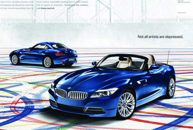
“Not all artists are depressed,” is quite possibly be best tag line we’ve heard in a while. BMW’s latest Z4 campaign, Expression of Joy, has recently rolled out across several platforms, attempting to reach affluent customers of all of ages and interests.  BMW’s roadster has always been synonymous with intelligent design and has collaborated with select artists in the past to express this priority. Using GSD&M Idea City as their creative backbone, BMW has opted to jump into the driver seat this time around and let their product become the paintbrush, “While the original idea was to use the car to create artwork, over time, our thinking evolved from the final product to the process,” says David Matathia, VP and Idea Team Director at GSD&M Idea City. The results are both stunning and effective, as this vibrant spot translates seamlessly across all media platforms- be it print, tv, web, mobile or on premise entertainment.

tiretracks2

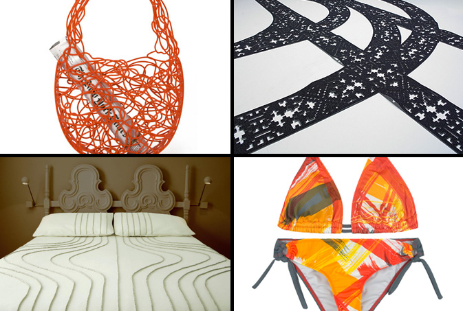
In an effort to embrace the concept, Expression of Joy, we decided to explore a few other products that inspire controlled chaos and negative space.  This Corallo Bag, a current feature on MoMA’s retail website, is an elegant, non-ending doodle that’s a durable alternative to the plastic throwaway.  Moving in a more literal direction, Hudson-Powell‘s patterned rug mimics tire tracks in the snow. Emulating tracks of another sort, Walter Onion’s wool and linen bed spreads are a minimalist and high-end interpretation of this trend.  This painterly Hurley bikini looks as if the roadster rolled over it while creating its 240 yard masterpiece.

Additional Contributions by Emily Gup.
Trend: Natural Formations


clinique-nantaka-plantation

Nearly everyone can remember their first trip to the Science Museum.  Between interactive displays and ecological wonders, it’s easy to understand why these educational centers have always drawn endless crowds.  Interestingly, many of the natural formations that have educated the masses are now being tapped for inspiration.  Rock patterns, as noted in late February, are continuing to subtly nudge their way into the the commercial marketplace, both figuratively and literally, adorning home accessory lines and commercial advertisements.  This Nature Exploration Agate greeting card, designed by Joy Deangdeelert Cho is one of many nature inspired prints on her website, Nantaka Joy.  In an effort to imply timeless beauty, Clinique ‘s latest product push embraces the tortoise, nature’s slow and steady (not to mention, reliable) winner.  Taking this theme to the most literal level, this rock-covered pillow from Plantation, in San Francisco, glamorizes the everyday pebble.

Fashion: Curious Neckwear from Alexander Olch


alexander-olch

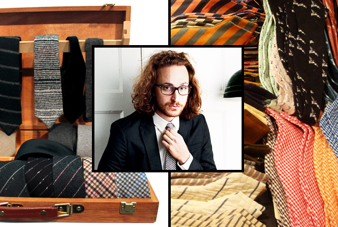
The motto, “unconventional meets conservative” is one that many brands aspire to achieve on a seasonal basis.  Alexander Olch, a filmmaker and designer from New York, has taken men’s neck ware by storm with his subtly vibrant patterns and tailoring.  After a brief browse through Bergdorf’s Men’s Department a few weeks back, it was obvious that Olch held his own beside Thom Brown and David Hart, two household names representative of upscale men’s fashion.  The greatest difference between these three designers was the fact that Olch’s designs playfully honored the bow tie without looking ancient or overly flamboyant.  After further research on Valet Magazine and The NYT’s fashion blog, The Moment, it’s quite obvious that this creative mastermind has a bright future ahead of him, check out his collection if you’re looking to give your professional wardrobe a face lift.

alexander-olch-ties

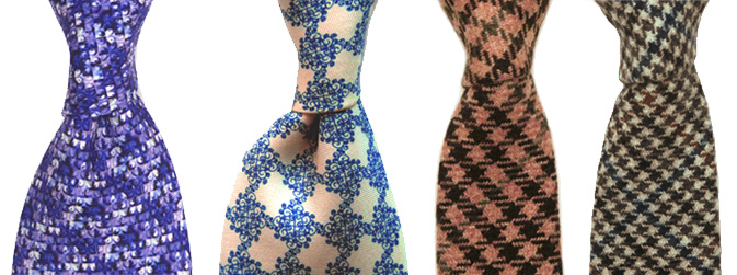
Olch’s ties nearly always possess a hidden surprise.  This secret ingredient makes a memorable impact as well as differentiates him from the commercial masses.  For a modern take on classic, here are two skinny Italian cashmere styles.

Trend: Pixel Mashing


burton-bloomingdales

Photography and graphic design have become so interconnected in today’s marketplace that one medium rarely exists without the other.  Websites like ffffound and qbn showcase the best and the brightest, overshadowing what many print monthlies used to accomplish.  By offering a 24/7 stream of creative inspiration, designers and critics alike have been able to familiarize themselves with what’s current.  This photo, taken by Bueller Designs in LA, displays a cluster of translucent dots that are a result water and light.  By merely adding saturation and a grid, brands like Burton and Bloomingdales prove that the transition from natural beauty to commercial glam can be a quick (and profitable) one.

Typographic Story Telling


visa-2

Visa’s most recent advertising campaign is the company’s first stab at going global. Who would have though it would’ve taken this long to send a singular message under one corporate umbrella?  Merging lifestyle concepts with playful typography, each go spot taps a local audience, incorporating pattern-appropriate themes. Interestingly, the international commercial, Gofesto weaves several adventurous concepts throughout a one minute reel, taking their viewer on a Visa inspired journey.  The thirty second American spot, entitled Aquarium, simplifies this journey with the use of emotion and special effects.  Though the reel has a beautiful kaleidoscope theme throughout, we wonder if the Disney formula was applied, as this spot seems much like a summer tralier.

visa3

All of these concepts (in addition to a few others) were executed by Chiat Day and can be found on Visa’s corporate website.

Tracking Repetitive + Awesome.
On Instagram.