Pattern Pulp

Trend: Baring it with Bubbles


bubble-pattern

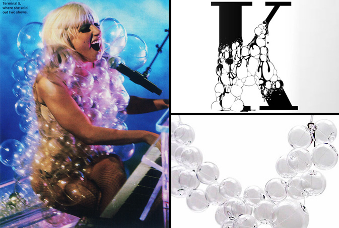
Bubbles have been inching their way into our commercial consciousness.  Be it a translucent outfit for pop starlet Lady Gaga, chemically treated typography on the visual tagging website, ffffound, or a high-end glass necklace made by the Sent sisters of Italy,  we can’t help but fixate on the transparent quality of this effervescent material. Danish poet, Hans Christian Andersen illustrates our voyeuristic sentiment best in his famous novel, The Emperor’s New Clothes.  Just as the emperor assigned value to the concept rather than the final product, the idea of wearable bubbles is certainly the definition of “fashion over function,” at least when sitting’s involved.

Trend: Designing Frequencies


audiowaves-pattern

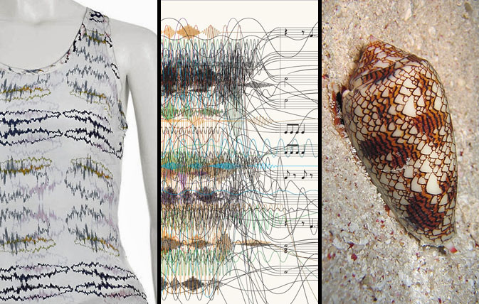
We seem to be taking our patterns back to the basics lately; finding new and interesting facets to things we see in everyday life — focusing on form rather than utility. Recently, we’ve been noticing an increase in the use of sound waves as a design element. With instant access to fresh new tunes served daily from music influencer sites such as RCRD LBL or Pitchfork, the general population has been able to “see” their music that was once invisible. Illustrating this concept in the most tactile of ways, Lorick’s SS ’09 collection romanticizes the audio file, while this New York Time’s info graphic proves that chaos and structure can be balanced with the simple use of argyle. This cone shell forces us to acknowledge nature’s ongoing influence, making us ask- what came first the ocean wave or the sound wave?

Additional contributions by: Emily Gup

BA Street Finds: Saving in Style


swines and savings

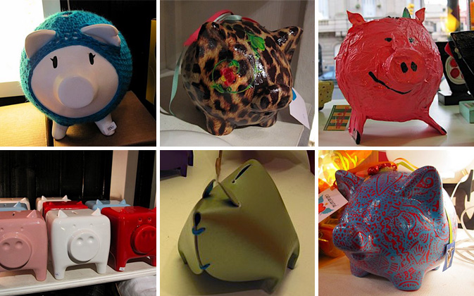
Saving money is certainly in style this season, and now so are piggy banks. Since everyone is pinching pennies, Argentine designers have transformed the kiddie version of a 401k into a design object for the style and money conscious. The colorful swine are dominating Buenos Aires’ boutiques, including Tienda Palacio, Puntos en el Espacio and Materia Urbana. Local kitsch brand Casicursi created two of our favorite piggys – one covered in leopard print, another in red and blue paisley. These two patterns have been dominating international trends, but look fresh when used in this unexpected way. Malba (Museo de Arte Latinoamericano de Buenos Aires), the premier modern art museum in Argentina, features colorful leather piggys in the must-see museum shop. The leather material of these banks celebrates the culture’s most popular export in a fun new way.

How else can you save in style?

By: Rebecca Silver

Beauty Marketing & High-Heeled Houndstooth


stila-houndstooth

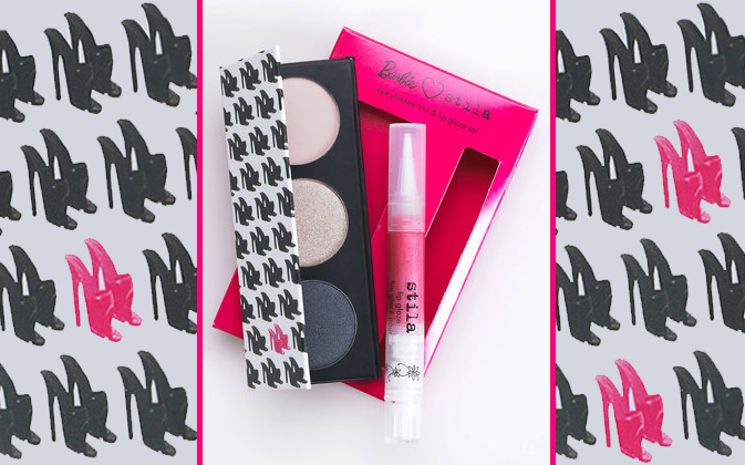
The 50th anniversary of Barbie has ushered in product upon product over the past year.  From Karl Lagerfeld’s Colette exhibition in March, to the above Stila compact that’s currently on sale at Gilt Groupe, Barbie’s impact upon the commercial design community has deeply influenced patterns over the past season.  As we pointed out in mid April, houndstooth is a staple many artists take the liberty of altering. Here we have a high heel repeat that’s a refreshing reminder of how one can merge stiff commercial marketing guidelines with creative themes and a colorful palette.

Interview: Valeria Pesqueira


PESQUEIRA-interview

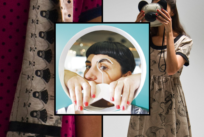
A brand that makes you smile. In 2001, Argentine designer, Valeria Pesqueira, founded her fashion label, PESQUEIRA, with that simple philosophy. She has certainly succeeded. Her innovative use of high-quality materials, bright, fresh colors and exclusive kawaii prints would make anyone happy. Pesqueira sells her classically modern clothing from her flagship store in Palermo Soho, Buenos Aires, in addition to distributing to worldwide retailers such as Bird in New York, Le Bon Marche in Paris, the MoMA Stores worldwide, as well as Nano Universe in Tokyo. Check out our Q&A for a bit of insight into Valeria’s world of pattern and inspiration.

*            *            *

PP:  How did you begin your clothing label?

VP: I studied fashion design at the University of Buenos Aires, then started working for huge fashion brands (Uma, Dockers, Levis etc) from Argentina. That experience taught me the basics of how to work in fashion. About 3 years later I really wanted to create my own work from my personal inspirations, so I started the PESQUEIRA brand.

I started in 2001 in the middle of Argentina’s huge economic crisis. As a result of the economic crisis, Argentines couldn’t afford to travel to shop, so they began buying Argentinean design.

PP: Describe your design philosophy and style.

VP: I love classic style. I enjoy mixing vintage fitting with modern design and prints.  I would love people to remember my brand with a smile. That is my philosophy.

PP: Who is your ideal consumer?

VP: Our clients are very special people with creative spirits. They are women of all ages who love art, the street scene, foreign cultures, fashion, animals, etc. They are curious and this keeps them young.

PP: How does pattern play a role in your design choices?

VP: It is the most interesting part of my work. I collaborate with young artists making exclusive prints for PESQUEIRA. I enjoy working with shapes, colours, animals; mixing all my worlds and prints together.

PP: What are your future goals?

VP: This August I am creating a children’s exhibition in the Malba Museum in Buenos Aires. I will present my Summer 2010 collection in the fashion fair showrooms in Tokyo this September.

PP: What inspires you? Any specific websites or designers?

VP: Basically life. Going to the supermarket, to art openings, traveling around the world, music, cinema, old ladies outfits in the street, yoga, the countryside, animals, colours, japanese packaging, my cat Neko.

Compiled by: Rebecca Silver

Budget: Taping Spaces


taping-spaces-patterns

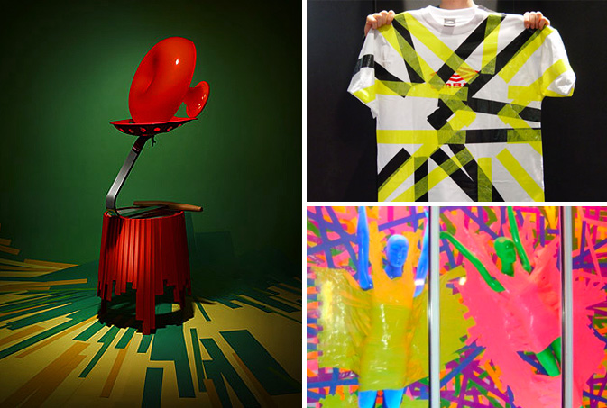
Budget slashing has forced artists, retailers and marketers across the globe to get creative in finding lower-cost solutions to advertise their wares.  Be it a rummage in the craft bin or a simple play on words, trend-setters such as Anthropologie and Barneys have proven less can be more when the concepts are strong. Today we’ve chosen to focus on tape as a decorative way to enhance a creative message.  Earlier this summer the malleable nature of this medium was incorporated in the Color Forms layout featured in the New York Times Magazine where the photographer chose to compliment this Matryoshka table with vibrant colored floor striping.  Applying similar energy and stiff color blocking, this repuposed Umbro t-shirt from 2006 reveals that DIY done right can update any brand.  Using color, function and a healthy dose of sexy, Marc Jacobs has created one of the simplest and most striking window displays on New York’s Bleeker Street, proving that duct tape can work for even the most innovative designers.

Tracking Repetitive + Awesome.
On Instagram.