Pattern Pulp

Accessories: Merging Fashion & Interiors


TENandCoShoes

You know when you’re amped about something and your significant other doesn’t necessarily share your excitement? I wouldn’t go so far as to say that’s’ the case with patterns and textures, but when my husband sends me a link, I take note, as he normally goes about his day finding joy and interest in complete opposite stratospheres.

This morning he shared a link to Ten & Co‘s recent line of Oxfords from Cool Hunting. We both have a personal interest in Turkish and Moroccan rugs- as we’ve recently purchased several Kilims off of ebay. They’re vintage, varied and colorful, just like these shoes. While I’m not sure if the referral was a direct correlation to our interior travails or that he just really like them, the line’s a beautiful and unisex translation of an interior style that’s been popular for a while. Enjoy!


Illustrations, Note Cards & Mara-Mi


mara-mi-stationar

Abstract watercolors have been in the illustration spotlight since geometrics took a back seat. Proving their weight in gold in the female homegoods market, the notion of luxury, individuality and beautiful imperfection has been a refreshing turn from the preppy rigidness of gridded patterns. Mara-Mi is a line of stationary, table decor and desk accessories that gets this. Their surface patterns are made in-house and speak to the creative, high-spending, free-spirit (hello ABC Carpet, Rifle Paper Co, and Ampersand Design Studio). Their foil-stamped envelope inserts add an interesting accent of luxury to mirror the time investment of writing a note. We’re big fans.


Opposing Worlds in Social Media


1seanfromtexas 2Erica Domesek

These two are really the antithesis of each other- it’s almost comical to compare the stratospheres. Sean Williams, an exceptionally talented tattoo artist living in LA, recently posted his latest work to instagram. Take a deep dive into his reel, and while it’s rather dark, you’ll find beautiful illustrations and inticate body art.

Fast forward four minutes, and I’m looking at Facebook, then Refinery29’s piece on Erica Domesek of P.S I Made This. For those who are unaware, Erica is one of the internet queens of DIY replica fashion. My brain had a fission, but when you’re visual, you can’t deny the obvious comparison, and with social media, you also can’t control or avoid the stream coming at you. Alas, I’m sharing these military tassel themes.

Any odd but poignant compare/contrasts in your reels? Would love to see…


Graphic Storytelling & Color Accents


graphic_storytelling_bergdorfcatalog

Bold contrasts make incredible statements when striped down to the basics. Just as camoflauge, florals and animal prints are staples, so are colorless patterns. When you add a singular hue to the mix though, you’re setting the mood – red/black/white screams news(!) while a canary yellow conveys alert(!) Eggplant still has a regal feel to it and kelly green feels playful and unexpected.

Last night, while paying bills, canceling memberships, and catching up on articles saved, I also paged through piles of product from Bergdorf Goodman, Madewell, LandsEnd, J.Crew and Anthropologie. These three images sold a story to me: Manolo Blahnik’s houndstooth, polka dotted and striped heels, Proenza Schouler’s textured clutches and Anthropologie’s cotton upholstered Astrid Chair. All loose, lyrical, rigid and of the moment.


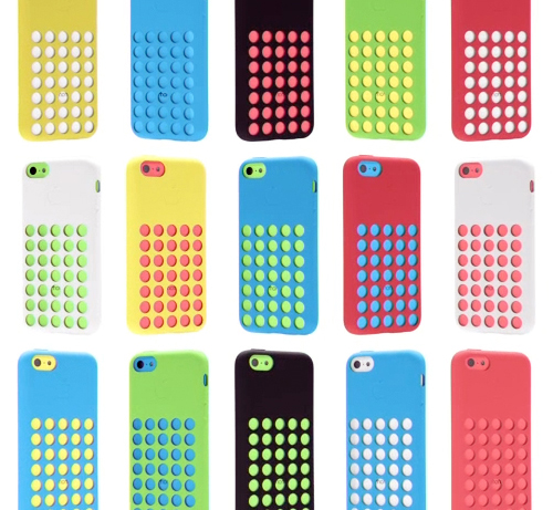
Color & Pattern: Apple's iPhone5 C


2iphone5c

The anticipation’s over and even Apple’s in back-to-school mode with their latest iPhone C product launch. Combining matte and shiny surfaces, gridded netted covers, and a very bright color palette, these phones have a decidedly childish twist- taking a 180 diversion from the stark monochromatic days of the past.

The palette feels very American in a naive, almost unglamorous way. The playfulness of the colors are rather commercial and we suspect will have a good deal of influence over the coming years. When you’re a brand like Apple, you have serious sway. You set the mass market trends in the world of tech and product design.

I’m assuming the male market will veer towards the white C or any of the S phones, while the female buyers will be more varied (hello, coral), though it’ll be interesting to see how this palette plays out and inserts itself into our subconscious vernacular. If you’re planning to buy one, which color will win?


Color, Conversation & Hanes Underwear


http://www.youtube.com/watch?v=gRJ9ko0nZmI

1color_marketing_hanes

2color_marketing_hanes 3color_marketing_hanes

Have you seen the latest Hanes spot? Chances are, maybe not, as the YouTube page has only 118 views. Parts of it are pretty cool, we’d recommend giving it a go. The concept reminds us a bit of Gap’s Be Bright campaign from a while back, but has clever synchronization and pattern mash-ups that transition human puzzles into cotton graphics.

Complimenting the TV spot, the social media component plays off of color, hoping to create chatter about an otherwise taboo topic. Would you tweet the color of your underwear? Hanes is hoping you will, by utilizing a Pinterest-like layout and pre-populated tweetable content, with a campaign entitled, What’s Your #undercovercolor? Have a look, play with the wheel, and let us know what you think…


Tracking Repetitive + Awesome.
On Instagram.