Pattern Pulp

Friday Quick Links!


pattern-wrapup_337

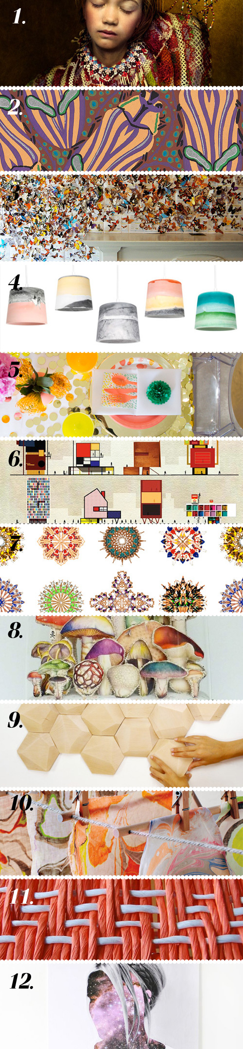
1. The Weather Diaries looks at Nordic fashion via Yatzer
2. Eugène Séguy’s gorgeous insect illustrations via Miss Moss
3. Andrea Mastrovito delightful installation via Colossal
4. Julien Renault’s lovely Rainbow Shades via Trendland
5. How fun is this DIY confetti table runner?! via Oh Joy!
6. If Salvador Dalí was a building, what would it look like via Honestly WTF
7. Shiny happy cheerleaders via Design Crush
8. Loving Lyndie Dourthe’s mushroom terrariums via The Jealous Curator
9. Digging these decorative wood tiles via design-milk
10. Give marbling a whirl via Martha Stewart
11. Neat DIY stool via design*sponge
12. DIY galaxy face art! via A Beautiful Mess

Contributed by Emily Gup

Interior Color Stories from Dubai


1kate_lewis-harpersbaazar_dubai 2kate_lewis-harpersbaazar_dubai

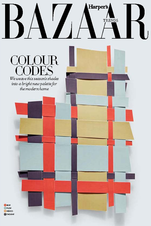
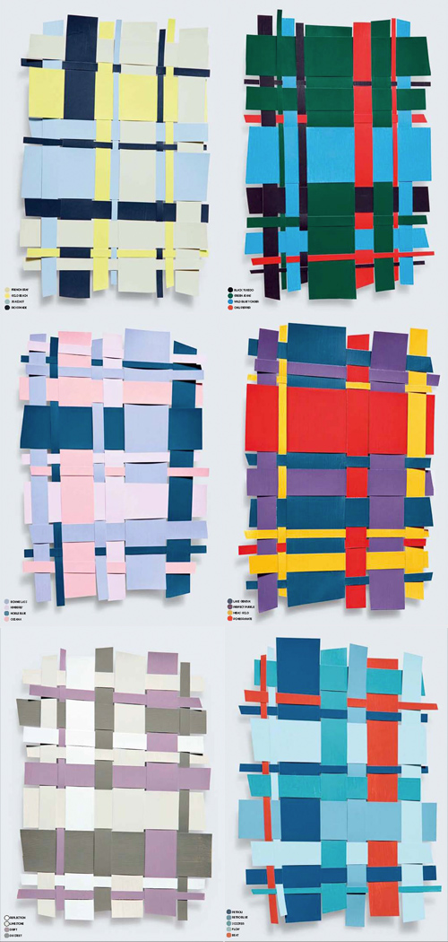
Paging through instagram this morning, I came across the work of Kate Lewis. Lewis is a photographer living in Dubai with a gifted eye for chic, modern, magazine-worthy moments. She recently shared these still life color collages from the March edition of Harper’s Baazar Interiors on her tumblr. They’re inspiring in more ways than one, as they convey an interesting balance in color harmony while doubling as unexpected plaids, worthy of art or fashion. Do any of these translate to your home?


Tuesday's Gallery Picks


gallerypicks_patternpulp51

It’s all about the ladies in this week’s choice gallery picks!

*            *            *

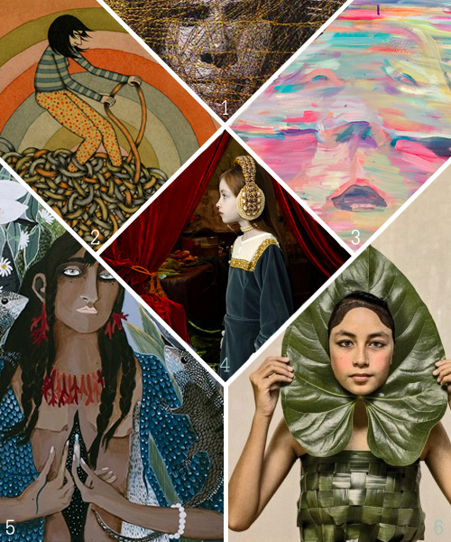
1. This exhibition spotlights women artists who use media traditionally associated with women and painters whose subject matter speaks of women’s lives and concerns at Seager Gray Gallery
2. Mel Kadel’s All Tied Up at Merry Karnowsky Gallery
3. Bravely exposing personal traumas, fantasies, and nightmares, Maria Lassnig’s art offers instruction for courageous living in a time of increasingly spectacularized social interaction. at MoMA PS1
4. Beautiful children dressed like small monarchs reign against a backdrop of velvet and brocade, adorned with a crown that looks like a headset, bringing them into contemporary world despite the Baroque atmosphere at Zipper Galeria
5. Leah Fraser’s latest work is based on stories of diverse cultures worldwide at Arthouse Gallery
6. Dressed in costumes and masks she has collected on her travels, Jacqui Stockdale’s hybrid characters are layered with cross-cultural and personal references at Helen Gory

Skin Color, Marketing & Media


pantone skin huespantone skin hues3

I’m gonna keep this short today, as I injured my hand late last week and am still on the one-handed mend. I recently came across this creative project by Angelica Dass and was really drawn to it. It’s a gem of an exhibition, and when I first saw it, I thought it was from Pantone’s marketing team and was quite pleased to see an effort beyond branded merchandise.

Then, I realized it was an outside project. In the world of mug, makeup and fashion collaborations, this initiative speaks to the soul, touching the entire human race. Everyone’s skin color fits within Pantone’s classification system and the neutral portraiture is quite striking. If I worked at there, I’d get on the phone with Dass immediately and try to broker a collaboration.


Friday Quick Links!


pattern-wrapup_336

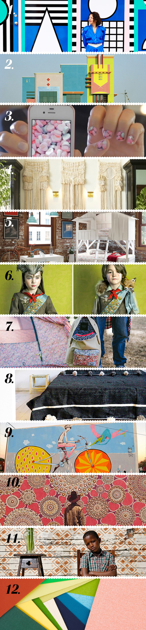
1. Interview with French artist and designer Camille Walala via The Design Files
2. Indian architecture inspired by Ettore Sottsass via Present & Correct
3. What do you think about Instagram nail stickers? via PSFK
4. Panama City’s gorgeous American Trade Hotel via design*sponge
5. These kids beds are so cool, it’s a shame they’re just for kids via design-milk
6. Todd Baxter’s striking Owl Scouts photo series via The Jealous Curator
7. When Liberty of London & Herschel Supply Co join forces via Honestly WTF
8. Because pom poms make everything better via SF Girl By Bay
9. Argentinian artist Mart’s delightful street art via Colossal
10. Casey Vogt’s elaborate patterns made from layers of paint via Artsy Forager
11. Love Alexia Webster’s South African street portraits via Miss Moss
12. Carl Kleiner created these graphic compositions with Herman Miller’s refreshed materials palette via Trendland

Contributed by Emily Gup

Gender & Paralleling Illustration Styles


GeoffMcFetridge_PatternPulp

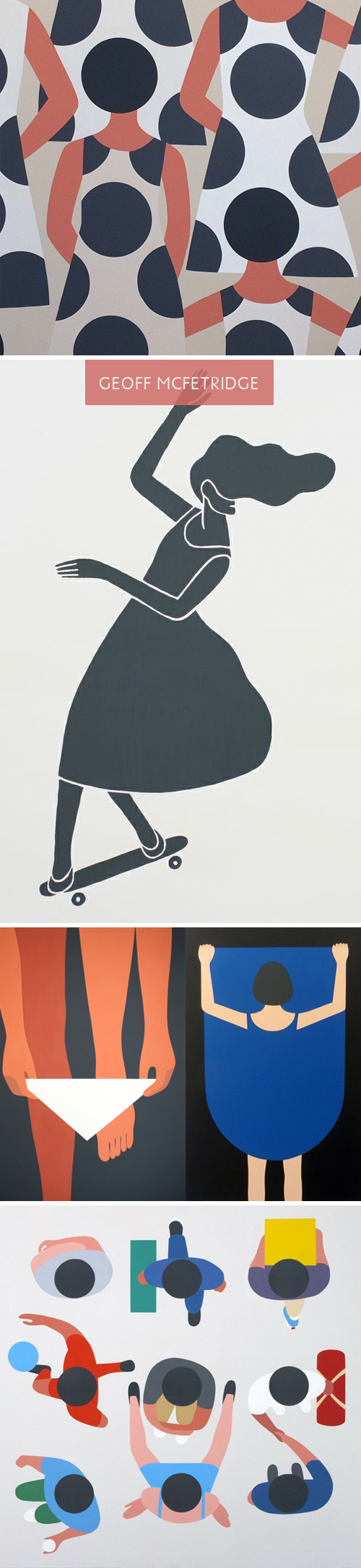
Lately, I’ve been spending a lot of time on Pinterest. Part of it’s due to a few social media assignments for various clients, and the other part is a renewed interest in home decor and dying techniques. Interestingly, Geoff McFetridge, an artist I’ve always loved, has been populating my feed quite a bit. Much of his recent work reminds me of a style I’m used to seeing in Olimpia Zagnoli‘s illustrations. When you take a closer look though, each artist may use bold, abstract shapes, though the story lines are extremely different.

McFetridge’s recent work feels quite sexualized when you view the grouping together. Men are men, and women are welcoming of men. At first, you don’t think much of it, as the perspective and lack of detail throws you off. The design feels quite simple, but the longer you sit with it, the complexities and storyline grows. Themes of exposure, individuality, disguise and personal space seem to be markers of this series. In comparing the works side by side, you notice the difference in artistic nuance.
Olimpia Zagnoli_PatternPulp

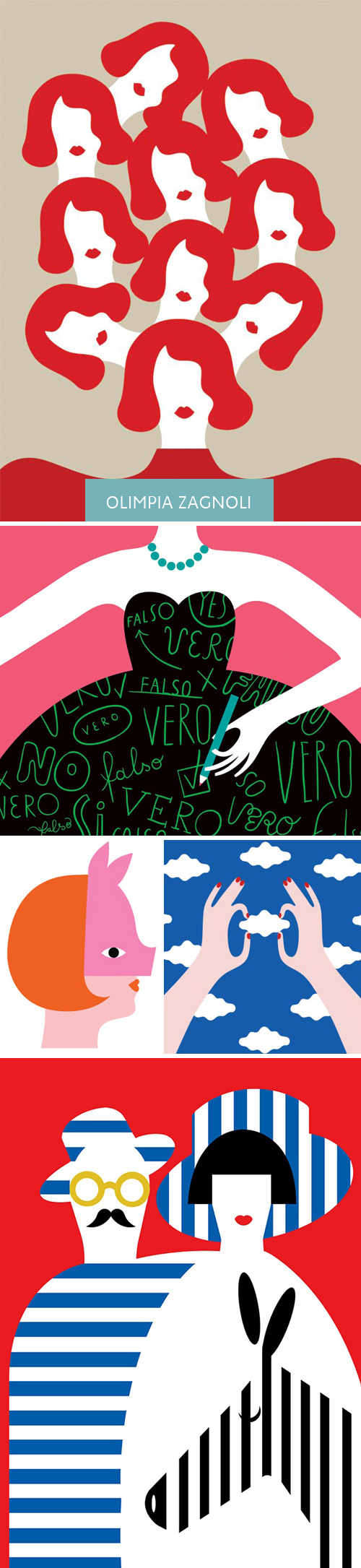
Zagnoli’s woman has a coyishness to her that feels defiant. She seems stylish and quirky, and an equal player amidst male counterparts. Her shapes and color palette have greater contrast and present what feels like an uptown woman (where McFetridge’s female feels younger and more exploratory of herself).  I have to believe neither artist wants to be compared to one another, but when works have been pinned alongside one another, it’s hard not to notice a narrative and comment on the parallels and differences. Curious, what do you all think?

 

Tracking Repetitive + Awesome.
On Instagram.