Pattern Pulp

Homegoods: Dissecting Malachite


malachite-moss

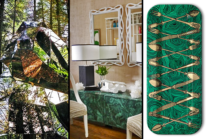
Originality is the benchmark for every creative release, particularly when a review’s involved. Designers love to observe, dissect then reinterpret.  Fusing mismatched edges with polished mineral patterns, malachite ensembles have begun to surface in many upscale home good departments.  This forest sculpture, comprised of glass angles and green reflections translates commercially as beautiful 2D cabinetry.  Merging wood, paint and pattern, Fornasetti achieves similar success with his gold cutlery malachite trays.

Street: Figuratively Freakish


street-shots

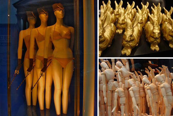
Conformist installations have started to emerge throughout European retail displays.  From militaristic mannequins wearing Eres lingerie, to gold bunny gardens at Printemps, to soldier-style figurines in Amsterdam, the idea of sameness is popping up in the most unlikely of places.  Be it unstable economics or adverse politics, retail is embracing the notion of unity, hoping to curtail risky business, taking creative (and creepy) measures.

gieves-hawkes

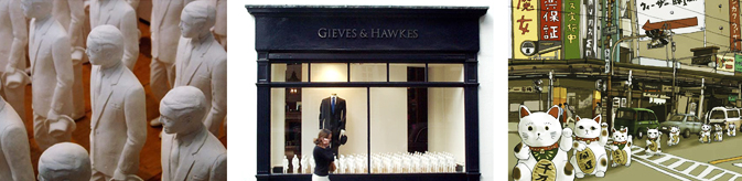
Gieves and Hawkes, in traditional British fashion, caters to the military man gone CEO. The grid of suits in this window display, shot by Tom Oldham and arranged by 3D designer, Johnathan Thomas is a playful throwback to army line-ups of yesteryear.  Kozyndan, a creative duo from Santa Monica, highlight the Japanese Maneki Neko in their Weezer illustration entited, “The Link and the Witch.”  A marching band of lucky cats let loose in perfect porcelain formation.

Trend: Coworking within Color Palettes


kapitza-geometrics

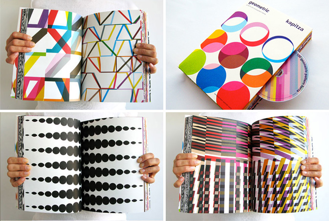
The idea of co-working can exist beyond office environments.  Kapitza’s latest publication, Geometric Book presents a visual menagerie of contrasting shapes and intersecting palettes.  The organized chaos within each page mirrors the energy independent workers bring to collaborative work environments.  “How can you create beautifully if you don’t surround yourself with beauty?” says Judy Prays, a freelance internet video producer living in Greenpoint.  Co-working spaces have popped up in every city and suburb around the world, proving that creatives will find each other if wifi’s involved.

coworking

In Good Company, a collaborative work environment in Manhattan, caters to women entrepreneurs with small businesses. Reaching out to a more transient, non-committal group of innovators, Pretense, a workspace in Jerusalem, serves as a connector for creative clusters on the go.

brights

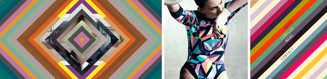
Fusing photography with Russian poster palettes, Lydia Burkhalter’s web portfolio presents harmonious contrasts of moving energy.  In spirit with last summer’s Olympic games, the NYTimes presented fashion’s take on gymnastics with this Pucci’s leotard of kaleidescope graphics.  Pixel Rumor, another personal project of mine displays contrasting stripes of unwavering color.

Artist Interview: Julia Rothman


julia-rothman

Julia Rothman is one of the most talented and original pattern designers in today’s marketplace.  I had the pleasure of catching up with her at “Design by the Book,” a collaborative event hosted by The New York Public Library and Grace Bonney of Design*Sponge.  Rothman has a the ability to beautify ordinary objects, using her unique style of illustration and layout to create whimsical repeats.  Her work has been featured in countless publications and dons home goods of every variety.  Check out our Q+A for a glimpse into her daily routine.

*            *            *

PP: What websites do you generally start your day with-do you have a daily routine for news/blog/information consumption?

JR: Design Sponge, Print&Pattern, Poppytalk, Oh Joy!, The Post Family, Grain Edit always start my day. And the NYTimes for news of course.

PP: Do you discuss your work with other designers?  If so, how does that impact your creation + execution process?

JR: I am on the video phone with Jenny Volvovski and Matt Lamothe, my Also partners all day every weekday. They see everything I am working on and give a constant critique on my work. That is always helpful. Sometimes they notice ways to improve my design that I would have never thought of. I think it’s always helpful to have designers you trust giving you feedback. You don’t always have to listen, but at least you are presented with other points of view.

PP: Where do you usually work on your patterns and how much time is devoted to illustration vs computer layout?

JR: I start with drawings I make with a pen in my sketchbook. I usually work on those hanging around my house, usually lounging on my couch. The time I spend making drawings varies but it’s usually the majority of the work. After the drawings are all done I go to my office and scan them in at high resolution. After that I manipulate and color the drawings using Adobe Illustrator.

PP: How has your work evolved over your career?

JR: In the beginning I was making drawings and then scanning them in and trying to make them into patterns. Over time when I decided making patterns was where I wanted to focus, I made drawings keeping in mind how they would later repeat. And then eventually when I started making specific products- wallpaper, mugs, stationery, it had to evolve one step even further. I had to give scale, colors and subject matter even more consideration for how it would specifically look on that object. For example, when I was making patterns to build up a portfolio I wasn’t worrying about the amount of colors. I put in as many as I wanted. But working recently on my wallpaper designs for Hygge&West, I had to limit my colors to three or less which was a fun challenge.

PP: What are some of your favorite creations/mediums/color palettes?

JR: I recently worked on a project organized by Design Sponge and the New York Public Library and made a very detailed navy men pattern. I was inspired by a book of uniforms and symbols of navy officers from around the world. I really love how it came out. I also recently made two patterns of vintage office supplies for Galison, a stationery company. I am really excited to see how those patterns get applied to a variety of products. They come out this Spring!

When I am painting I always use gouache. I love how flat matte the paint gets. It’s also similar to the flatness in silkscreen, another favorite medium.

One of the most often criticisms I get is about my color palettes. I tend to use really muted colors. Often art directors ask me to brighten up my colors. I’m more attracted to subtle tones with pops of brightness here or there.

PP: How do you incorporate commercial trends into your work- is this a factor that drives your design?

JR: I try not to think about trends too much. I make designs I think will be interesting whether or not they are popular themes or palettes at that moment. I’m sure with the amount of designs I look at on blogs every day, trends affect what I do, but it’s not on purpose.

PP: Do you have any advice for younger designers who are just getting started?

JR: I always tell new designers to be pro-active about promoting themselves. Nothing is going to come to you. You can be an incredible designer, but nobody will know that until you show them. And if the first person doesn’t think you’re great, don’t get discouraged. Maybe the next person will, or the next one after that.

Homegoods: Forest Tales


tuleh-lancelotti

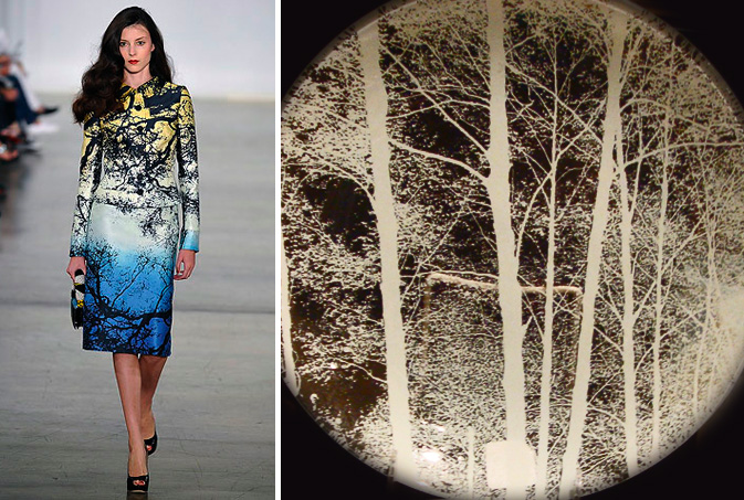
There’s nothing more symbolic of the February winter slump than bare trees silhouetted by dusk.  Designers from nearly every home goods and accessory category have infused their direction into this trend, moving away from the cozy appeal of eco-friendly design.  Tuleh’s S/S09 patterns possess a whimsical stillness that alludes to natural transition.  Flora detailing can also be found on glass plates sold at Lancelotti Housewares in downtown Manhattan.  Each plate is an interactive experience for both the chef and the diner, as the transparent canvas provides a scenic backdrop for every meal.

forest-tales3

Embracing tonal medleys, Forest Tales speaks to a darker feminine side of contrasts.  Selfridges of London sells pillows with sunrise/sunset references.  Using only a narrow silhouette and silver embossing, this metallic leather-bound notebook from ABC Carpet is both bold and simple.  Continuing to veer from prim and proper, this Black Forest China collection from Germany caters to the Tiffany-hating types, an under appreciated niche.  Armani Code combines transparency, gradients and nature to produce elegant, sultry packaging for it’s latest signature fragrance.

Trend: Woven Minimalism


correll-hedner

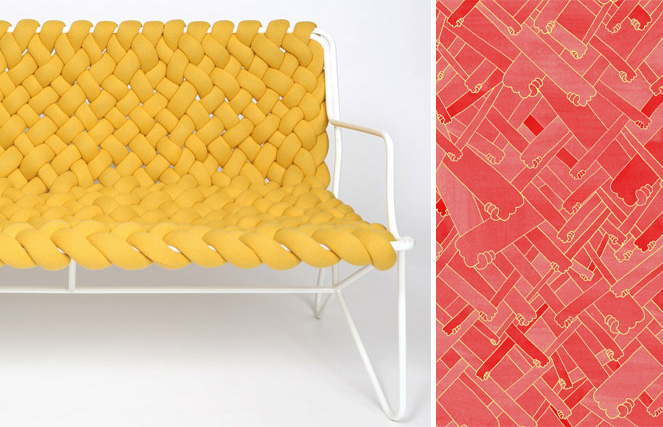
As excessive desires wain under the current economic climate, minimalist living shifts back into the spotlight.  Daniel Hedner, the mastermind behind Imaginary Office, a Swedish design and architecture firm, recently designed Pleats Please, a bare-bones approach to traditional seating.  Weaving only 19 stripes of upholstered polyurethane foam to a white coated steel pipe frame, Hedner built his creation using the macramé technique of knotting.  Illustrating this method on a flat surface, graphic designer Damien Correll, interlocks various arms together in Like Pattern, a print of hands holding hands. Utilizing a monochromatic palette and consistent stroke, Correll conveys a timeless sense of optimism, communicating strength in the basics.

Tracking Repetitive + Awesome.
On Instagram.